







Picking colors sounds deceptively easy until you actually have to do it. You open a blank canvas, punch in a few haphazard hex codes, hate all of them, and then spend twenty minutes mindlessly nudging saturation sliders as if that somehow counts as measurable design progress.
If you have spent more time adjusting the opacity of a background swatch than you care to admit, you are far from alone. Color selection remains one of the most psychologically taxing bottlenecks in modern web design and digital product development. It is an intersection of art, human psychology, accessibility law, and technical implementation. When a palette fails, a brand looks amateurish, conversion rates can plummet, and users might even struggle to read critical call-to-action (CTA) text.
Fortunately, the digital toolkit available to designers has evolved far beyond trial and error. Today, a sophisticated ecosystem of web-based generators, contrast checkers, and palette curators allows creators to bypass the blank-page syndrome. For those looking to master the fundamentals before diving into software, understanding the basics behind color theory provides an essential foundation. But when it is time to build, these five platforms stand out as indispensable assets for web designers, developers, and creators.
Main Facts: The Anatomy of Digital Color Fatigue
The struggle of choosing a digital color scheme is rooted in both cognitive overload and technical fragmentation. When designers conceptualize a website or application, they are rarely just picking a "favorite" color. They are constructing an ecosystem that must satisfy several rigid criteria:
- Brand Identity: The colors must evoke the correct emotional and psychological response from the target audience.
- Accessibility (WCAG Compliance): Text and interactive elements must pass rigorous contrast guidelines to ensure readability for users with visual impairments.
- UI Hierarchy: Primary, secondary, neutral, and accent colors must be delineated cleanly so users intuitively know where to look and click.
- Cross-Platform Consistency: Colors rendered via hex codes, RGB, HSL, or Tailwind tokens must look cohesive across diverse screens, from high-end OLED monitors to budget smartphones.
When manual iteration fails, automated tools step in to bridge the gap between abstract inspiration and concrete UI implementation. Whether you need a comprehensive palette generator or a quick background gradient, specialized web apps can drastically accelerate your workflow. For a broader look at what is available across the industry, our comprehensive roundup of free color tools for web designers explores even more resources.
Chronology: From Color Wheels to Algorithmic Generators
The evolution of how web designers select colors mirrors the maturation of the internet itself.
- The Early Web (Late 1990s – Early 2000s): Designers relied on the standard 216-color "web-safe" palette, constrained by hardware limitations. Hex codes were hand-coded from memory or looked up in static print tables.
- The Rise of CSS and Digital Color Pickers (Mid 2000s – 2010s): Desktop software like Adobe Photoshop introduced robust color picker suites, while early web blogs shared static tables of complementary color harmonies based on traditional art theory (analogous, triadic, complementary).
- The Interactive Web App Era (2010s – Present): Developers began building dedicated web applications specifically designed to solve the friction of color selection. Instead of opening a heavy desktop application to generate a gradient or find a matching accent color, designers could rely on cloud-based, interactive toolkits like Coolors and Color Hunt.
Today, these tools integrate directly into modern workflows, offering Tailwind CSS export formats, contrast validation, and real-time UI simulations.
Supporting Data: The 5 Essential Color and Gradient Tools Worth Bookmarking
To cut through the noise, we have evaluated the most reliable platforms currently available. Here are five standout tools that address different facets of the color-selection workflow.
1. Coolors: The Swiss Army Knife of Color Generation
- Best For: Rapid inspiration, complex palette building, and end-to-end workflow integration.
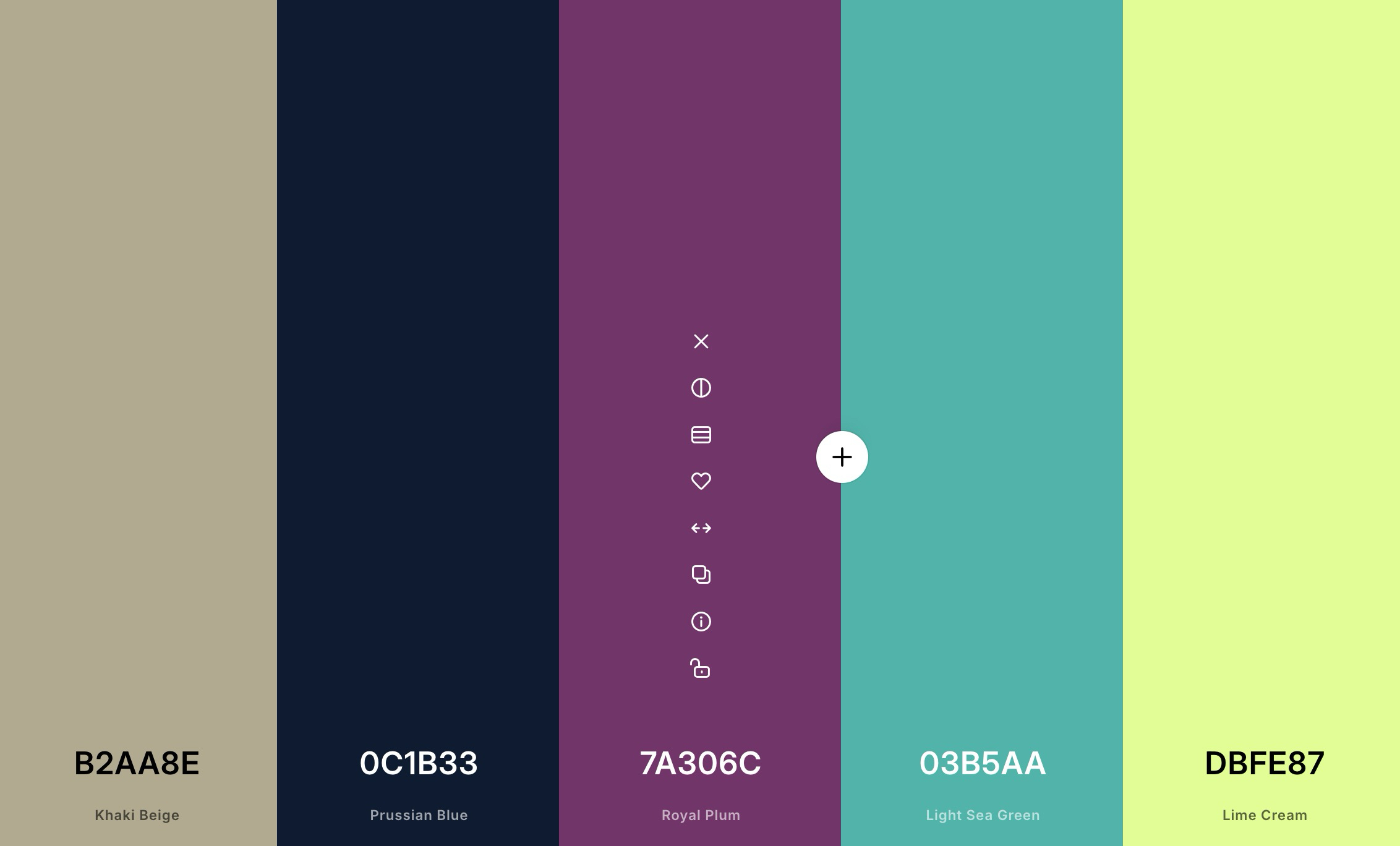
Coolors remains one of the absolute fastest ways to get unstuck when staring at a blank screen. Its core feature is an addictive and highly efficient palette generator: you simply tap the spacebar, and the algorithm instantly serves up fresh, mathematically harmonious combinations until something clicks.
However, reducing Coolors to a simple randomizer would be a mistake. The platform has expanded into a robust suite of tools that includes palette exploration, an image picker (allowing you to extract colors from uploaded photographs), a real-time contrast checker, a palette visualizer, and dedicated Tailwind-focused color helpers. If you want a single platform that can take you from rough, abstract inspiration to a concrete UI testing phase, Coolors is arguably the most complete option on the market.
2. Grabient: The Gradient-First Solution
- Best For: Modern landing pages, hero sections, and vibrant background blends.
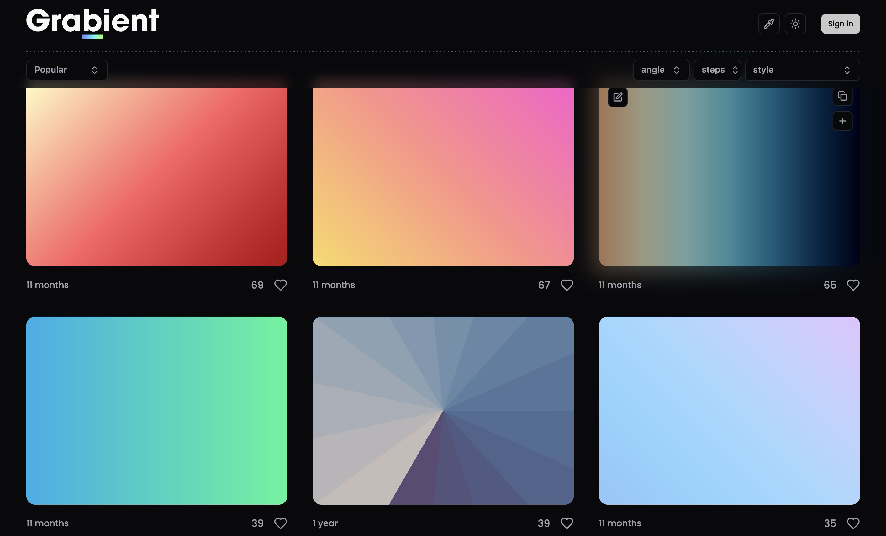
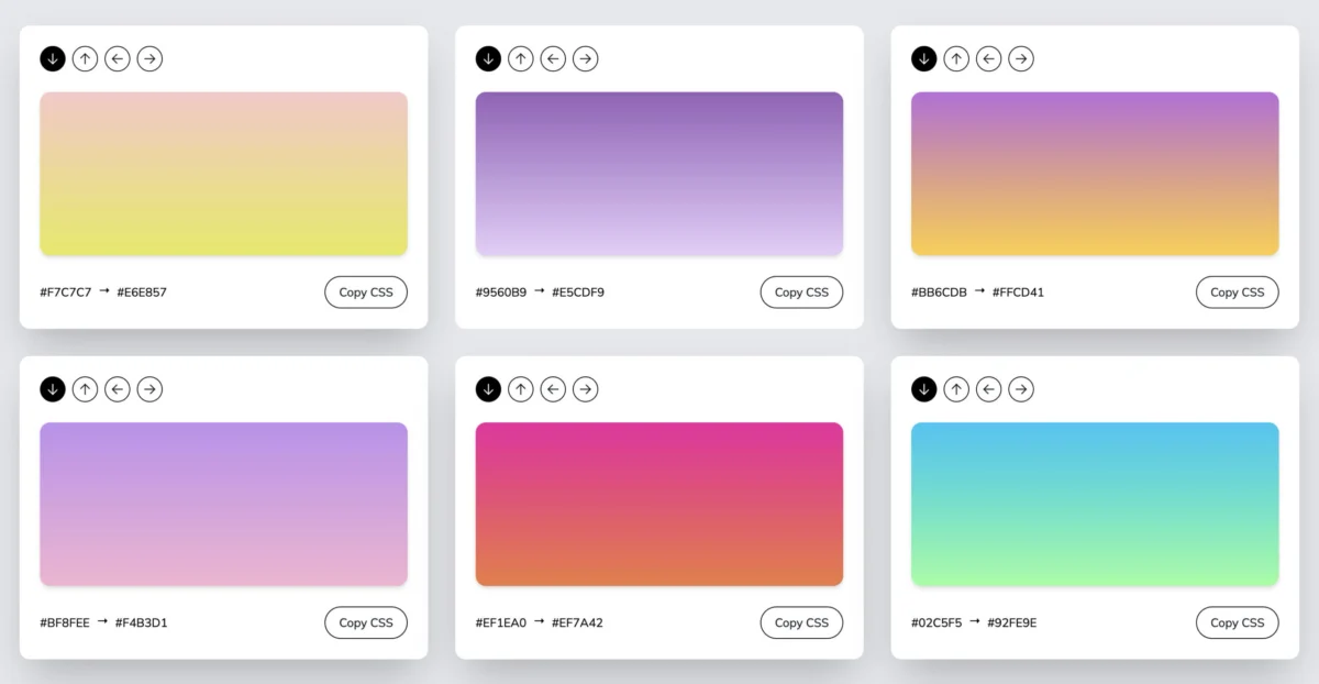
When a design brief calls for smooth gradients rather than flat, minimalist color swatches, Grabient is the tool to open first. Built specifically around the generation of CSS gradients, it features a remarkably clean interface that eliminates the headache of writing gradient syntax by hand.
Grabient allows users to adjust angles, tweak color stops, and copy production-ready CSS code instantly. While it also functions as a palette finder, its true strength lies in its gradient controls. For developers and designers building high-converting landing pages or marketing visuals that require soft, multidimensional depth, Grabient acts as a massive time-saver.
3. ColorHub: Product-Minded Palette Testing
- Best For: Visualizing how colors translate into realistic user interfaces.
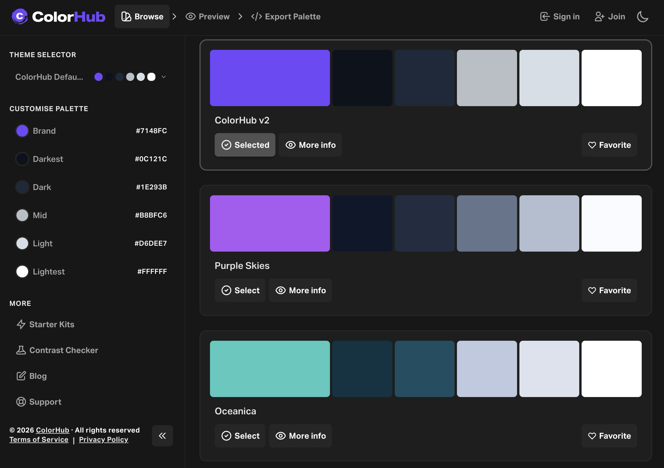
Many color generators fail because they display colors in isolation—against a sterile white background that looks nothing like a real website. ColorHub bridges this gap by feeling distinctly product-minded.
Rather than stopping at raw color generation, ColorHub provides features that help you preview palettes within realistic layouts. Its modern interface features starter kits, full landing-page template previews, built-in contrast checkers, a favorites system, and curated palette libraries. If your primary anxiety is not finding a nice shade of blue, but rather determining whether that blue will look professional once applied to a complex SaaS dashboard or e-commerce storefront, ColorHub is an essential bookmark.
4. Color Hunt: Curated Simplicity
- Best For: Fast, frictionless browsing of hand-picked color moods.
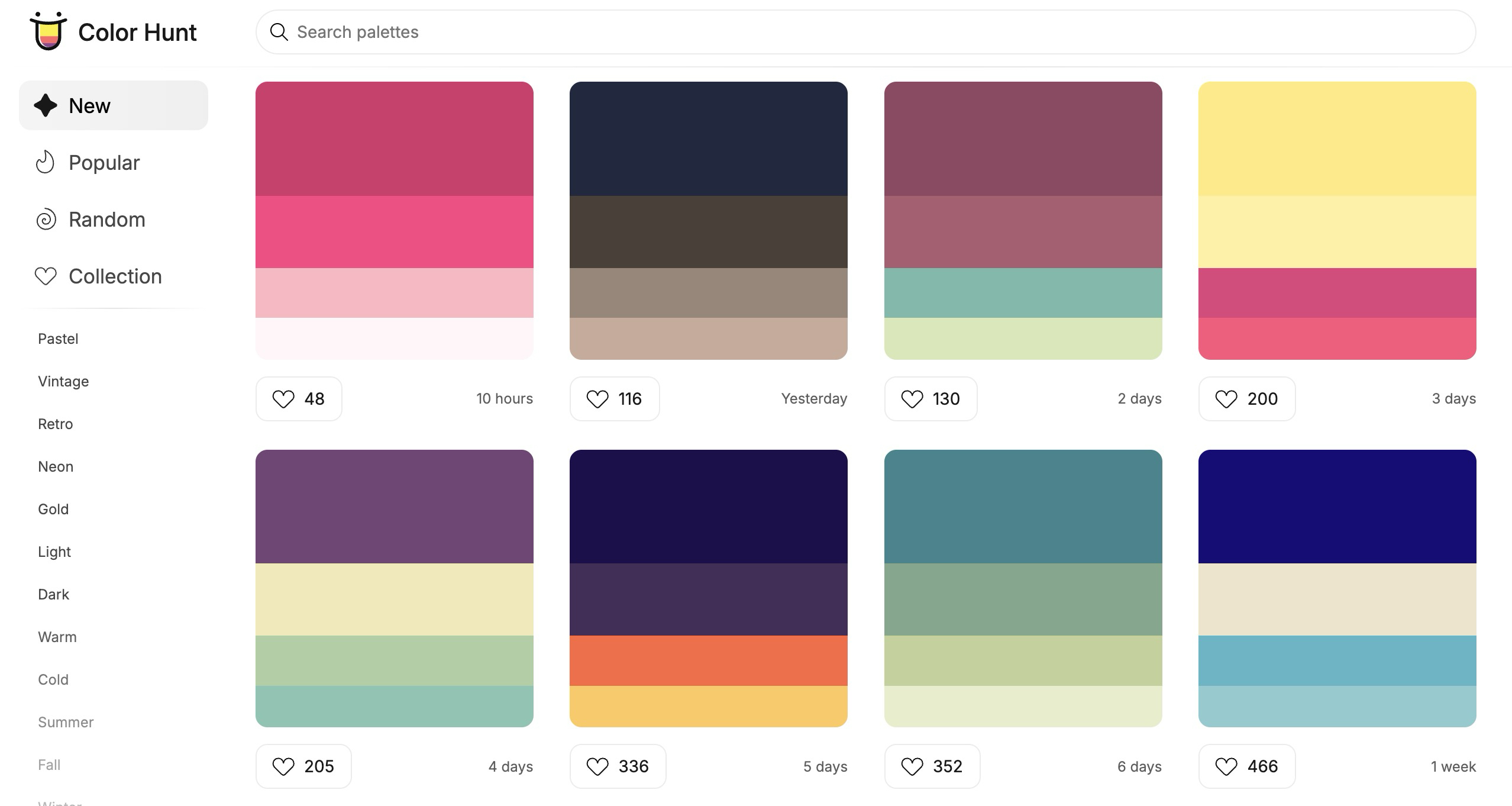
Color Hunt succeeds by keeping things refreshingly simple. It is a massive, highly browsable collection of hand-picked color palettes organized intuitively by mood, theme, and style—ranging from pastel and retro to dark mode, seasonal events, food, sunsets, and neon.
The beauty of Color Hunt lies in its lack of friction. You can scroll through the feed for five minutes and almost always walk away with a ready-to-use combination. It avoids overcomplicating the design process with unnecessary labs or adjustment sliders. Sometimes, you do not want to analyze color theory; you simply want to browse curated aesthetics until something aligns with your creative vision.
5. Gradients by Colorion: Direct, No-Fuss Backgrounds
- Best For: Quick CSS background blends without the bloat.
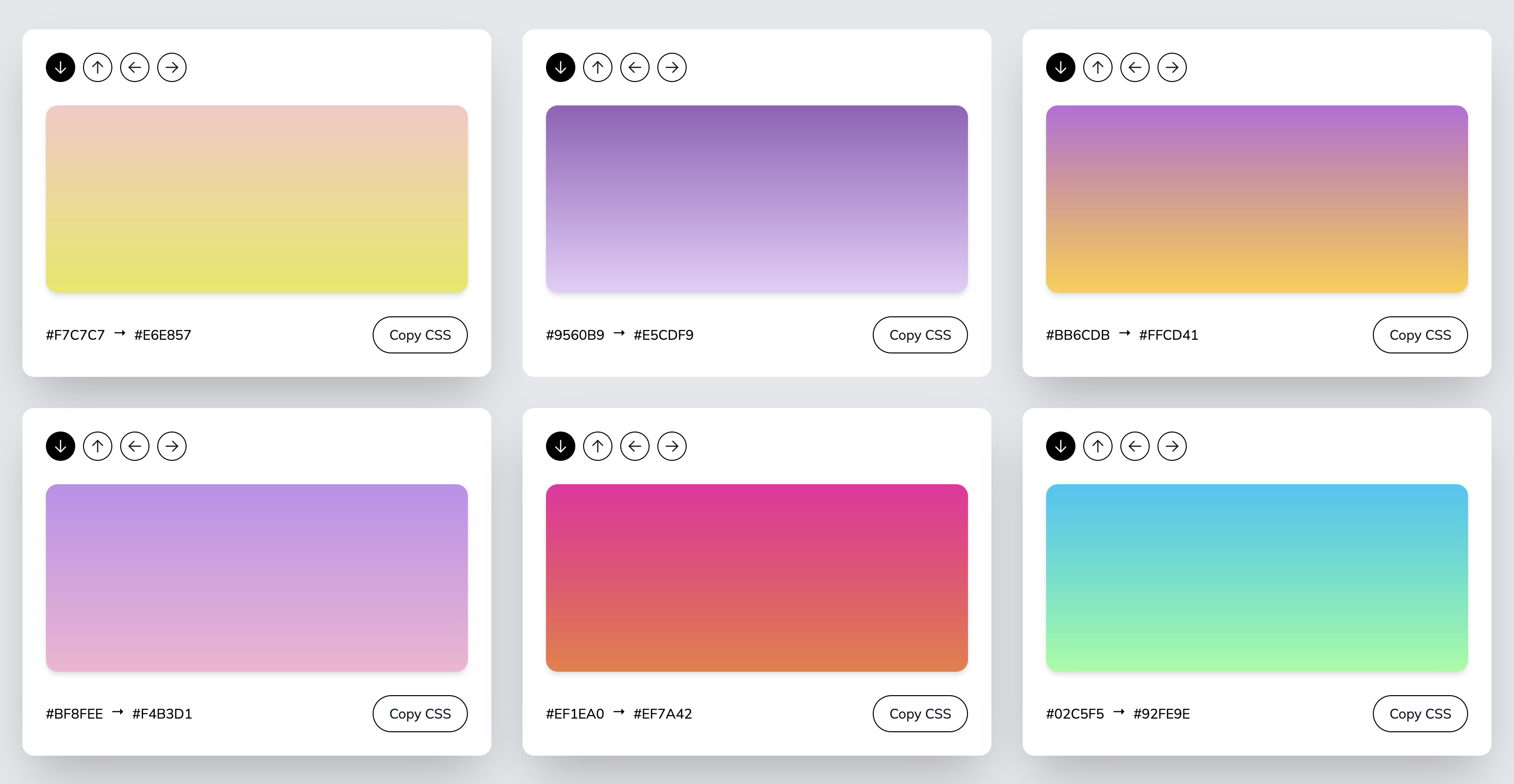
When your project requires a soft background gradient, a stylish callout box, or an engaging hero section fill, Gradients by Colorion keeps the process direct and efficient.
The site offers a hand-curated library of background gradients. Users can quickly adjust the direction of the color blend and copy the generated CSS code with a single click. There is no steep learning curve, no heavy setup, and no unnecessary interface clutter. You browse, tweak, copy, and move on with your build.
Official Industry Responses & Standards
As web design standards have matured, digital regulatory bodies and enterprise design systems have placed an unprecedented emphasis on color accessibility and standardization.
The Web Content Accessibility Guidelines (WCAG), established by the World Wide Web Consortium (W3C), outline strict contrast requirements for digital interfaces. Specifically, normal text must maintain a contrast ratio of at least 4.5:1 against its background, while large text requires a 3:1 ratio. Regulatory shifts globally—including the European Accessibility Act—mean that failing to meet these color contrast standards can expose businesses to legal liabilities.
Consequently, modern color tools are no longer viewed merely as aesthetic toys; they are essential compliance utilities. Platforms like Coolors and ColorHub have integrated real-time contrast scoring directly into their generators, reflecting an industry-wide consensus that beauty and accessibility must coexist.
Implications: Solving the Workflow Problem
When analyzing why designers struggle with color, a larger truth emerges: Most of us do not have a color problem; we have a workflow problem.
The right tool cannot magically grant you innate artistic taste, nor can it guarantee that your client will love your first proposal. However, what a great color tool can do is help you explore variations faster, compare visual contrast accurately, and stop second-guessing every single hex code you type into your stylesheet.
By eliminating the mechanical friction of color selection, these platforms free up cognitive bandwidth for higher-level architectural and user-experience decisions. If you are currently embarking on a new digital project and still ironing out your foundational aesthetic direction, diving into guides like how to choose a color scheme for your website can help you frame those initial strategic choices.
Ultimately, keeping these five tools in your browser toolbar ensures that when the blank canvas stares back at you, you are ready to conquer the chromatic bottleneck with speed, precision, and confidence.