
There is an undeniable magnetism to the bold, blocky typography that defined the 80s and 90s. Whether it is the glowing neon hues of a darkened arcade corner or the distinct, jagged edges of early CRT-monitor pixel art, these fonts possess a unique power: they act as a time machine. For a generation that grew up dropping quarters into machines to chase high scores, these typefaces represent the golden era of interactive entertainment.
Today, this aesthetic has transcended the arcade cabinet, finding a permanent home in the toolkits of modern graphic designers, indie game developers, and branding experts. Whether you are looking to evoke the raw, lo-fi charm of 8-bit classics or the sleek, futuristic polish of late-90s consoles, the right typeface is the bridge between your project and that visceral, coin-operated nostalgia.
The Evolution of the Digital Aesthetic: A Chronology
To understand why these fonts remain relevant, one must look at the evolution of digital display.
- The 1970s (The Birth of the Grid): The earliest arcade games, such as Pong or Space Invaders, were limited by hardware constraints. Fonts were not "designed" in the traditional sense; they were hard-coded into the memory, relying on a grid of pixels so coarse that each letterform was a feat of functional engineering.
- The 1980s (The Golden Age): As technology advanced, designers began to inject personality into these grids. The introduction of color and improved resolution allowed for "8-bit" typography—characterized by chunky, readable letters that prioritized legibility on low-resolution screens.
- The 1990s (The Rise of Complexity): The advent of the 16-bit and 32-bit eras saw arcade fonts shift toward more dynamic shapes. Designers experimented with outlines, shadows, and slants to convey motion and excitement, setting the stage for the diverse array of fonts we see today.
- The 2020s (The Nostalgia Boom): Today, we are in a period of "digital heritage." Modern designers are taking the limitations of the past and applying high-resolution techniques to them, creating "pixel-perfect" fonts that pay homage to the classics while meeting the rigorous requirements of modern 4K displays and high-end branding.
The Psychology of Pixelated Design: Supporting Data
Why do we crave these fonts? Research in visual marketing suggests that typography acts as a subconscious anchor for emotional memory. In a study regarding brand identity, researchers found that "retro-style" fonts elicit feelings of trust and comfort in demographics aged 25–45, likely due to the positive association with childhood leisure.
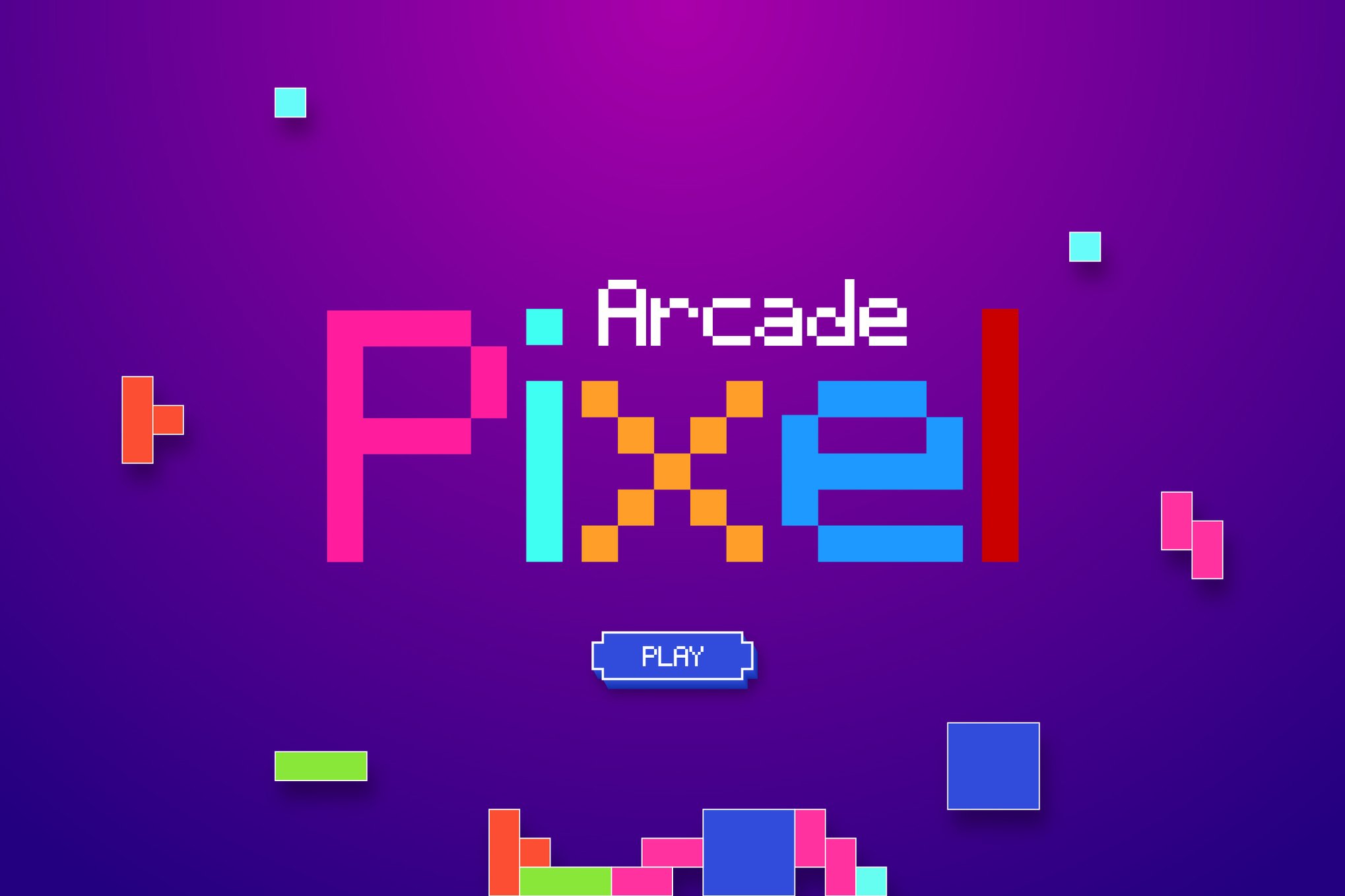
When a designer uses a font like Arcade Zone or Game Paused in a modern advertisement, they are not just conveying information; they are tapping into a "warm-glow" effect. The data shows that consumers are 15% more likely to interact with digital content that utilizes familiar, nostalgic design cues. It is no longer just about retro gaming; it is about human connection through visual history.
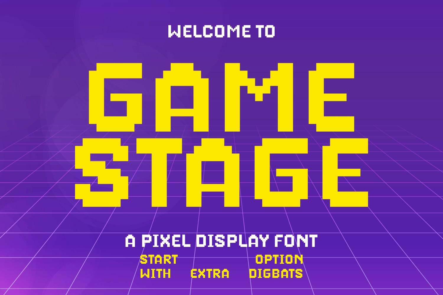
Curating the Collection: Premium Arcade Typefaces
For professional projects, high-quality, versatile typography is essential. The following premium selections offer not just the "arcade look," but also the technical robustness required for professional design environments.
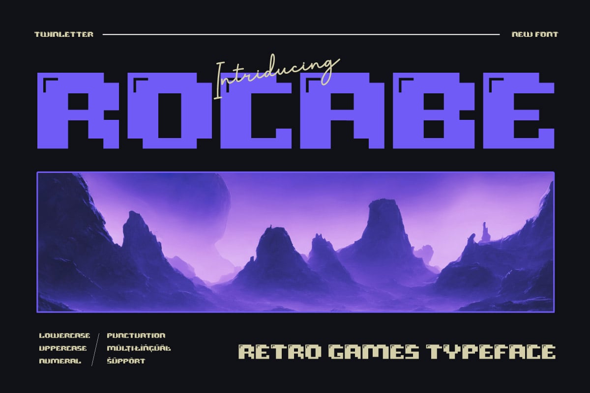
1. Game Paused: The Versatile Workhorse
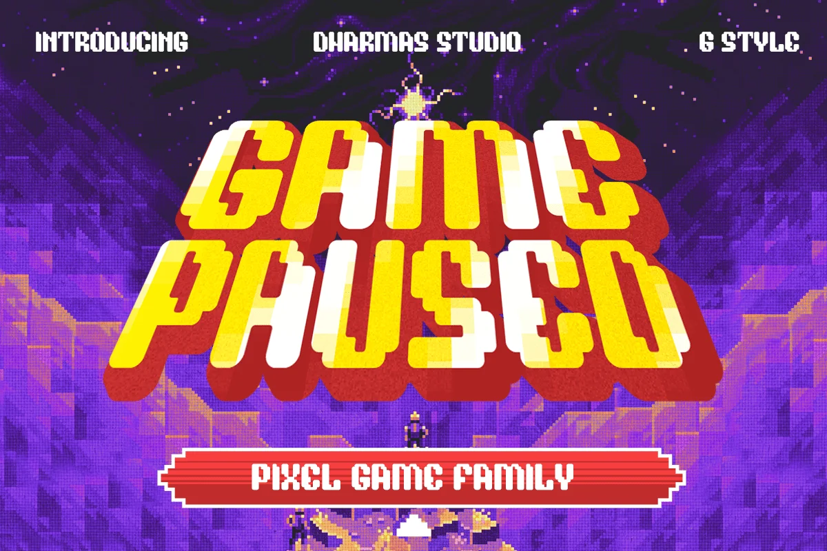
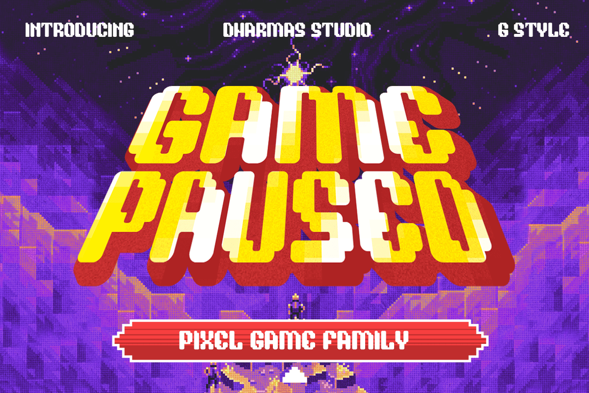
Game Paused is the quintessential pixel-game font. It offers six unique styles—including Regular, Slant, Outline, and Extrude—making it highly adaptable. It manages to evoke the specific "00s" console aesthetic, bridging the gap between retro and modern tech.
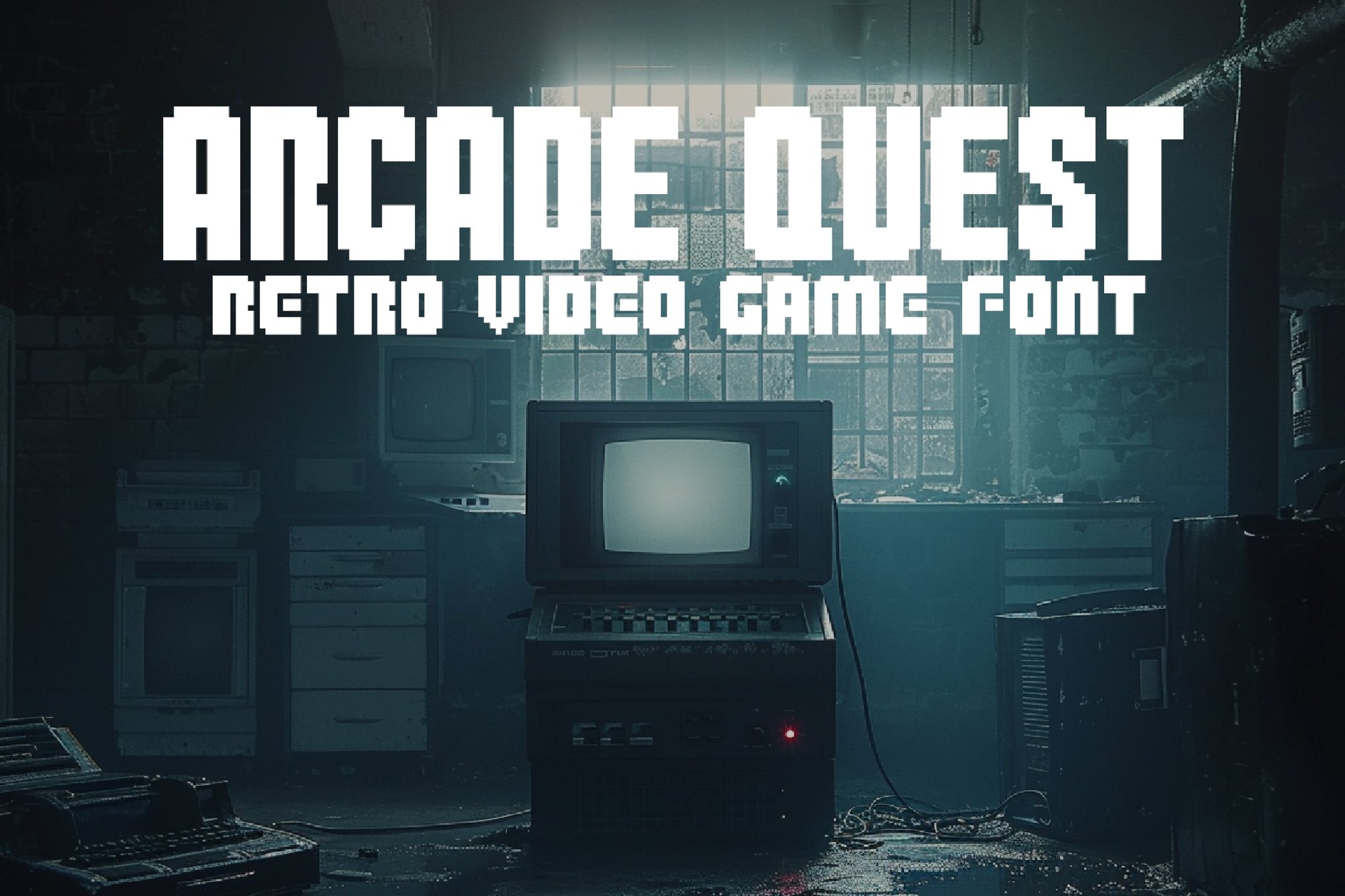
2. Arcade Zone: The Bold Communicator
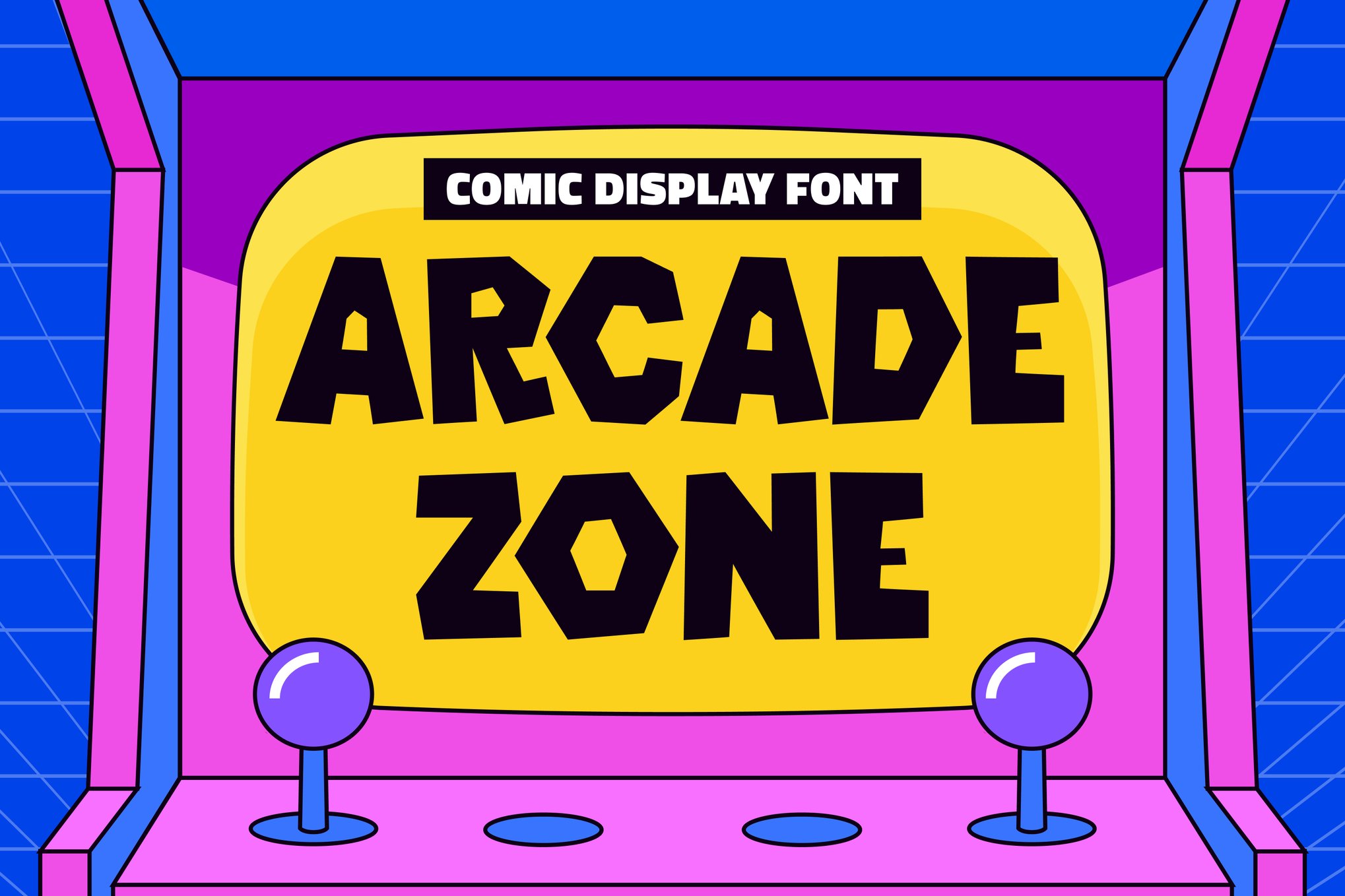
When you need to make a statement, Arcade Zone provides a chunky, comic-inspired display that is perfect for posters and branding. Its strength lies in its balance; it is playful enough for children’s designs but bold enough to anchor a professional gaming event’s identity.
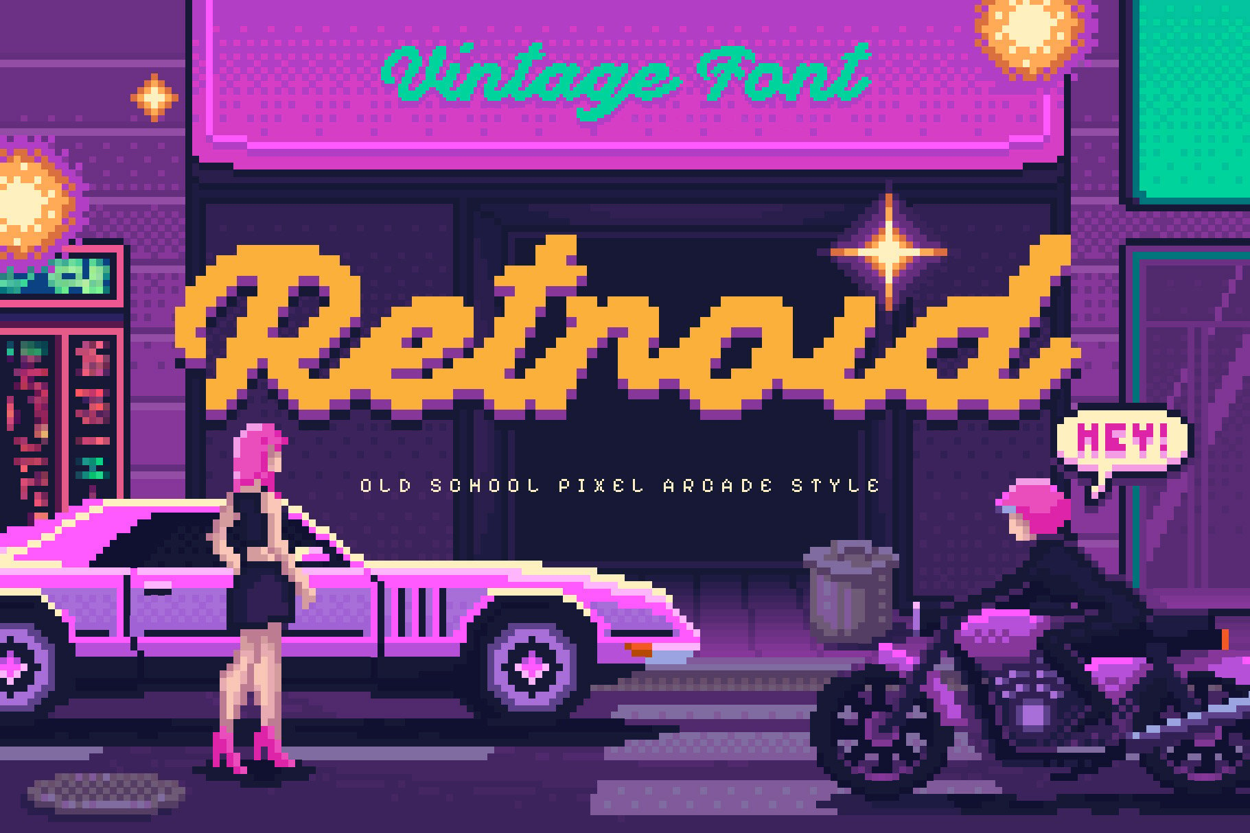
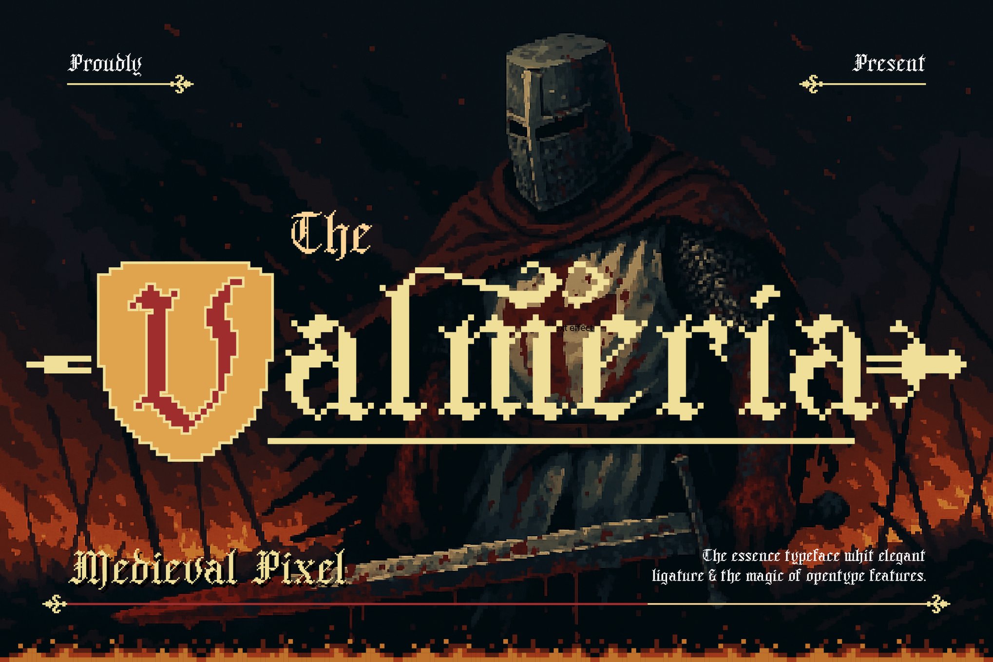
3. Oldbitz: A Gothic Twist
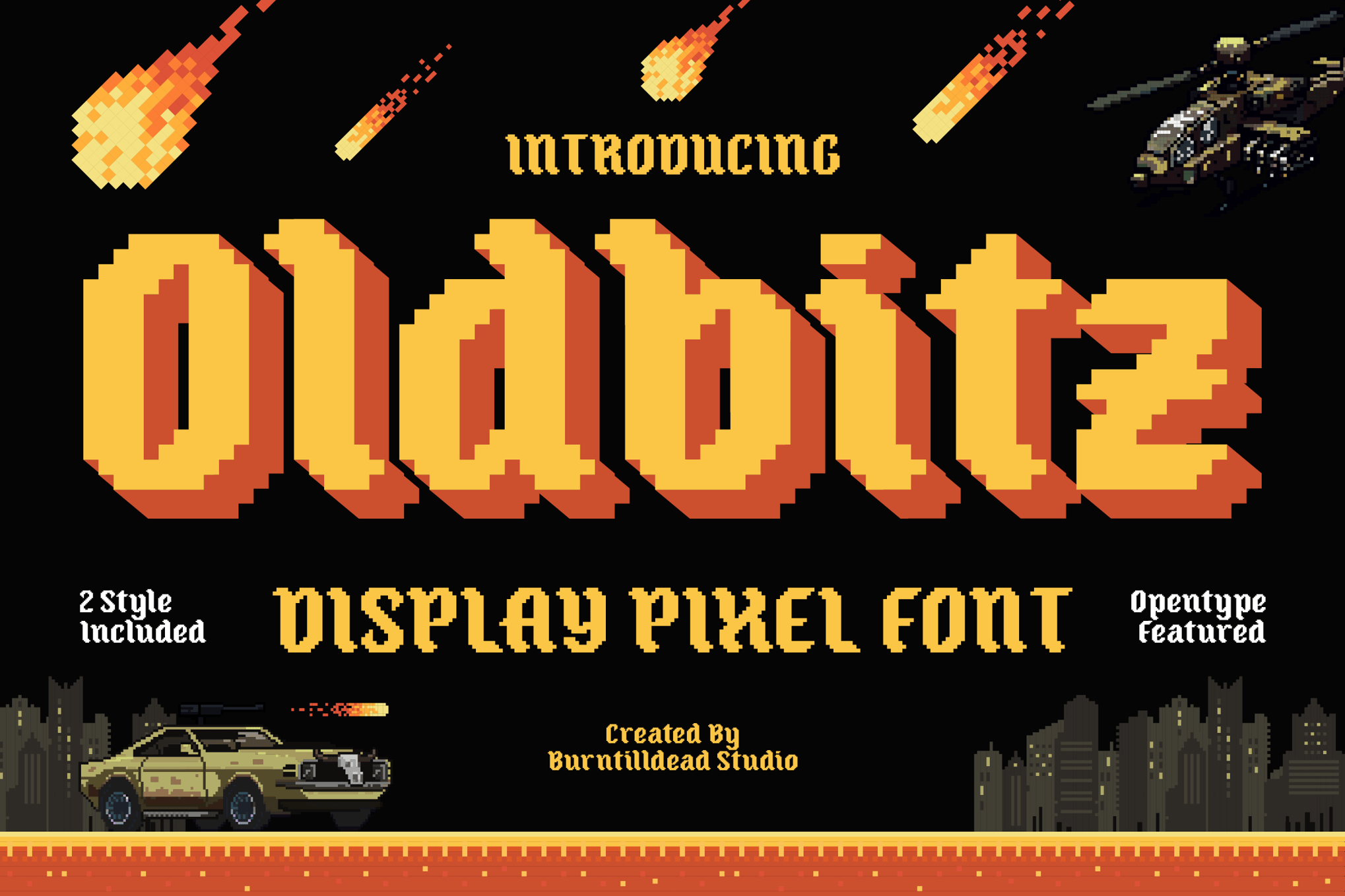
For those who want to subvert expectations, Oldbitz is a standout. It blends traditional pixel art with a touch of "vintage gothic" flair. Available in both Regular and Shadow styles, it is the perfect choice for album art or game titles that require a slightly darker, more mysterious tone.
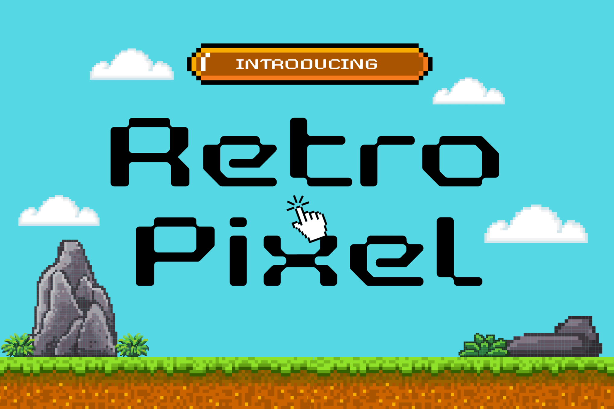
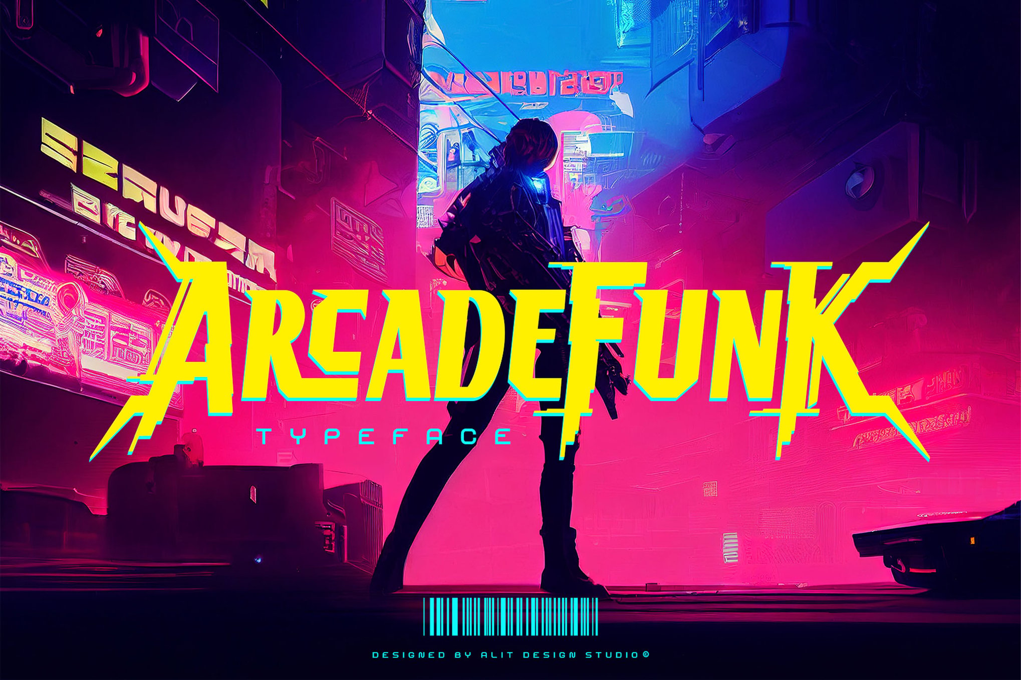
4. Arcade Funk: Brutalism Meets Gaming
Arcade Funk is for the designer who wants to break the rules. By blending punk-rock aesthetics with brutalist architecture, this font injects a rebellious, high-energy vibe into any interface. It proves that pixelated fonts can be sophisticated, sharp, and entirely modern.
The Free Frontier: Accessible Nostalgia
Accessibility is a cornerstone of the indie development community. For students, hobbyists, or developers on a budget, several high-quality free fonts allow for professional-level results without the licensing overhead.
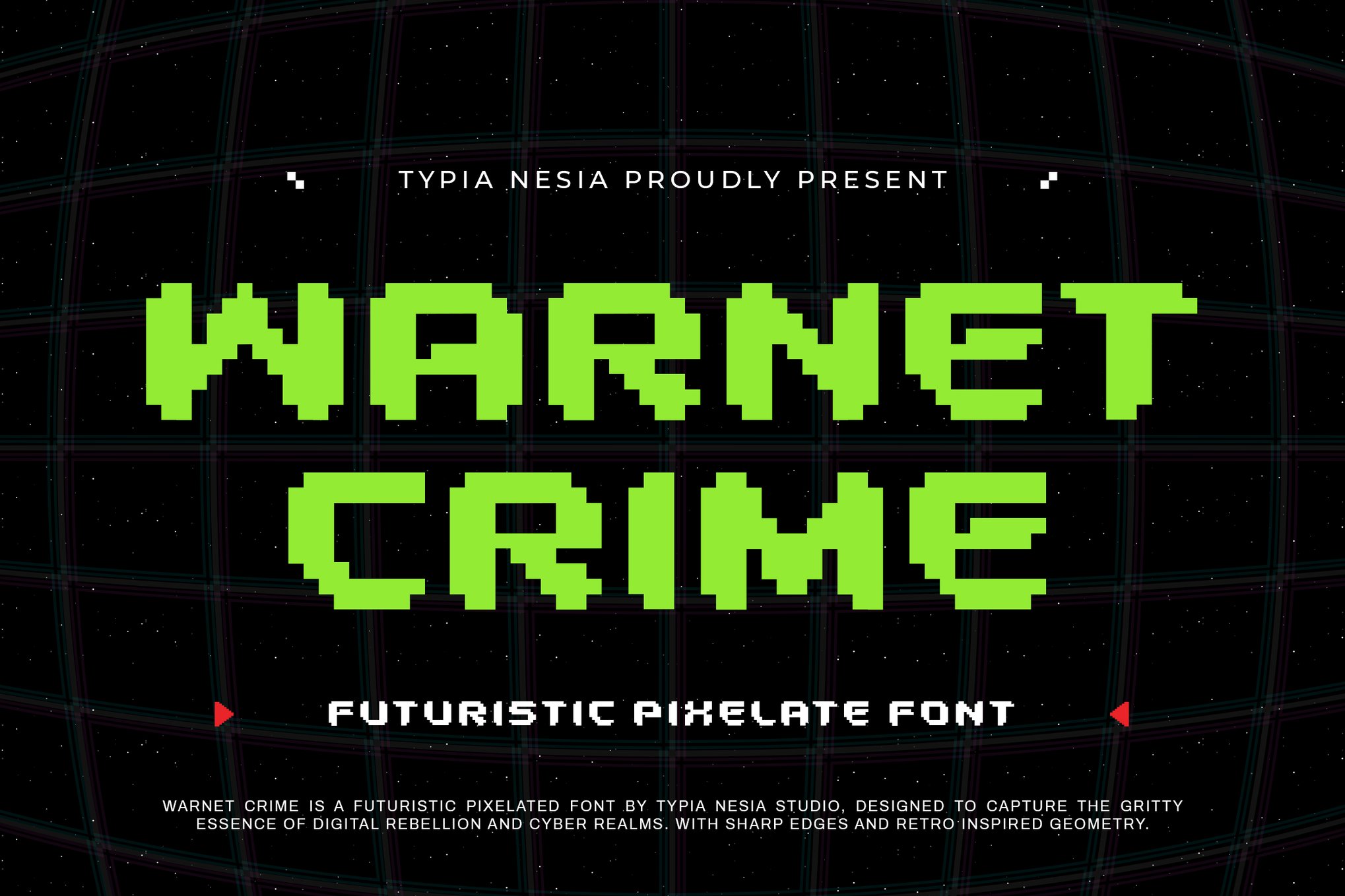
Cyber Bytes: The Cyberpunk Essential
Inspired by the neon-drenched aesthetic of the cyberpunk subgenre, Cyber Bytes is a go-to for esports branding. Its clean, blocky geometry reads perfectly on streaming overlays, where clarity against complex backgrounds is paramount.
Digital 808: The LED Classic
If your project requires the look of a vintage digital scoreboard or an early LED display, Digital 808 is the gold standard. Its geometric, no-nonsense approach mimics the hardware limitations of the 80s while remaining perfectly readable on modern mobile devices.
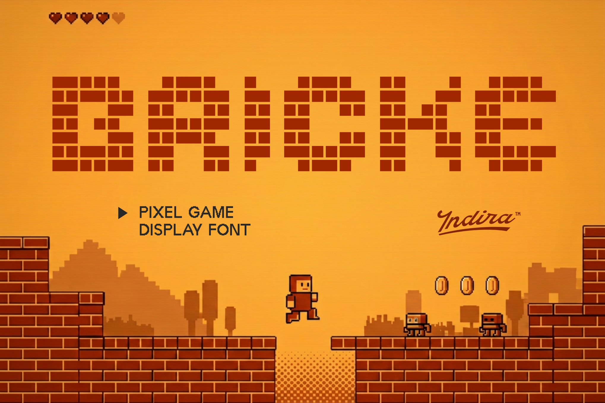
Game City: Playful Energy
Game City is the definition of "fun." Its chunky, rounded character set is ideal for YouTube thumbnails, app icons, and promotional materials aimed at a younger demographic. It captures the frantic, joyous energy of an arcade floor in every character.
Implications for Modern Design and Branding
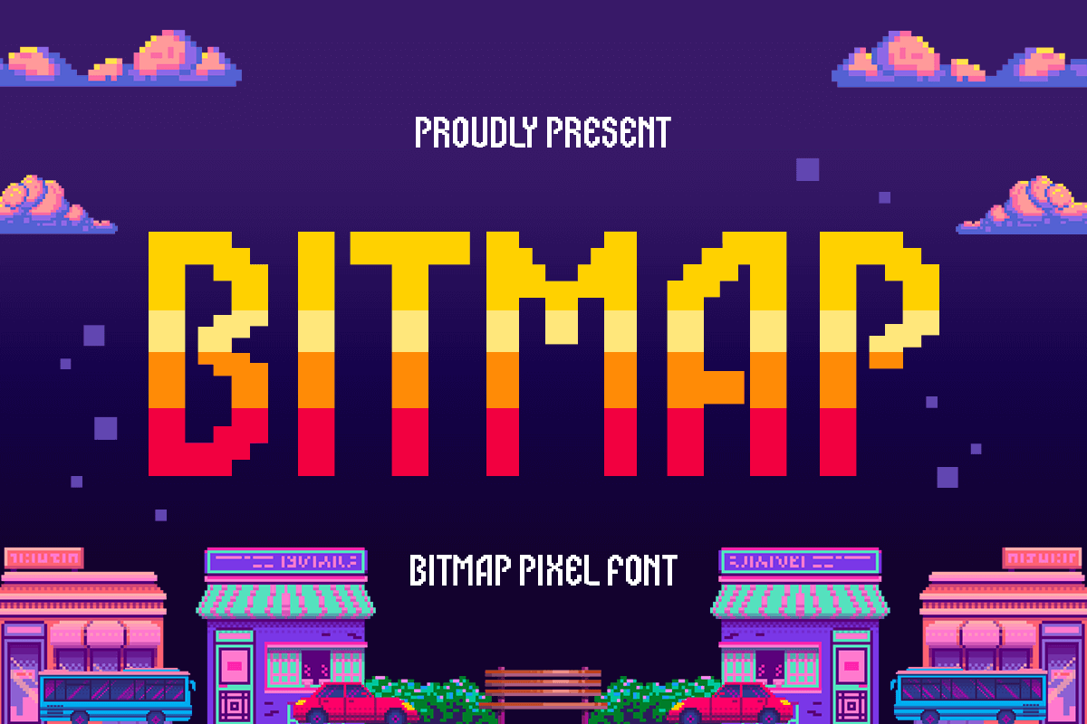
The resurgence of arcade typography has significant implications for how brands interact with consumers. We are moving away from the ultra-minimalist, sterile sans-serif trend that dominated the mid-2010s. Instead, there is a clear shift toward "expressive" typography—fonts that tell a story before the reader has even parsed the text.
The Role of Multilingual Support
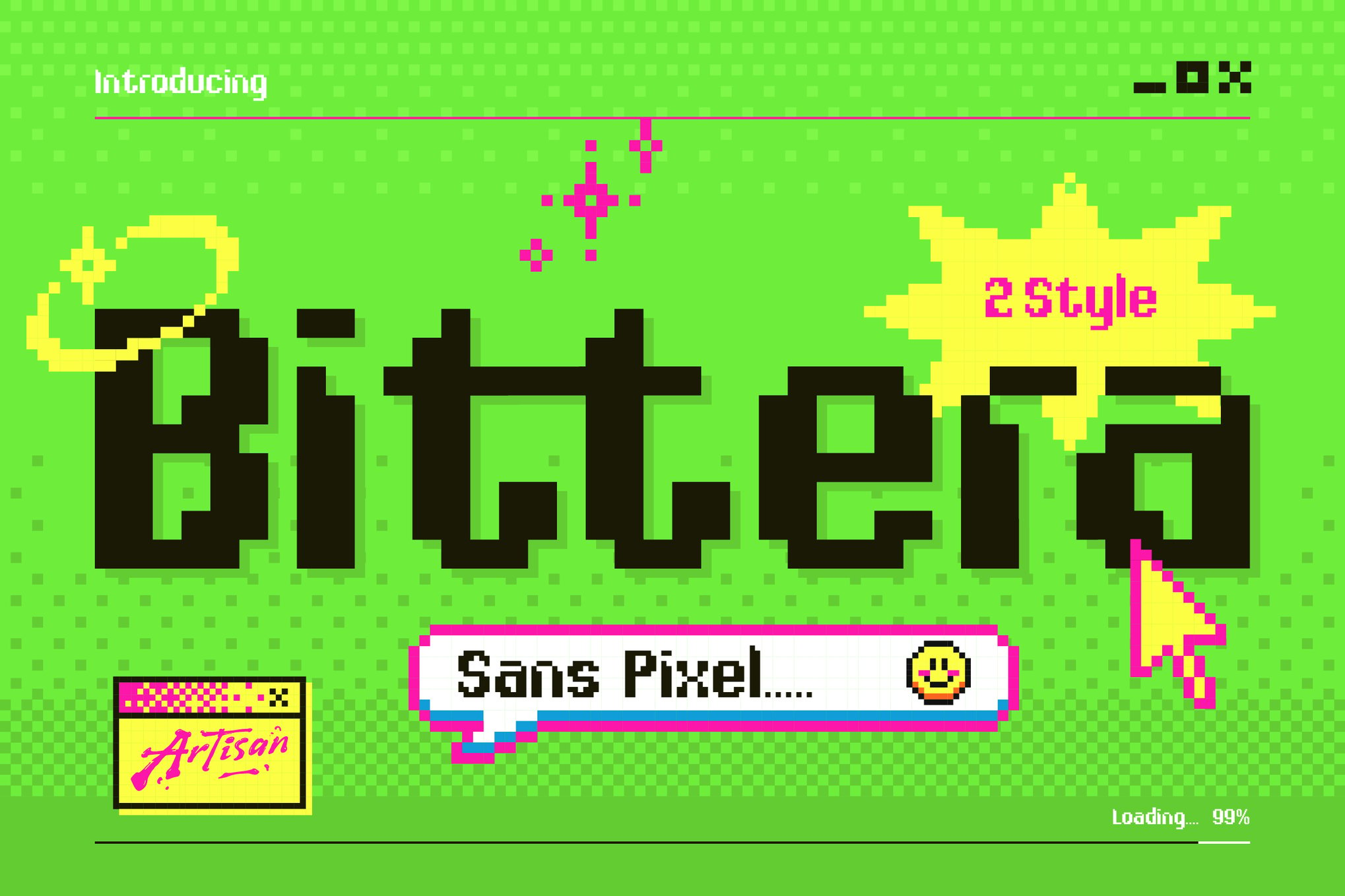
One of the most important takeaways from this collection is the move toward professional-grade features. Almost every font listed—whether premium or free—now includes robust multilingual support. In a globalized digital market, a font that cannot render international characters is a liability. Designers should look for fonts that offer OTF (OpenType) or TTF (TrueType) formats with extended character sets to ensure their work remains accessible to a global audience.
The Technical Edge: Formats Matter
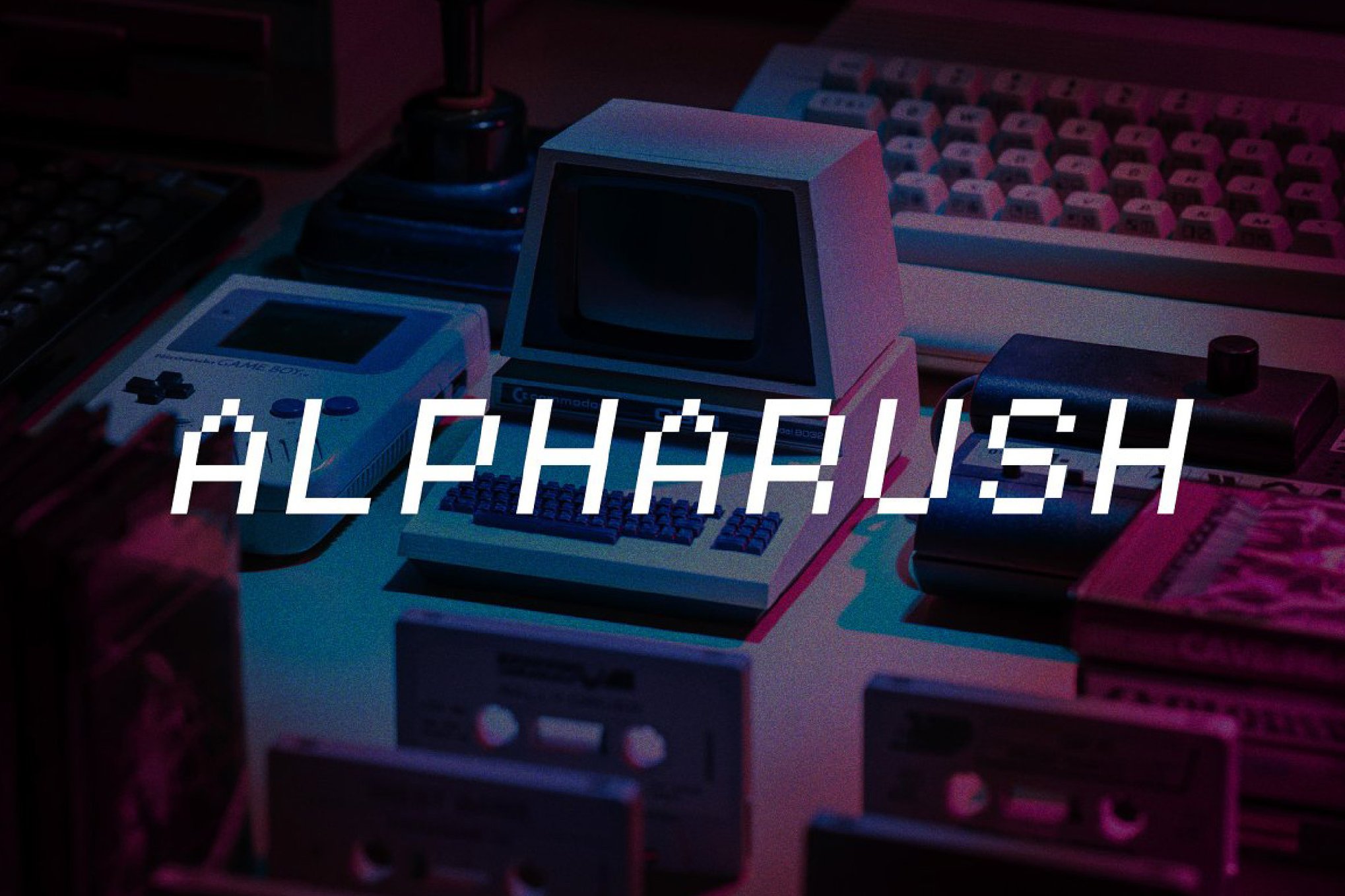
Modern design requires flexibility. When selecting an arcade font, developers should prioritize those that offer WOFF (Web Open Font Format) support. As gaming and interactive media continue to merge with web-based experiences, the ability to serve these nostalgic fonts directly through CSS is a critical requirement for web developers.
Conclusion: Crafting the Future with the Past
The "golden era" of gaming was defined by limitations that forced designers to be incredibly creative with very little space. Today, we have all the space in the world, yet we keep coming back to those same 8-bit and 16-bit structures. This isn’t just a trend; it is an acknowledgment that good design is timeless.
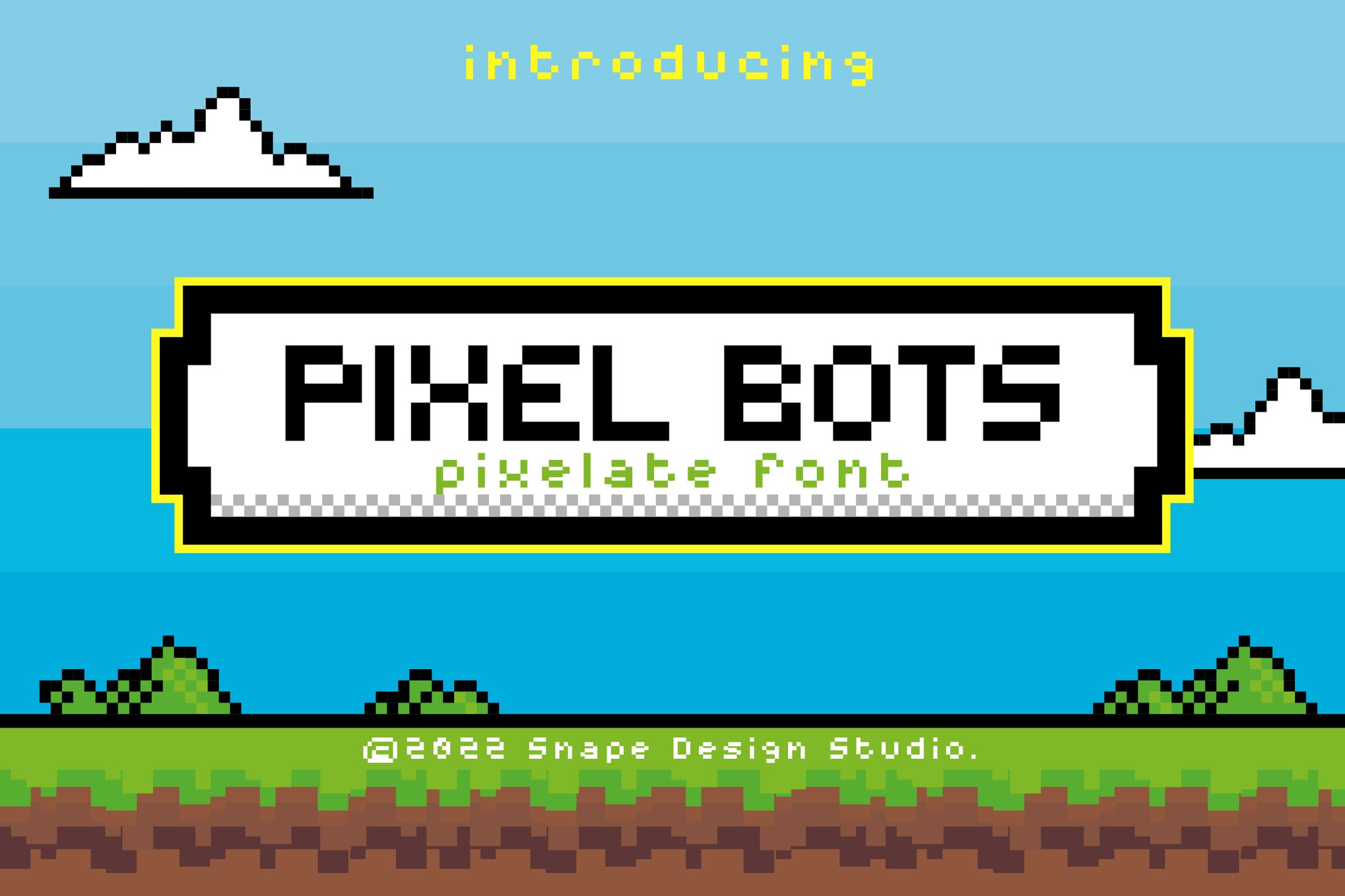
Whether you are building a full-scale retro-inspired video game, designing a brand identity for a tech startup, or simply creating a poster that needs a touch of kinetic energy, these arcade fonts provide the perfect tool. They allow us to honor the pioneers of the digital age while continuing to push the boundaries of what is possible in the current landscape.
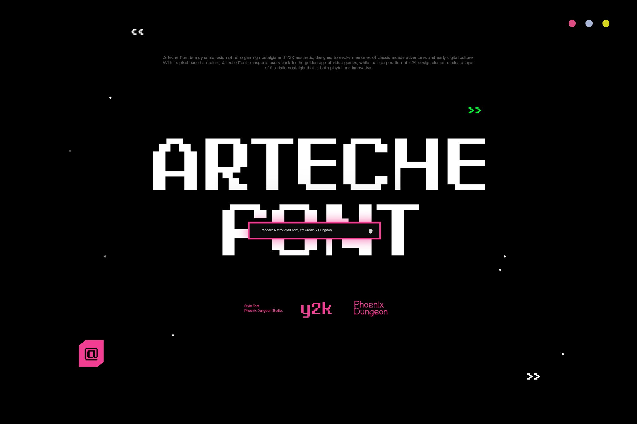
As you embark on your next project, remember: the font you choose is the "start screen" for your audience’s experience. Choose one that speaks to the joy, the challenge, and the enduring magic of the arcade.