







In the contemporary web development landscape, artificial intelligence has ceased to be a novel luxury and has instead become a standard expectation. Nearly every mainstream WordPress block plugin now boasts native AI integration, promising users a streamlined path from a blank canvas to a fully designed, conversion-optimized web page through the simple power of a text prompt.
However, a critical element of illusion permeates most marketing materials in this space. Promoted workflows typically showcase an immaculate, polished result as though it materialized magically on the first attempt. Developers and marketers almost never disclose the trial-and-error process—the exact number of prompts, corrections, and frustrating dead ends required to achieve that final screenshot.
To peel back the layers of polished marketing and examine how AI-driven web generation performs under strict, unedited conditions, this experiment adopted a radically transparent approach. Using the free Otter Blocks plugin and its built-in Section Generator, a test environment was established to construct nine distinct sections of a WordPress site.

Rather than engaging in endless iterative prompting until a section looked "just right," a strict methodology was enforced: a single prompt was executed for each section, and the unedited result of that first prompt was captured via screenshot.
The findings reveal a nuanced reality about AI web generation. Some outputs were immediately publication-ready, while others fell short. Surprisingly, the disparity in quality had almost nothing to do with semantic phrasing or clever prompt engineering, and everything to do with the substance embedded within the instructions.
Main Facts: What the Otter Blocks Section Generator Offers
Before evaluating the individual sections, it is essential to understand the mechanics of the tool under scrutiny. Otter Blocks integrates directly into the native WordPress block editor (Gutenberg), allowing users to access the Section Generator as easily as any standard content block.

Unlike many competitor plugins that monetize AI through rigid, consumable credit systems, Otter’s approach relies on connecting a user-provided AI provider directly to the WordPress installation. Once configured, the workflow is straightforward: the user types a descriptive prompt for a specific web section, the AI constructs the layout using native Otter blocks, and the developer retains granular control to edit every element afterward.
To initiate the system, users must follow a brief setup process to link their chosen AI provider within the WordPress dashboard, add the dedicated AI block to the editor, and input their descriptive layout parameters. Comprehensive documentation is maintained via ThemeIsle’s official knowledge base for administrators requiring advanced configuration support.
Chronology of the Experiment: Putting Nine Prompts to the Test
With the technical foundation established, nine discrete sections were commissioned through single, unedited prompts. The chronology of this test provides a clear look at where the system excels and where human intervention remains vital.
1. The Testimonials Section: Layout Success, Content Void
The experiment commenced with a concise baseline prompt designed to test structural comprehension:
Prompt: A testimonials section with three customer quotes and names.
The resulting layout was an immediate success. The generator produced three well-spaced cards, appropriately positioned quotes above customer names, and an organic offset from the preceding page section.
The textual content, however, proved to be classic, generic AI filler:
"The whole experience feels thoughtful from start to finish. We found our rhythm quickly and delivered better work with far less friction."
The tool did not fail; it executed the prompt precisely as instructed. When tested later with prompts specifying concrete business outcomes—such as meeting deadlines or increasing sales—the generated text grew noticeably closer to authentic customer voice. Nevertheless, for a production website, placeholders must always be replaced with authentic testimonials. The takeaway was clear: the value of the first-pass AI generation lies in the structural layout, not the copy.
2. The Founder’s Letter: A Breakthrough in Tone
Transitioning from simple requests to opinionated prompts, the second test involved crafting a personal narrative block:
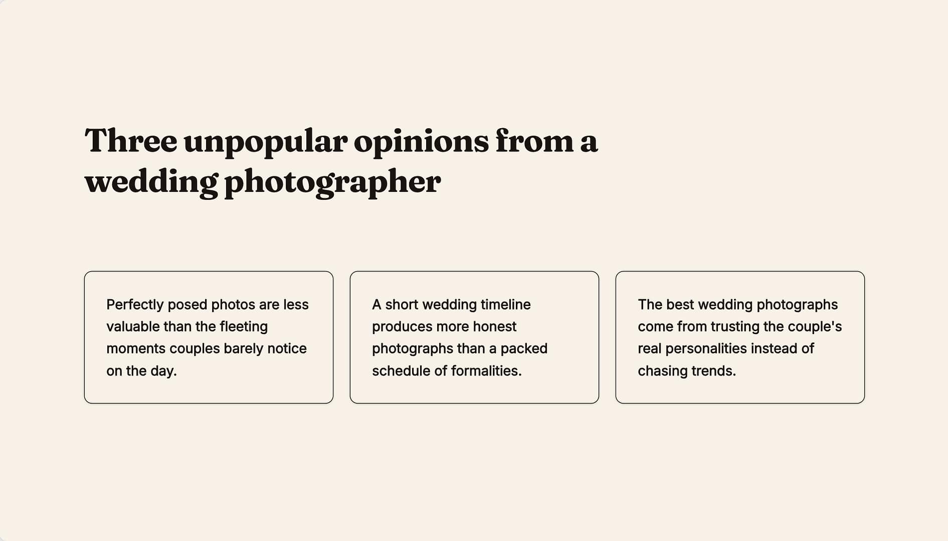
Prompt: Three unpopular opinions from a wedding photographer about wedding photography. One sentence each, stated as claims not questions.
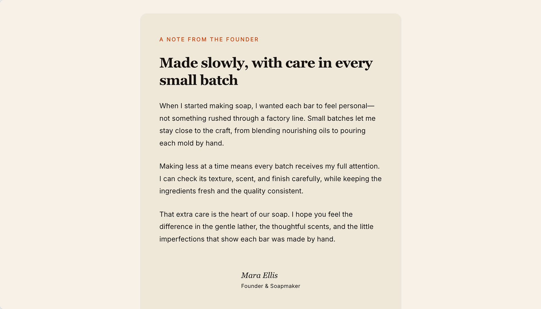
This output yielded the most striking result of the entire experiment. The generator produced a dedicated section label ("A NOTE FROM THE FOUNDER"), a compelling headline ("Made slowly, with care in every small batch"), three argumentative paragraphs focusing on craft rather than corporate fluff, and a professional signature for a fictional artisan. This output was one of only two across all nine tests that could have been published without modification.
3. The Copywriter’s Dual-Column Layout
Testing the system’s ability to balance contrasting messaging, the third prompt targeted a service-based freelance profile:
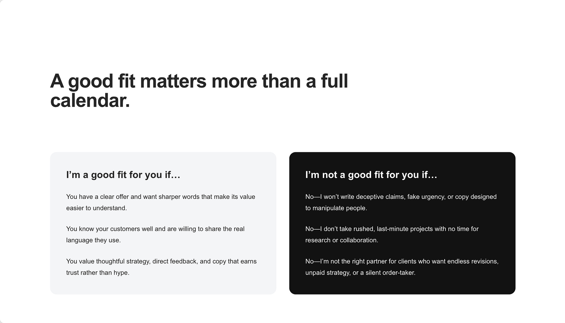
Prompt: Create a two-column section for a freelance copywriter: who I’m a good fit for, and who I’m not. Four honest points each. The second column should actually say no to people.
The generator autonomously devised a striking visual contrast, pairing a dark card against a light background. It generated a strong guiding headline ("A good fit matters more than a full calendar") and populated the negative space with firm boundaries (no deceptive claims, no rushed projects). Although it missed the exact count—providing three points per side instead of the requested four—the conceptual delivery exceeded expectations.
4. The Restaurant’s Monday Closure Note
To evaluate micro-messaging, a specialized informational block was requested:
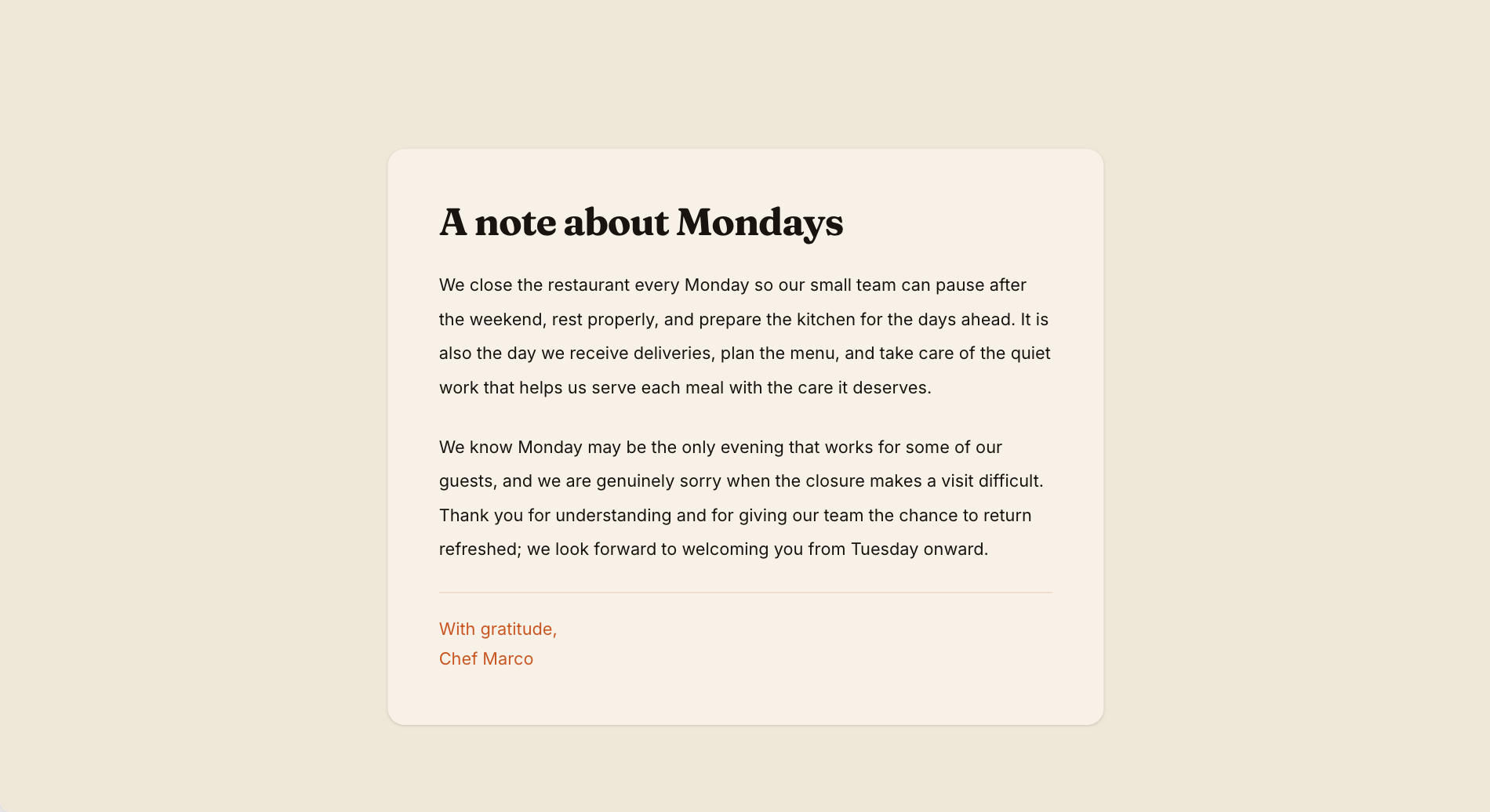
Prompt: I asked for a short note from a restaurant explaining why it closes on Mondays.
Rather than rendering this as a dull line of fine print in a footer, the generator created a dedicated two-paragraph editorial layout—one explaining staff rest and preparation, the other politely apologizing to inconvenienced patrons, signed "With gratitude, Chef Marco." This demonstrated a key lesson: providing a clear narrative context transforms standard boilerplate text into engaging editorial content.

5. Structured Data: Pricing and Size Guides
Next, the experiment tested the AI’s proficiency with factual, data-driven organization.
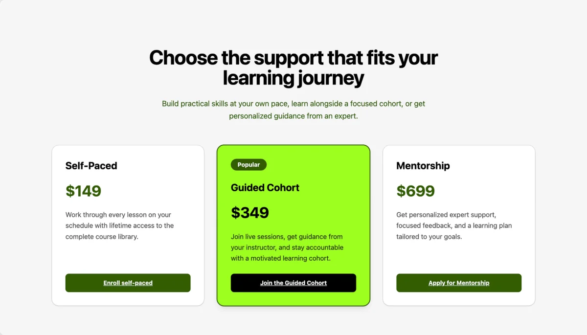
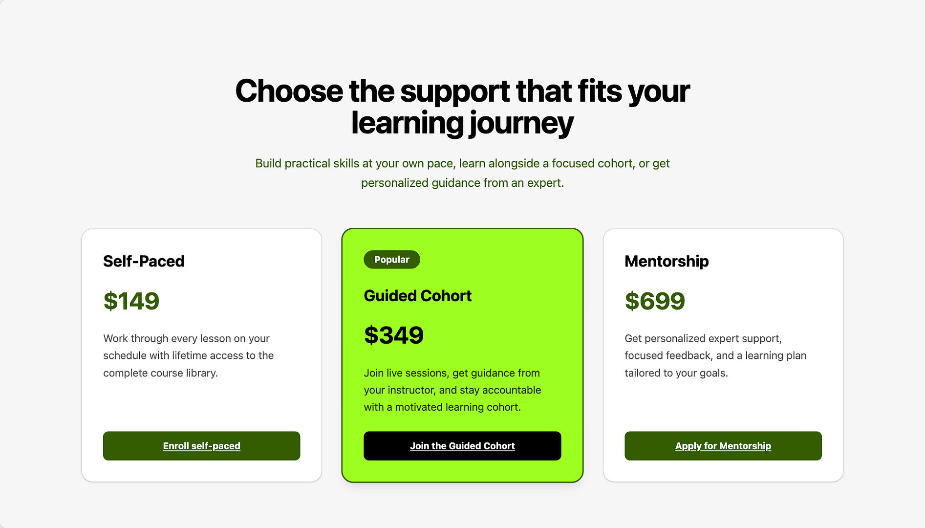
- The Pricing Table: A prompt detailing an online course with three tiers ($149 self-paced, $349 guided cohort, $699 mentorship) and a designated "popular" middle tier returned a fully functional pricing grid. The system highlighted the recommended plan in the theme’s accent color, added a "Popular" badge, and authored complementary feature lists.
- The Size Guide: Conversely, a prompt requesting a shirt measurement table for five sizes resulted in a compressed three-row table that grouped medium, large, and extra-large sizes together. This misstep highlighted the necessity of explicit structural instructions when dealing with matrix data.
6. Hero Section Stress-Tests: The Dentist and the Plumber
The final trials focused on high-stakes hero sections designed to capture immediate user attention.
- The Family Dentist: A prompt for a Bristol-based dental practice catering to nervous patients yielded a compliant layout with dual call-to-action buttons. However, the accompanying image defaulted to a clinical, anxiety-inducing close-up of dental instruments rather than a reassuring, patient-focused photograph.
- The Emergency Plumber: The final prompt prioritized utility: a dominant phone number, a 24-hour availability statement, and a request for a residential night-time van image. While the typographic layout achieved perfection by making the phone number the undisputed focal point, the image engine generated a daytime photograph on an open road instead of a nocturnal urban service call.
Supporting Data: Summary of Single-Prompt Outcomes
| Test Section | Prompt Type | Layout Quality | Content Quality | Asset/Image Accuracy | Usable Out-of-the-Box? |
|---|---|---|---|---|---|
| 1. Testimonials | Basic / Structural | Excellent | Generic / Filler | N/A | Layout Only |
| 2. Founder’s Letter | Narrative / Opinion | Excellent | Exceptional | N/A | Yes (Fully Usable) |
| 3. Copywriter Fit | Contrast / Binary | Very Good | Strong | N/A | Minor Edits Needed |
| 4. Restaurant Notice | Informational | Good | Engaging | N/A | Yes (Fully Usable) |
| 5. Course Pricing | Data / Hierarchical | Excellent | Professional | N/A | Yes (Fully Usable) |
| 6. Shirt Size Guide | Tabular Data | Fair | Accurate Data | N/A | Requires Restructuring |
| 7. Dental Hero | Promotional Hero | Excellent | Reassuring | Poor (Clinical) | Requires Image Swap |
| 8. Plumber Hero | Utility Hero | Outstanding | Precise | Poor (Daytime) | Requires Image Swap |
Official Insights: The Anatomy of a Successful Prompt
Synthesizing the results across all nine experiments highlights a definitive underlying pattern. The discrepancy between a mediocre generation and an exceptional one rests entirely on the quality of input provided by the creator.

When developers feed the AI bare minimum parameters, the system defaults to generic layouts and placeholder text. When developers supply substance—specific facts, distinct points of view, and explicit priority hierarchies—the AI functions as a high-level design assistant.
To maximize the efficiency of tools like the Otter Section Generator, practitioners should adhere to three core principles:
- Define the Hierarchy: Explicitly state which element must dominate the visual hierarchy (e.g., placing phone numbers or primary pricing tiers front and center).
- Inject Point of View: Avoid bland generalities. Providing specific opinions, stances, or brand personalities yields far more compelling copywriting.
- Specify Asset Context: Explicitly guide the visual imagery requirements to match the emotional tone of the copy (e.g., specifying calm human interactions rather than clinical machinery).
Implications for Web Professionals
The widespread adoption of AI block generators does not signal the obsolescence of human web designers; rather, it shifts their role from manual layout execution to editorial curation.

As demonstrated by this transparent, single-shot test, Otter Blocks successfully shoulders the heavy lifting of structural composition, spacing, responsive padding, and typographic hierarchy. However, the human element remains completely indispensable for brand alignment, factual accuracy, custom photography sourcing, and authentic storytelling.
Crucially, because sections generated via Otter are built using native WordPress blocks, developers are never locked into a proprietary framework. If a first-pass generation delivers an exceptional layout accompanied by subpar copy or an ill-fitting stock image, the editor retains total freedom to tweak, refine, and polish the components within seconds.
For WordPress creators seeking to accelerate their workflow without sacrificing control, embracing transparent AI generation tools offers a pragmatic path forward—provided users remember that AI is designed to build the skeleton, while human insight provides the soul.