







In the world of corporate communication, academic lecturing, and startup pitching, the visual component of your presentation is often just as critical as the narrative itself. While many presenters obsess over slide layouts, color palettes, and high-resolution imagery, the choice of typeface is frequently relegated to an afterthought. Yet, typography acts as the silent voice of your presentation. It dictates the tone, ensures legibility, and establishes a sense of professionalism before a single word is spoken.
Choosing the right font for your PowerPoint slideshow is arguably the most vital decision in the design phase. If your typeface is illegible or poorly matched to your subject matter, your audience’s focus will shift from your message to the struggle of deciphering it. To help you navigate the vast sea of design options, we have curated a comprehensive collection of the best fonts for PowerPoint, ranging from sleek, modern sans-serifs to sophisticated, authoritative serifs.
The Professional Necessity of Custom Typography
When building a slide deck, the path of least resistance is often the default font library pre-installed on your operating system. While these fonts are functional, they rarely convey the unique identity or professional polish required for a high-stakes presentation. A custom, thoughtfully selected font serves as a branding tool, signaling to your audience that you have invested time and care into the quality of your content.
Whether you are designing a high-pressure startup pitch deck, a complex business report, or an engaging educational lecture, your font choice influences perception. A unique, well-weighted font not only creates a cohesive visual identity but also serves a functional role in guiding the eye, creating hierarchy, and ensuring that your key points resonate with clarity.
A Curated Collection: Top-Tier Fonts for Every Presentation
To ensure your next slideshow is a success, consider the following selection of premium and free typefaces, each offering unique strengths for various presentation styles.
The Versatile Powerhouses
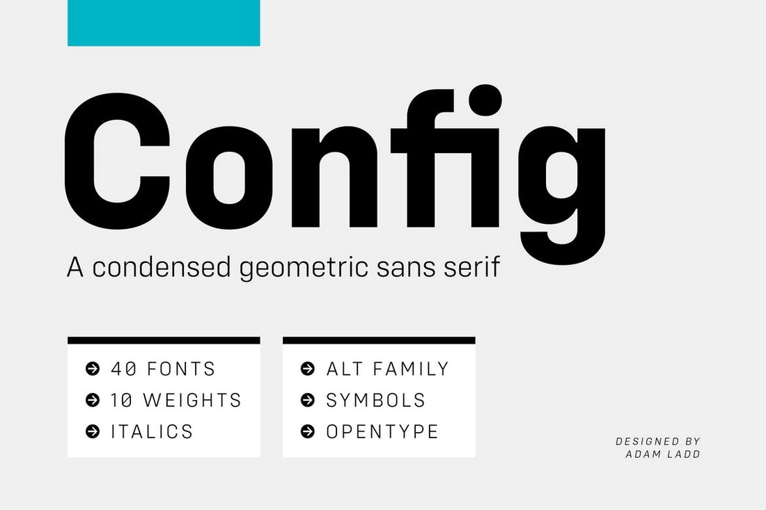
- Config (Complete Font Family): With 40 fonts across 8 styles and 10 weights, this is the ultimate toolkit for the professional designer. Its vast versatility ensures it can handle any project, from dense data tables to bold, impactful headers.
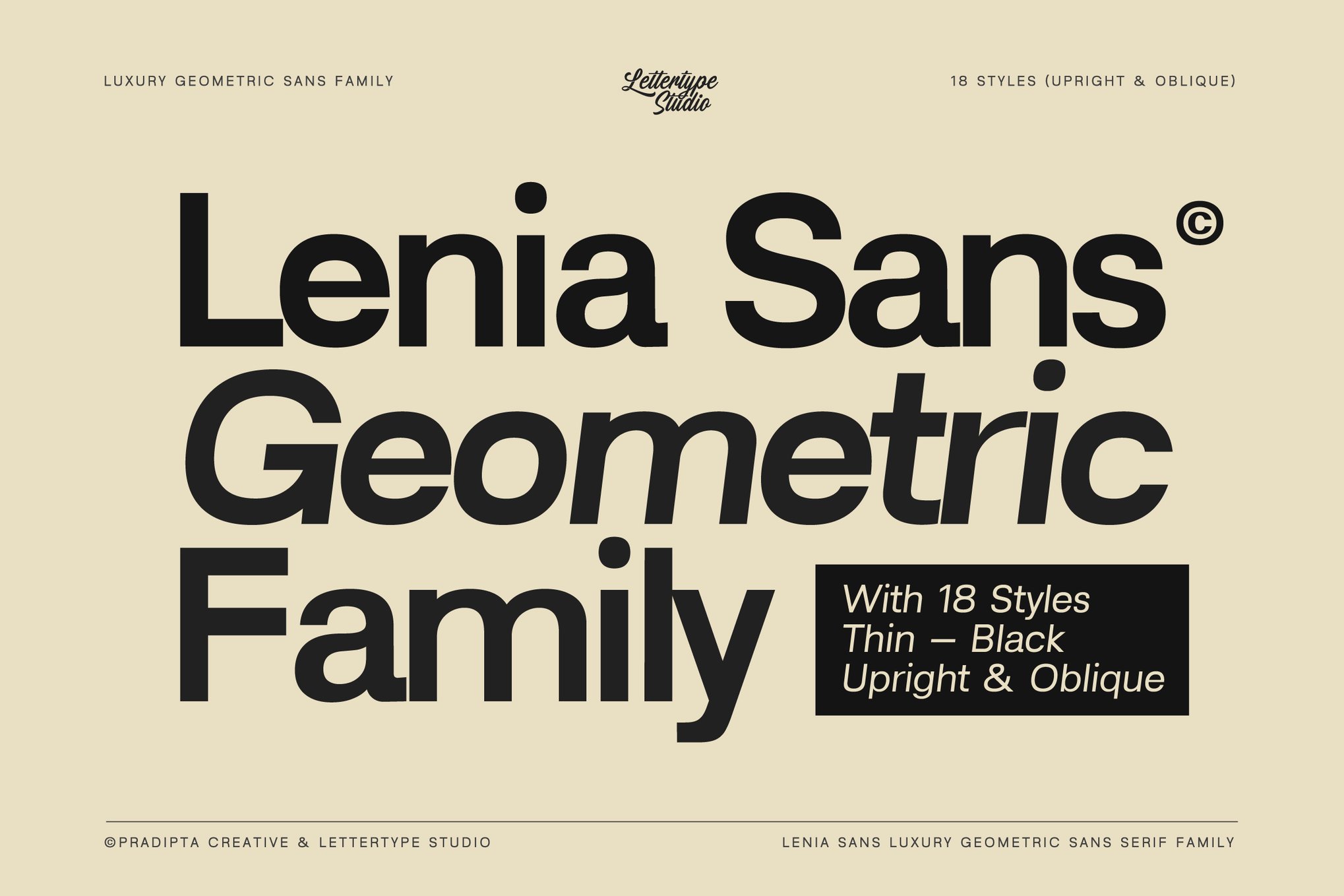
- Lenia Sans: A geometric sans-serif that balances modern aesthetics with extreme clarity. Featuring 484 glyphs and support for over 270 languages, it is the gold standard for global, multi-lingual business communication.
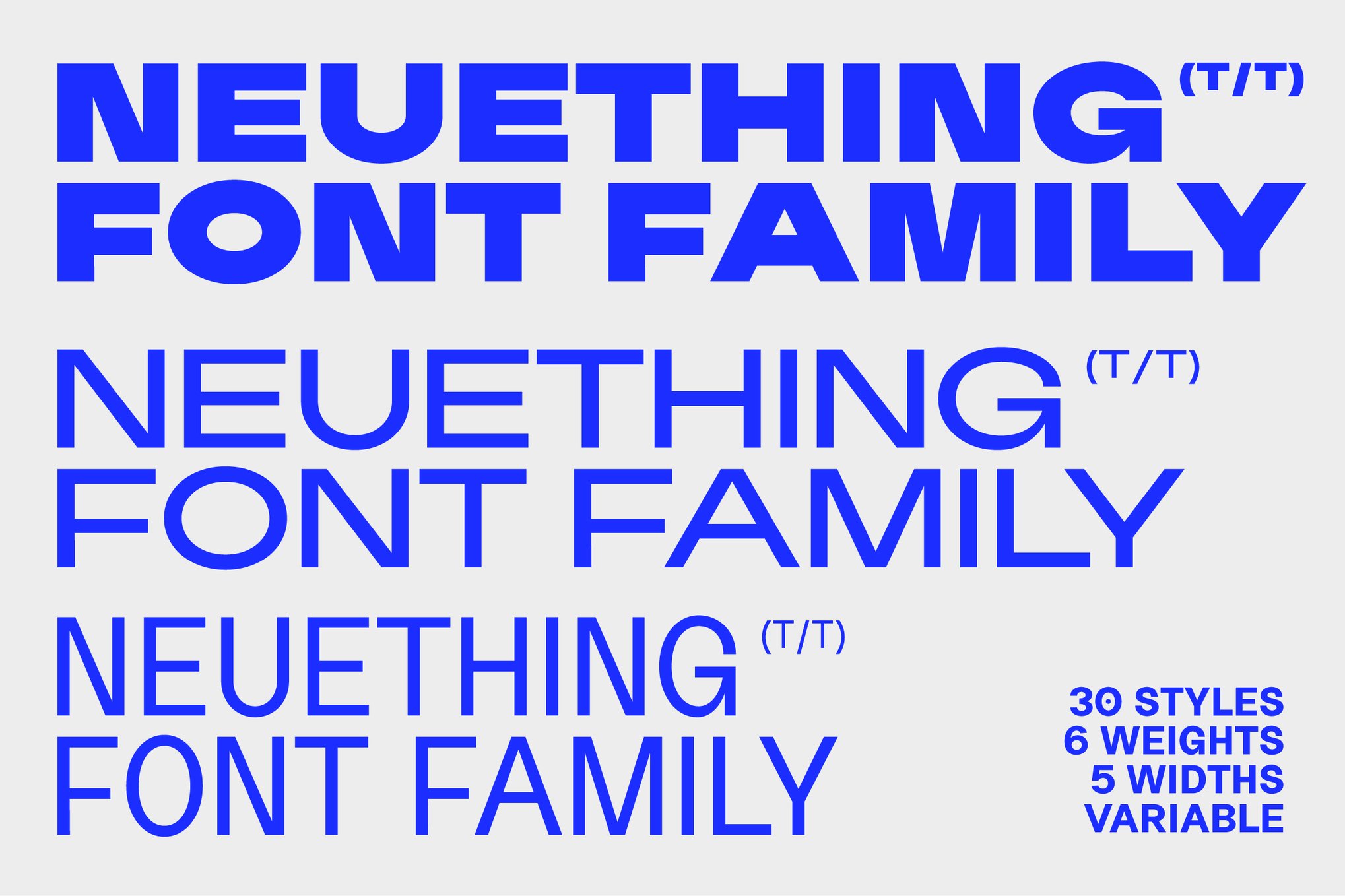
- Neuething: Offering 30 unique styles, this font is a masterclass in flexibility. Its modern, retro-sign-painter vibe is perfect for those looking to bridge the gap between classic design and contemporary, punchy headlines.
Bold and Impactful Display Fonts
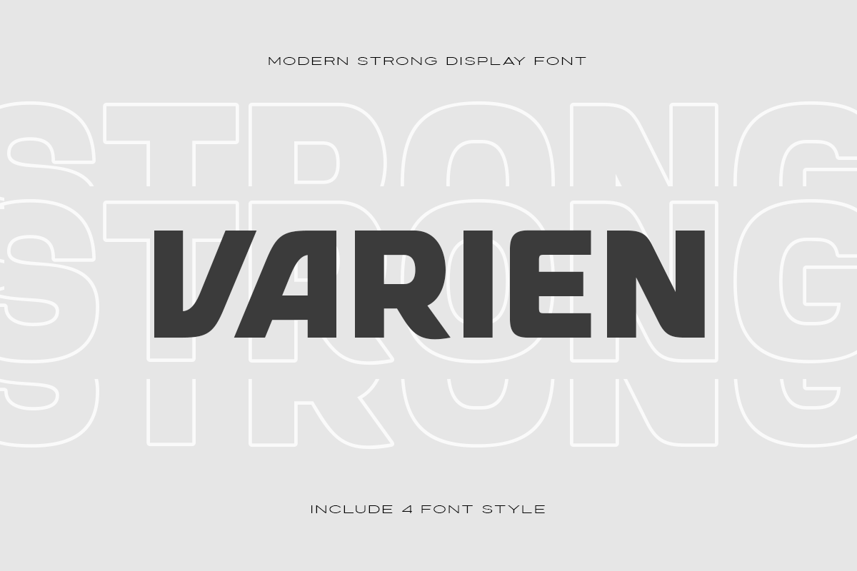
- VARIEN: When you need your text to command attention, VARIEN’s strong, display-oriented design is the answer. It is particularly effective for tech-focused or high-energy sports and action-themed presentations.
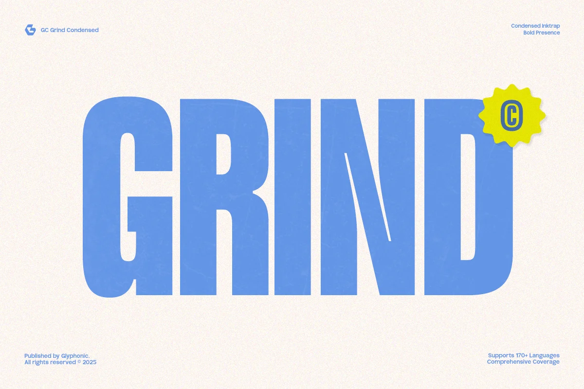
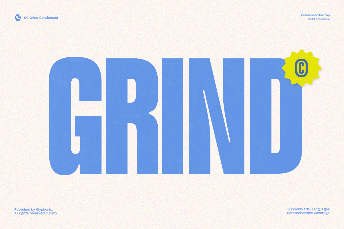
- Grind: Characterized by sharp edges and tight spacing, Grind exudes strength. It is an ideal choice for urban-themed branding and high-impact headers.
- Brightons: This bold family of 16 fonts allows for consistent, powerful titling that keeps the audience anchored to your main point.
Elegance and Luxury
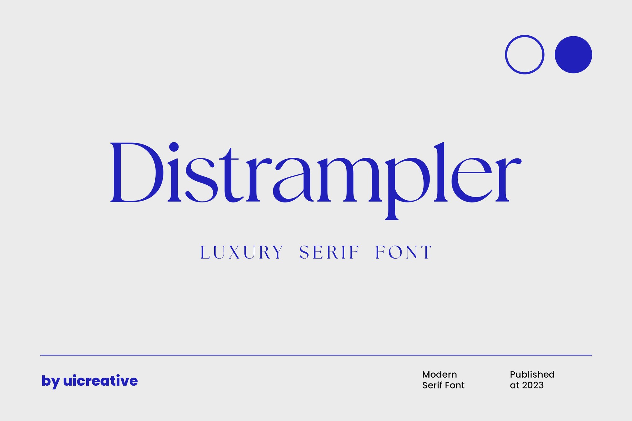
- Distrampler: For those in the fashion, wedding, or luxury goods sector, Distrampler offers a sophisticated serif aesthetic that adds a layer of refinement to any slide.
- Miracle World: Designed specifically for luxury brands, this font includes stylistic ligatures that elevate simple titles into works of art.
- Addington CF: A classic, formal serif family, Addington is the go-to for corporate reports that require a traditional, authoritative look.
Playful and Creative Options
- Apple Juice: A lighthearted, fun font that works wonders for educational or children-focused content.
- Jungle East: If your presentation requires a touch of whimsy, this quirky, all-caps font adds personality without sacrificing legibility.
- Handcraft Chalk: For a workshop or educational environment, this chalk-style font provides a familiar, organic feel that encourages engagement.
Strategic Tips for Choosing Your Presentation Font
Selecting the right font is only half the battle; how you implement it is just as important. Follow these four professional guidelines to ensure your design remains effective throughout your presentation.
1. Prioritize Readability Above All
The environment in which you present determines the legibility requirements of your font. A presentation delivered in a massive conference hall requires larger, cleaner sans-serif fonts to ensure that the back row can follow along with ease. Conversely, a small-scale, intimate team meeting allows for more stylistic flexibility, though clarity should always be the priority. Always test your font size from the back of the room before committing to a design.
2. The Two-Font Rule
Consistency is the hallmark of a professional. Using more than two fonts creates visual clutter and dilutes your brand identity. The industry standard is to pair one high-impact font for your headings and a highly legible, clean sans-serif for your body text. Mixing too many typefaces creates an amateurish, chaotic aesthetic that distracts from the content.
3. Maintain Stylistic Consistency
Never change your fonts from slide to slide. A unified visual language is essential for audience retention. If you use a specific font for your titles on the first slide, it must remain the same for the entirety of the deck. Furthermore, avoid "font-hopping" to highlight different sections; instead, use weight (bold vs. regular) or color to create distinction.
4. The Pitfalls of All-Caps
While all-caps text can be visually striking, it is notoriously difficult to read in paragraph form. Reserve all-caps strictly for short, impactful titles or headers. For body text, stick to standard sentence case to ensure that your audience can process the information quickly and comfortably.
The Implications of Professional Typography
In the modern landscape, where digital communication is constant, the visual quality of your presentation speaks to your attention to detail. A well-designed, readable presentation suggests that the presenter is organized, professional, and respects the audience’s time. Conversely, a poorly formatted presentation—using clashing fonts, unreadable scripts, or inconsistent sizes—can subtly signal a lack of preparation or professional polish.
By choosing from the curated, professional-grade fonts mentioned above and adhering to the core tenets of typographic hierarchy, you can transform your PowerPoint from a basic visual aid into a persuasive, memorable, and professional communication tool. Your audience may not always consciously notice the font you have chosen, but they will certainly feel the difference in the clarity and authority of your presentation.
Final Recommendations for Your Workflow
When downloading these fonts, ensure you check for licensing requirements, particularly if you are working on commercial or corporate projects. Many of the free options listed here, such as Manrope and Vistol, offer excellent, high-quality, and royalty-free alternatives that do not compromise on design quality.

Ultimately, your goal is to let the font do the heavy lifting of conveying tone, while your content does the work of conveying information. Choose wisely, keep it consistent, and prioritize the comfort of your audience. By mastering these basics, you ensure that your message is not just seen, but clearly understood and remembered.