





Every imagined future—from the sterile, oppressive corridors of a totalitarian state to the neon-drenched, decaying alleys of a cyberpunk metropolis—possesses a distinct visual DNA. While set design and color palettes are vital, the most visceral shorthand for a dystopian world is its typography. The right typeface does not merely present information; it dictates the atmosphere, signaling to the viewer that the world they are observing is fractured, industrial, and inherently unstable.
In contemporary design, the "dystopian aesthetic" has become a powerful tool for visual storytelling. By employing angular structures, glitch-inspired imperfections, and aggressive, industrial weight, designers can evoke chaos and tension before a single word is read. This article explores the evolution of this typographic style and provides a curated guide to the typefaces currently defining the genre.
The Anatomy of Dystopian Design
The visual language of dystopia is rooted in the subversion of traditional legibility. In a world where communication is controlled, fragmented, or rendered obsolete by technological decay, the font itself becomes a narrative device.
Key characteristics of this design movement include:
- Angular Geometries: Sharp, aggressive corners that suggest a lack of human touch and a prioritization of cold, mechanical efficiency.
- Glitch and Distortion: Intentional "errors" in the letterforms that mimic data corruption or the breakdown of digital infrastructure.
- Industrial Minimalism: A stripped-back, brutalist approach that favors bold, heavy weights over decorative flourishes, mirroring the harsh realities of a crumbling society.
- High-Contrast Utility: Whether meant for clandestine resistance posters or state-mandated propaganda, these fonts are designed to be read under duress—at high speed, in low light, or on flickering screens.
A Curated Selection: Premium Dystopian Typefaces
For designers looking to immerse their audience in a dark future, the following fonts represent the pinnacle of modern, high-impact dystopian typography.
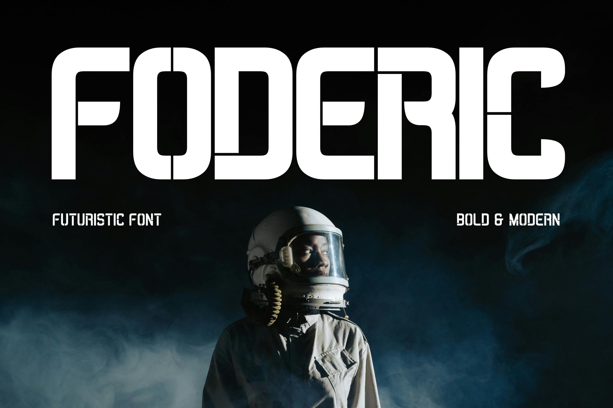
1. Foderic: The Versatile Futurist
Foderic is a masterclass in multifunctional design. It captures the essence of "edgy" without sacrificing the utility required for complex layouts. With a full suite of Latin characters, numbers, and symbols, it is a go-to choice for those working in cyberpunk branding or experimental media. Its weight is significant enough to command authority in headers, yet it remains readable for shorter body copy.
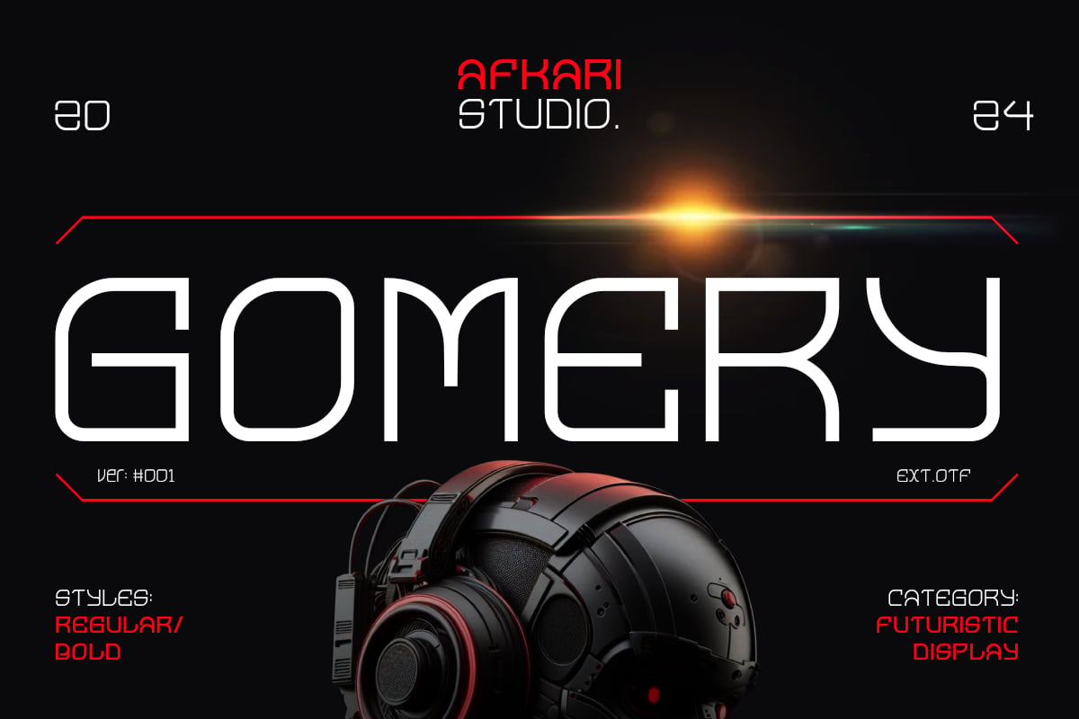
2. Gomery: Geometric Sophistication
Gomery stands apart by blending strict geometric foundations with surprising, fluid curves. This contrast gives it a "modern-futuristic" aesthetic that feels less like a ruin and more like a sleek, high-tech interface. Its inclusion of unique ligatures and alternates allows for a highly customized look, making it perfect for UI design and forward-thinking tech branding.
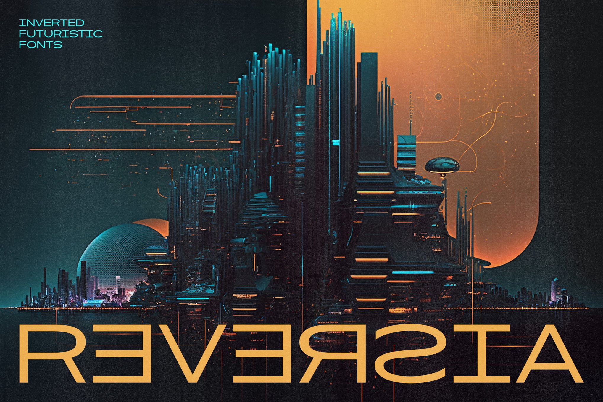
3. Reversia: Challenging Tradition
For those seeking to break the mold, Reversia offers an expanded, bold approach to typography. It is unapologetically brave, designed for creators who want to subvert traditional typographic conventions. Its expanded width makes it an excellent choice for advertising and large-format printing where a "loud" visual presence is required.
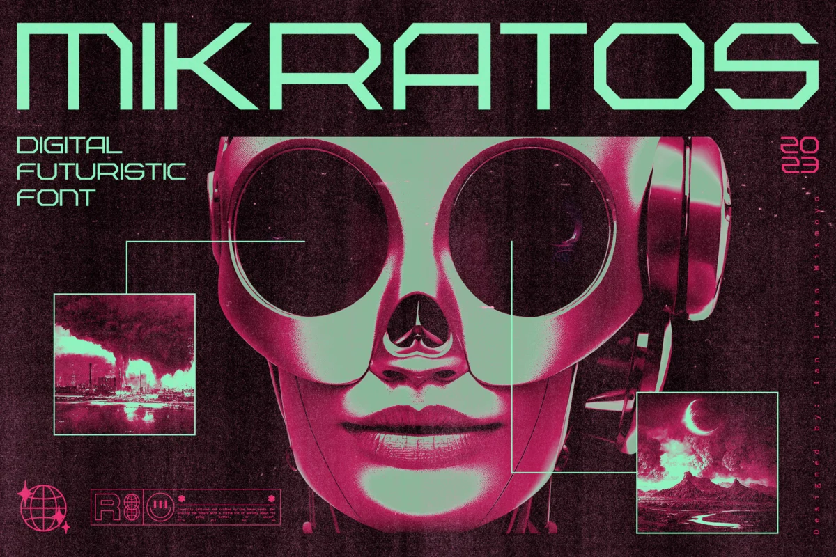
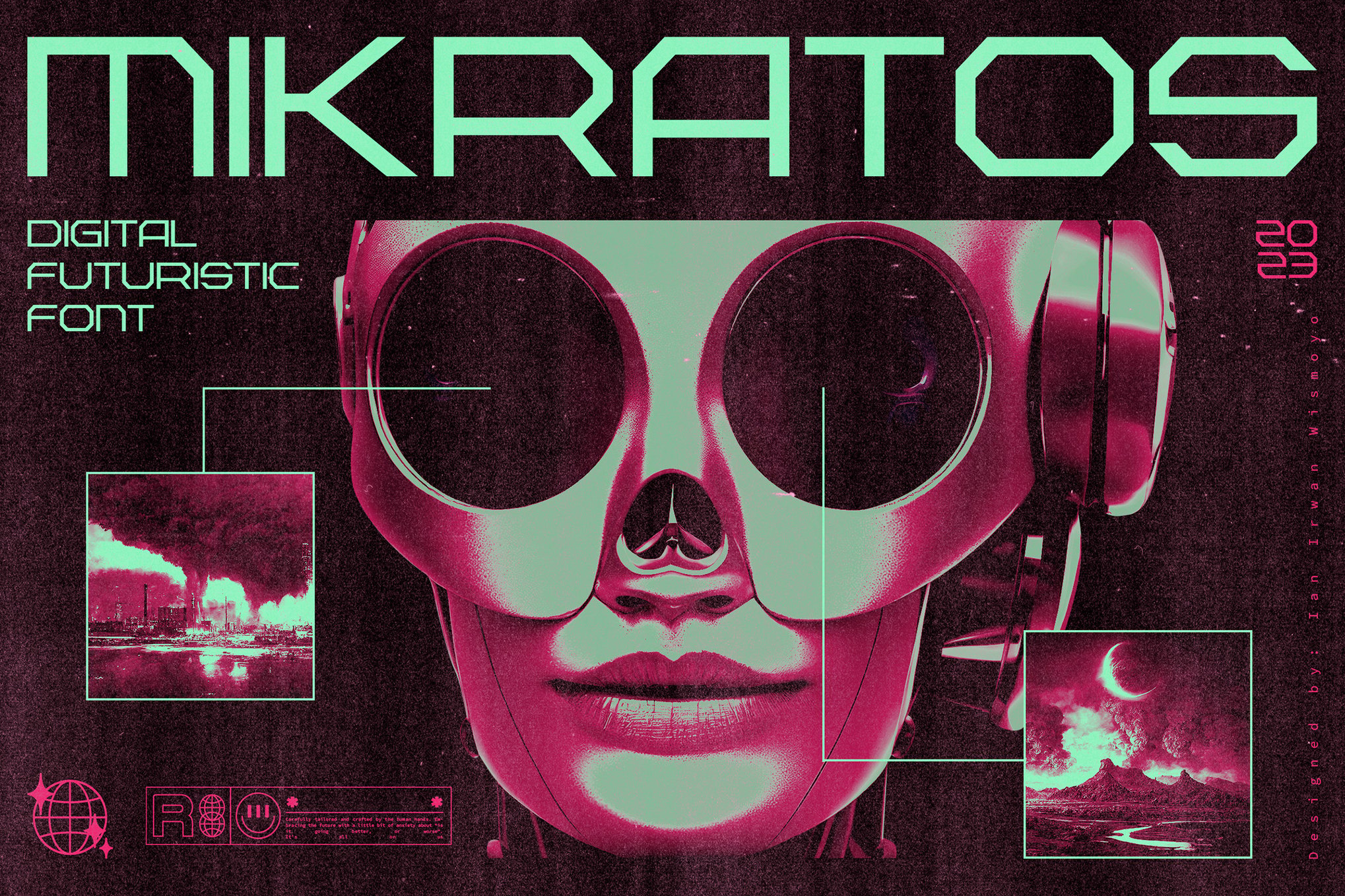
4. Mikratos: The Retro-Digital Hybrid
Bridging the gap between the aesthetic of 1980s sci-fi interfaces and contemporary digital trends, Mikratos is the ultimate choice for gaming and music-focused projects. It echoes the low-resolution charm of early arcade games while retaining the sharpness of modern design, making it an ideal candidate for album art, merchandise, and digital content.
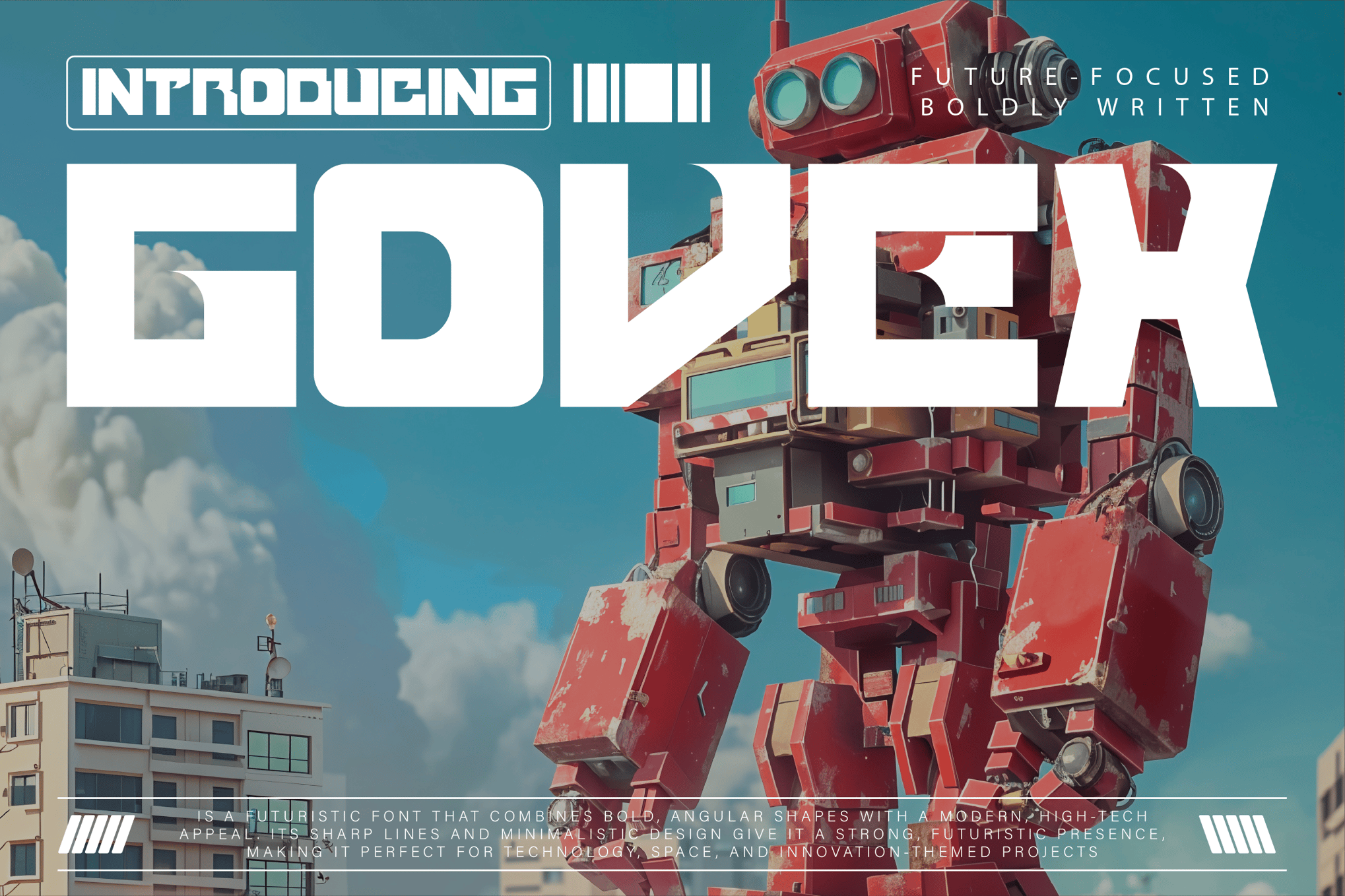
5. Govex: Industrial Minimalism
Govex is defined by its sharp, angular shapes and a high-tech, minimalist sensibility. It feels like the typeface one might find on a colony ship or a restricted research facility. By offering multiple formats, including WOFF and WOFF2, it is a practical, future-proof asset for web designers and developers.
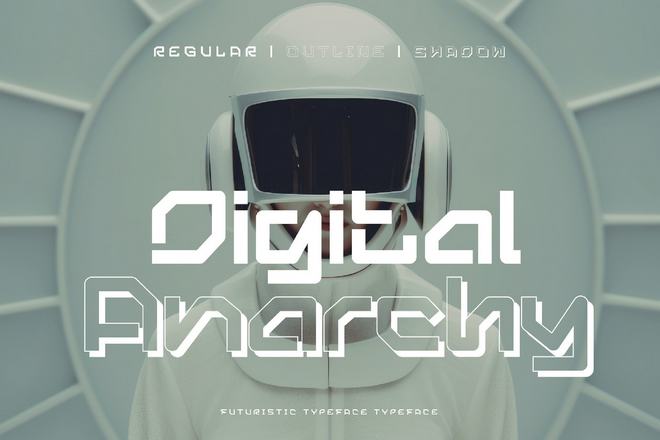
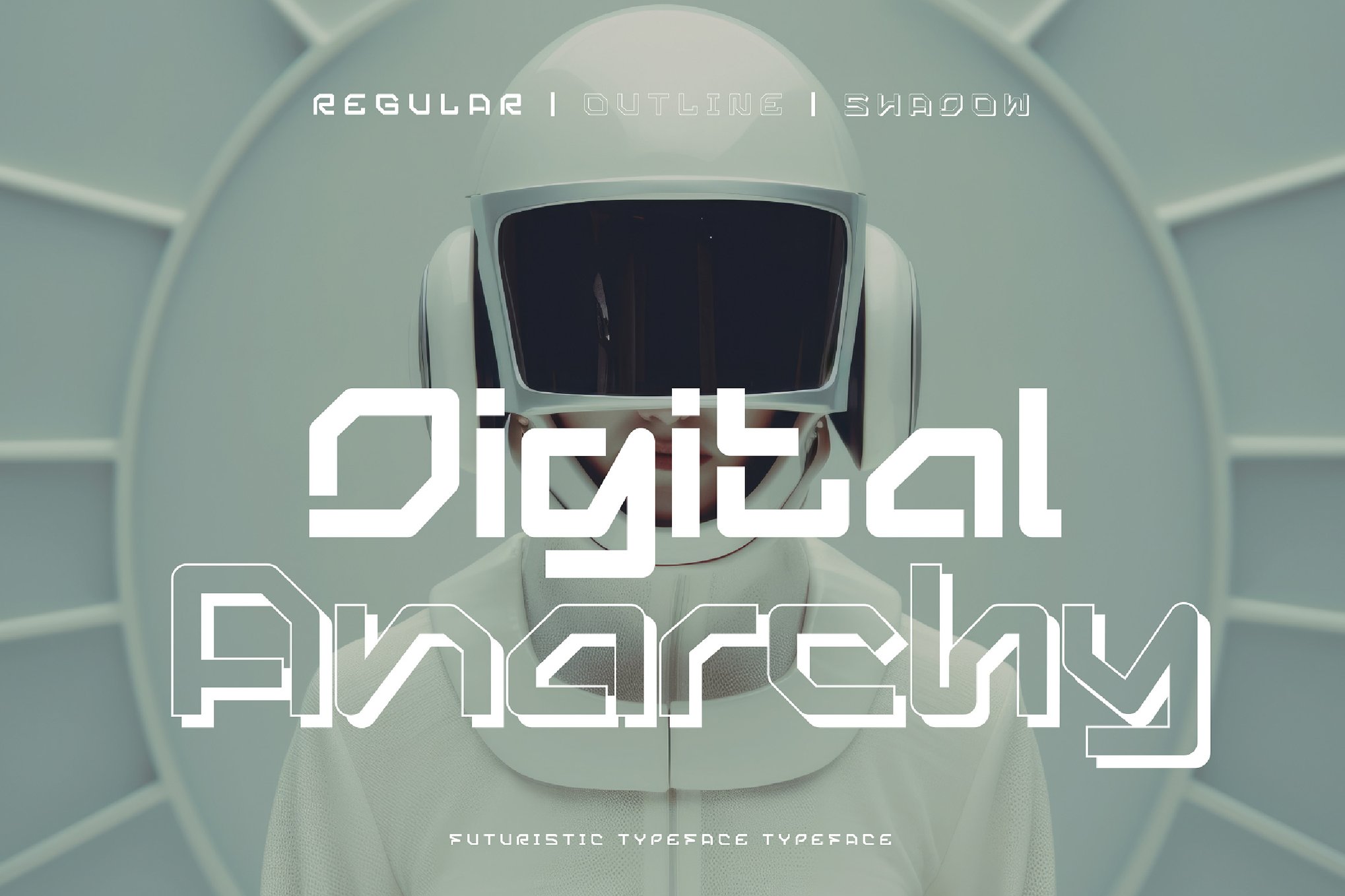
6. Digital Anarchy: The Essence of Dissent
As the name suggests, Digital Anarchy is a typeface that screams. With razor-sharp edges and an aggressive posture, it is perfectly suited for visual statements. It is not a font for subtle storytelling; it is a font for the front lines of a digital revolution.
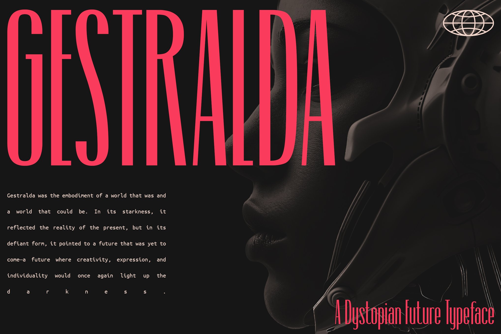
7. Gestralda: Compact Power
When screen real estate is limited, Gestralda thrives. It is designed to pack significant visual impact into compact spaces. Its roots in classic sci-fi film typography make it a favorite for esports branding and, increasingly, for digital content creators who need a logo that looks professional yet ominous.
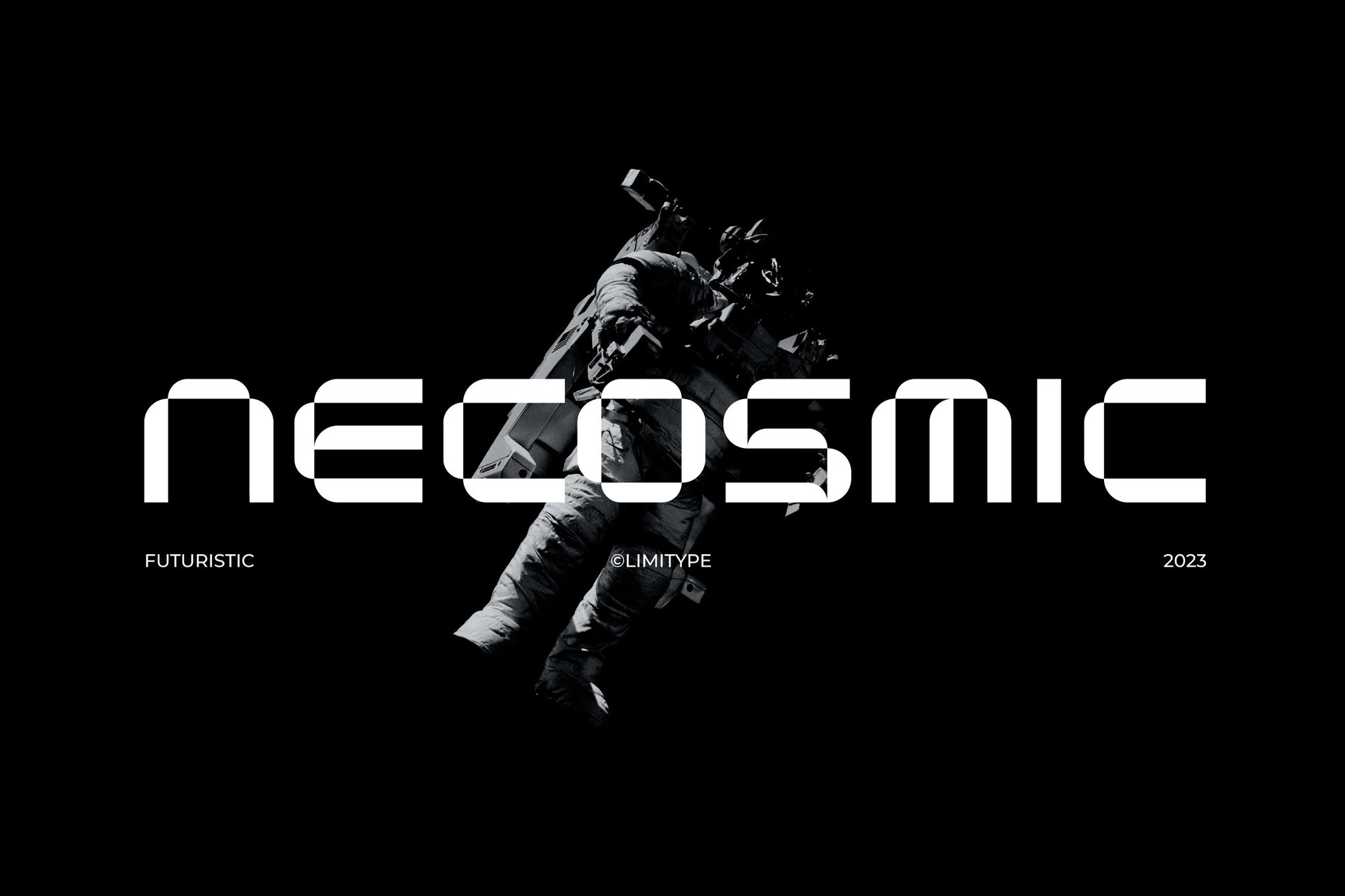
8. Necosmic: The Outer-Space Aesthetic
Necosmic captures the cold, expansive nature of space. It is sophisticated, clean, and highly legible, making it an excellent choice for projects centered on innovation, AI, or futuristic technology. Its multilingual capabilities ensure it can be deployed in a global context, reinforcing the "universal" nature of its futuristic look.
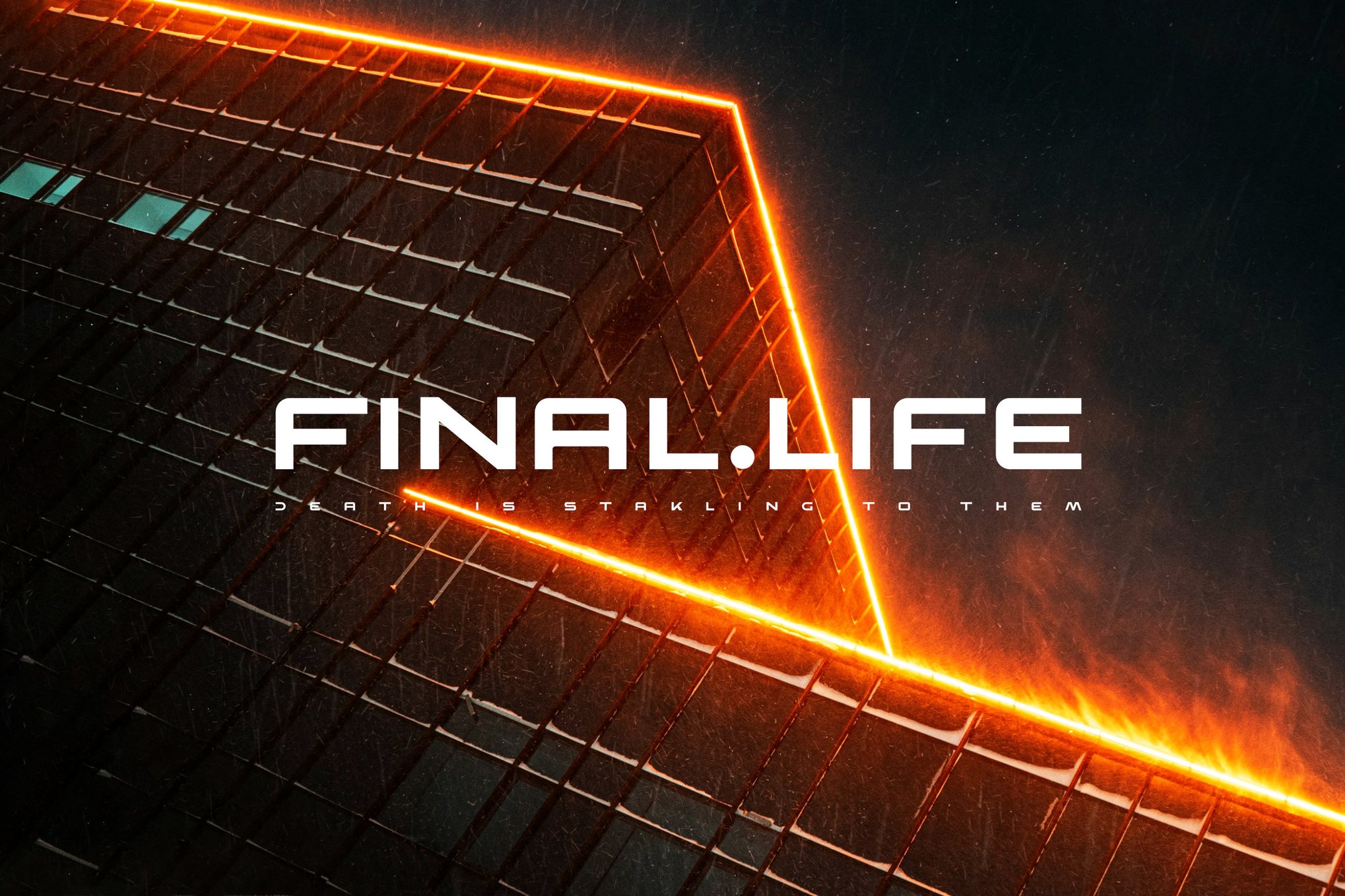
9. BERGAN: The Cyberpunk Standard
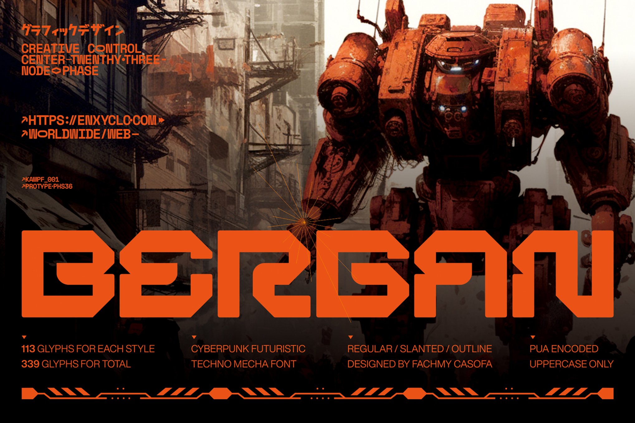
BERGAN is a powerhouse in the cyberpunk sub-genre. By providing three distinct styles—Regular, Outline, and Slant—it offers a level of typographic flexibility that few other fonts in this category match. Whether you are designing a robotic interface or a neon-soaked title card, the 113 glyphs per style provide all the necessary tools.
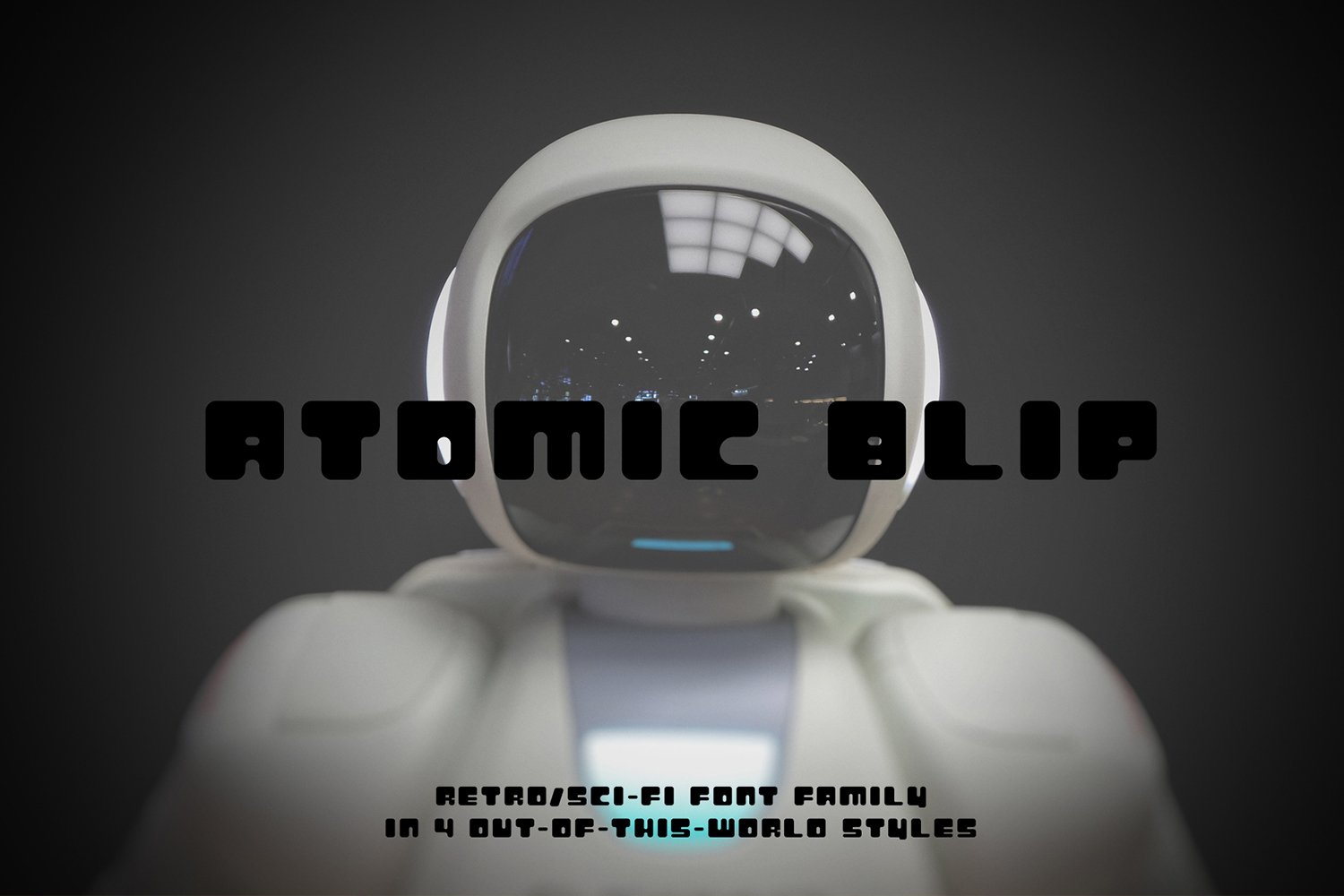
10. Zaiden & Digitron Futures
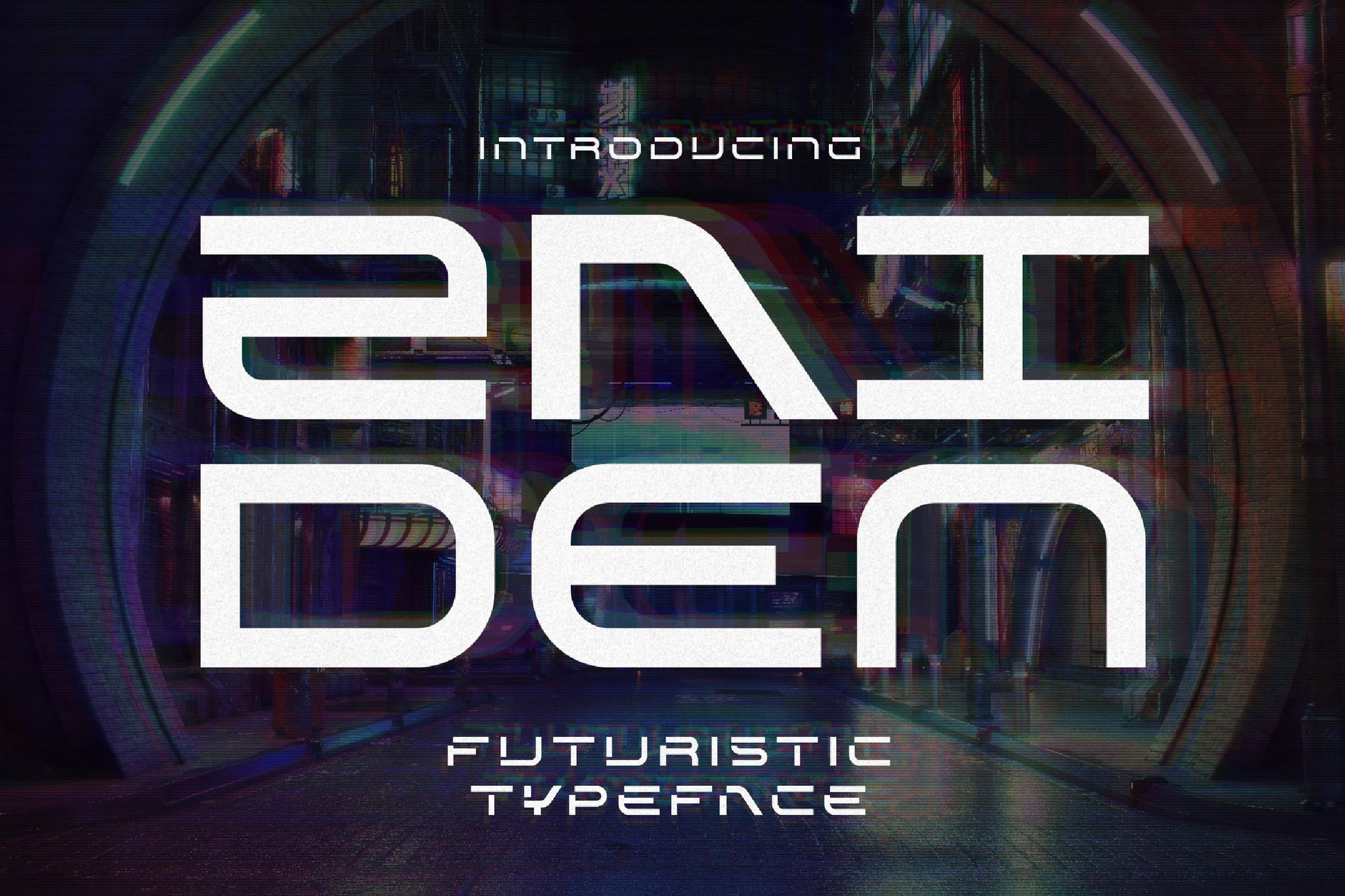
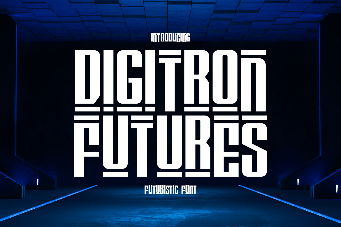
Zaiden excels in the "display" category, leveraging an all-caps, minimalist aesthetic that works beautifully for packaging and book covers. Similarly, Digitron Futures leans into a "tech-first" design, using meticulous geometric lines to create a sense of high-impact authority. Both are essential for those looking to simulate the UI of a dystopian control system.
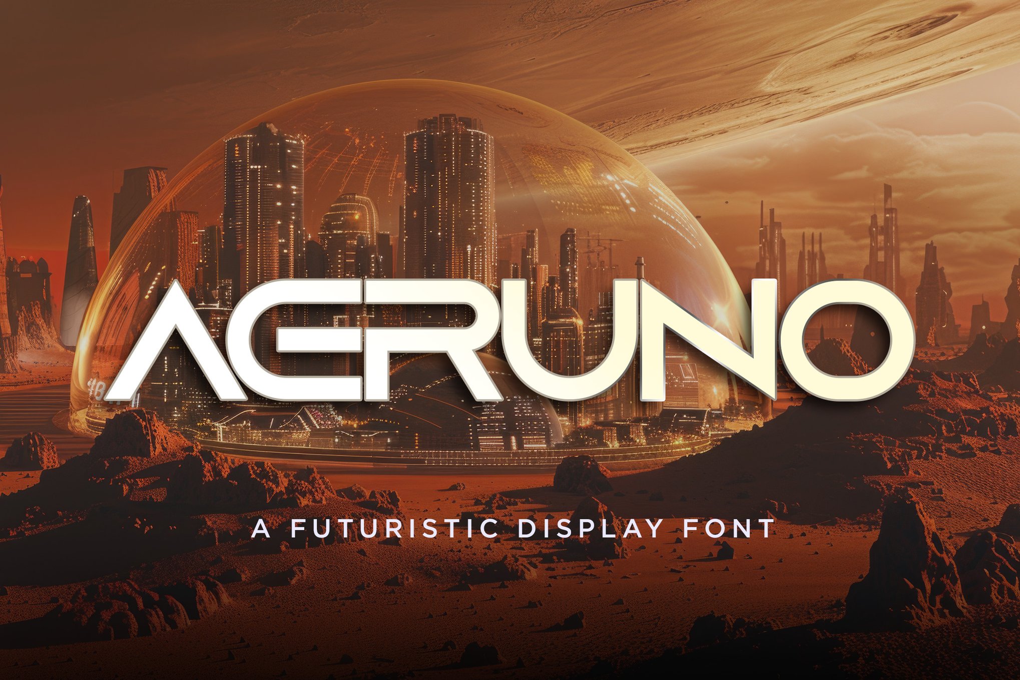
11. Fear Robot & Atomic Blip
Fear Robot brings a gritty, tactile quality to the digital space, while Atomic Blip provides a "retro-futuristic" flair. The latter’s inclusion of four distinct styles (rounded, square, dashed, and outlined) makes it a versatile toolkit for designers who want to maintain a cohesive look across various design elements.
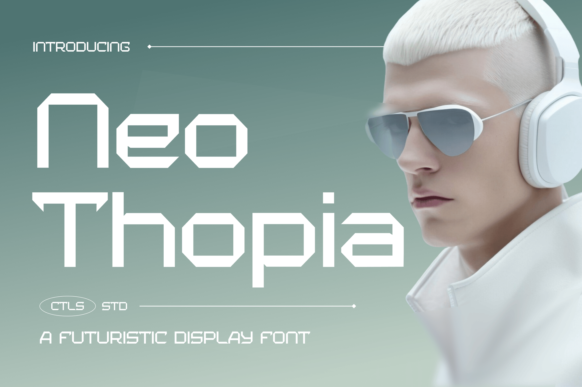
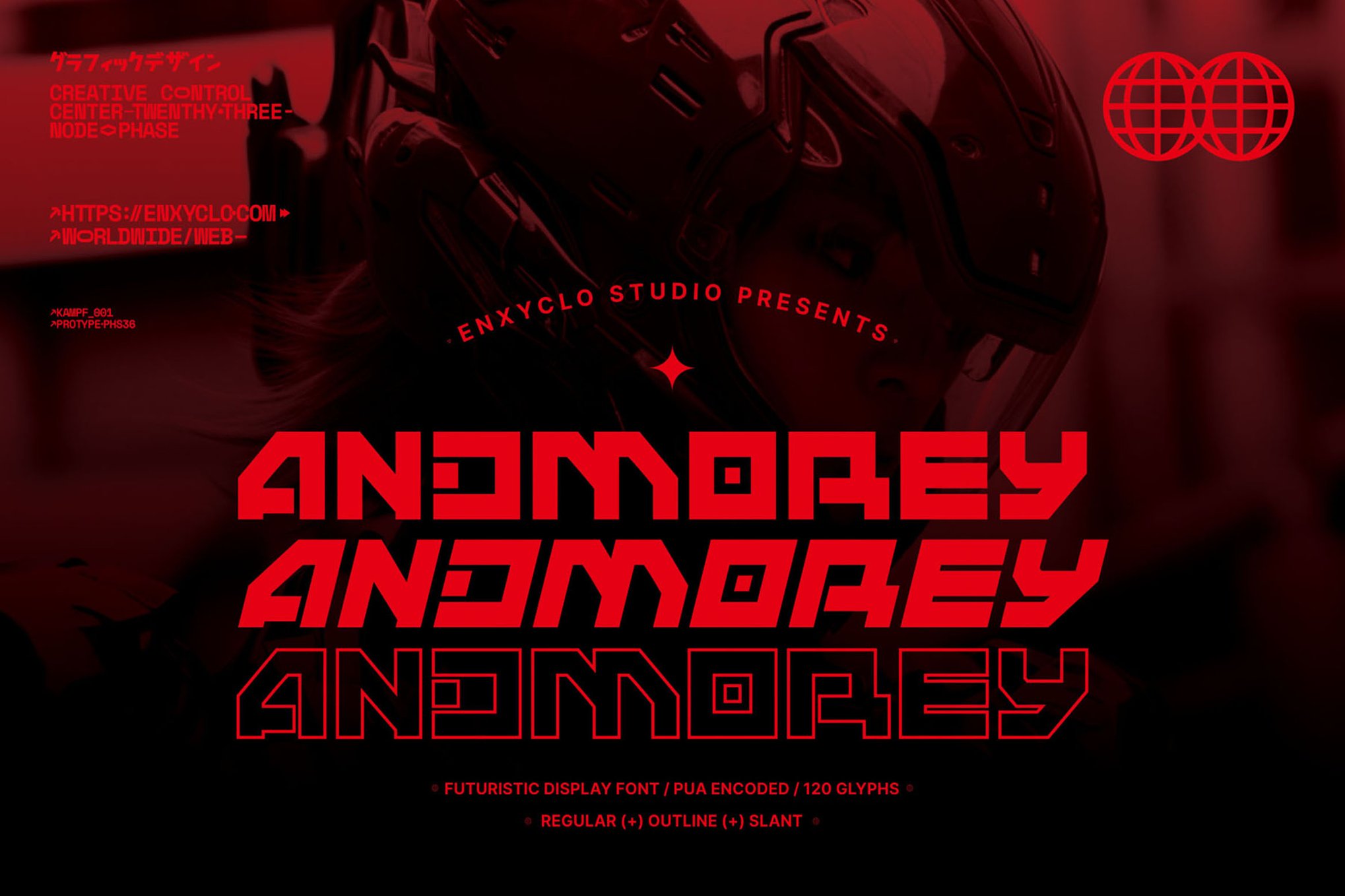
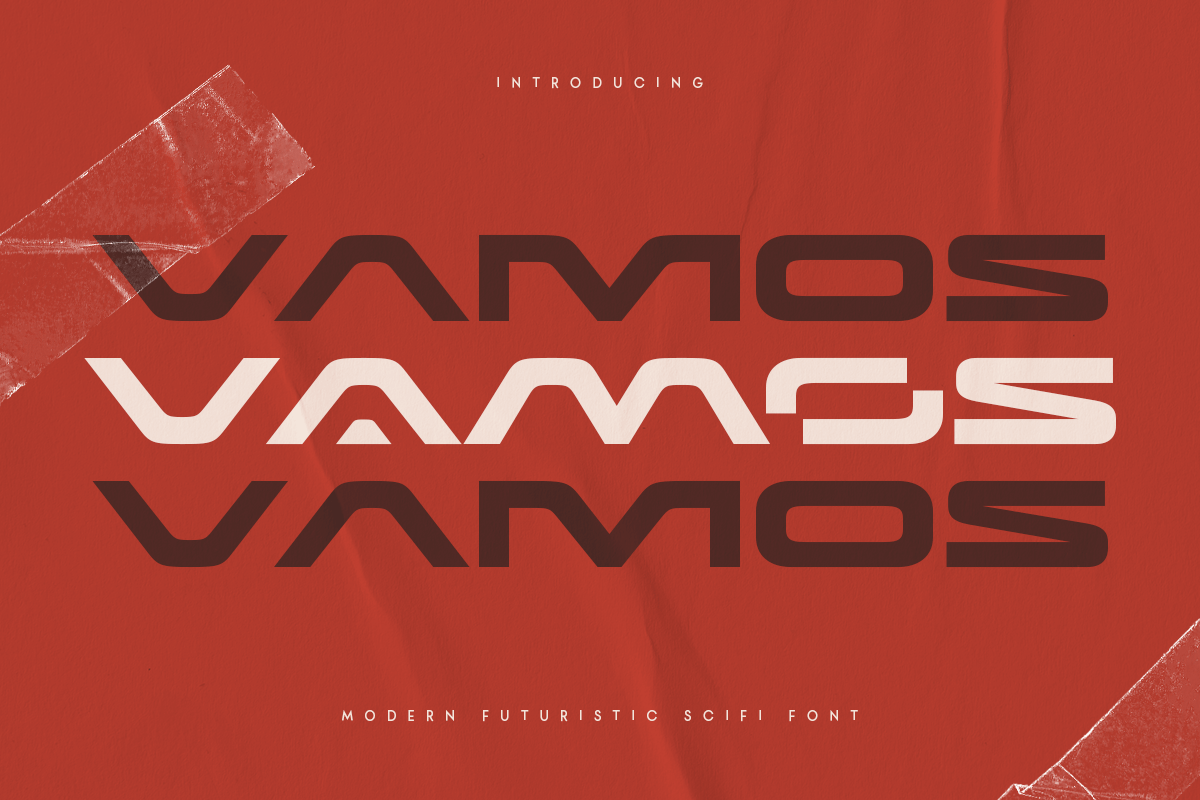
12. Aeruno, Neothopia, Andmorey, and VAMOS
These four fonts round out the premium list by offering distinct flavors of dystopian design. Aeruno is perfect for large, bold posters; Neothopia brings a modern, clean edge; Andmorey provides a massive 360-glyph set for ultimate customization; and VAMOS delivers a punchy, all-caps style that is tailor-made for film-themed headlines and crypto-branding.
The "Free" Frontier: Accessible Dystopian Type
While premium fonts offer specialized features, the open-source and personal-use-free community has produced some of the most iconic dystopian fonts to date.
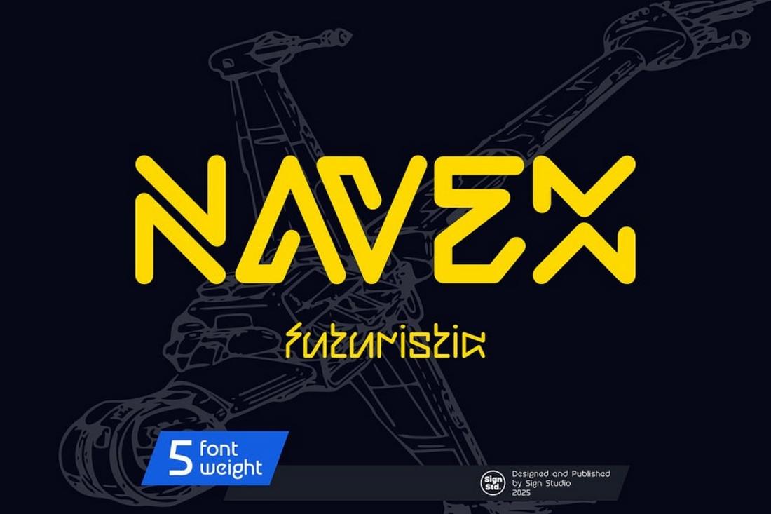
- Navex: Offers a cold, mechanical aesthetic that is perfect for posters.
- Death Craft: For those who need a truly "desolate" or post-apocalyptic feel, this font’s rugged edges are unmatched.
- Cybloc: A masterclass in utilitarian, tech-heavy geometry.
- Qwenser: A bold, heavy-weight display font that demands attention, ideal for headers that need to feel both strong and unstable.
Implications for Future Branding
The rise of these typefaces is not merely a passing trend; it is a reflection of how we view our own future. As technology becomes more integrated into our daily lives, and as the challenges of the 21st century—from climate change to algorithmic governance—become more pronounced, the "dystopian" style has moved from the fringes of sci-fi cinema to the mainstream of corporate and digital branding.
Designers are increasingly using these fonts to signal "authenticity" in a digital world. By choosing a typeface that feels slightly "broken" or "industrial," brands are attempting to create a human connection, acknowledging the chaos of the modern world rather than hiding it behind the sterile, overly-perfect sans-serifs that defined the early 2010s.
Conclusion: Crafting the New World
The visual language of the future is not a monolith; it is a diverse array of shapes, lines, and textures that tell the story of where we are going. Whether you choose the sharp, aggressive lines of Digital Anarchy or the retro-future charm of Atomic Blip, your choice of font is the first step in building a world that your audience will not just see, but feel.
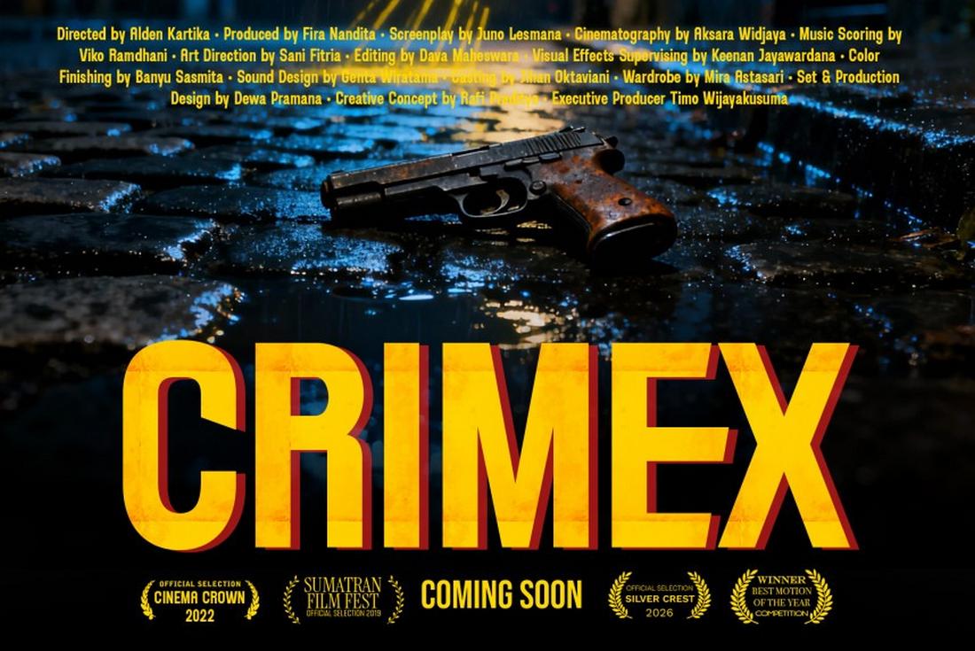
As you curate your next project, consider the emotional weight of your typography. In a world of infinite choices, the most memorable designs are those that commit fully to their atmosphere—embracing the grit, the decay, and the electric hum of a world on the edge of tomorrow.