








The evolution of web design has consistently trended toward more sophisticated, dynamic, and responsive layouts. With the release of Divi 5, Elegant Themes has introduced a powerful suite of tools designed to democratize advanced CSS Grid capabilities. At the heart of this innovation lies the Grid Offset Editor, a visual interface that allows designers to manipulate grid placements, spans, and repeating patterns without writing a single line of custom code.
By providing a visual bridge between backend configuration and frontend rendering, the Grid Offset Editor transforms how developers approach complex responsive architecture. This guide explores the mechanics, implications, and strategic application of these tools in modern web development.
The Core Mechanics of Grid Offset Rules
At its most fundamental level, Grid Offset Rules in Divi 5 dictate how individual elements—or groups of elements—occupy space within a container. In a standard grid, child elements follow an "automatic placement" flow, filling cells row-by-row in the order they appear in the Document Object Model (DOM).
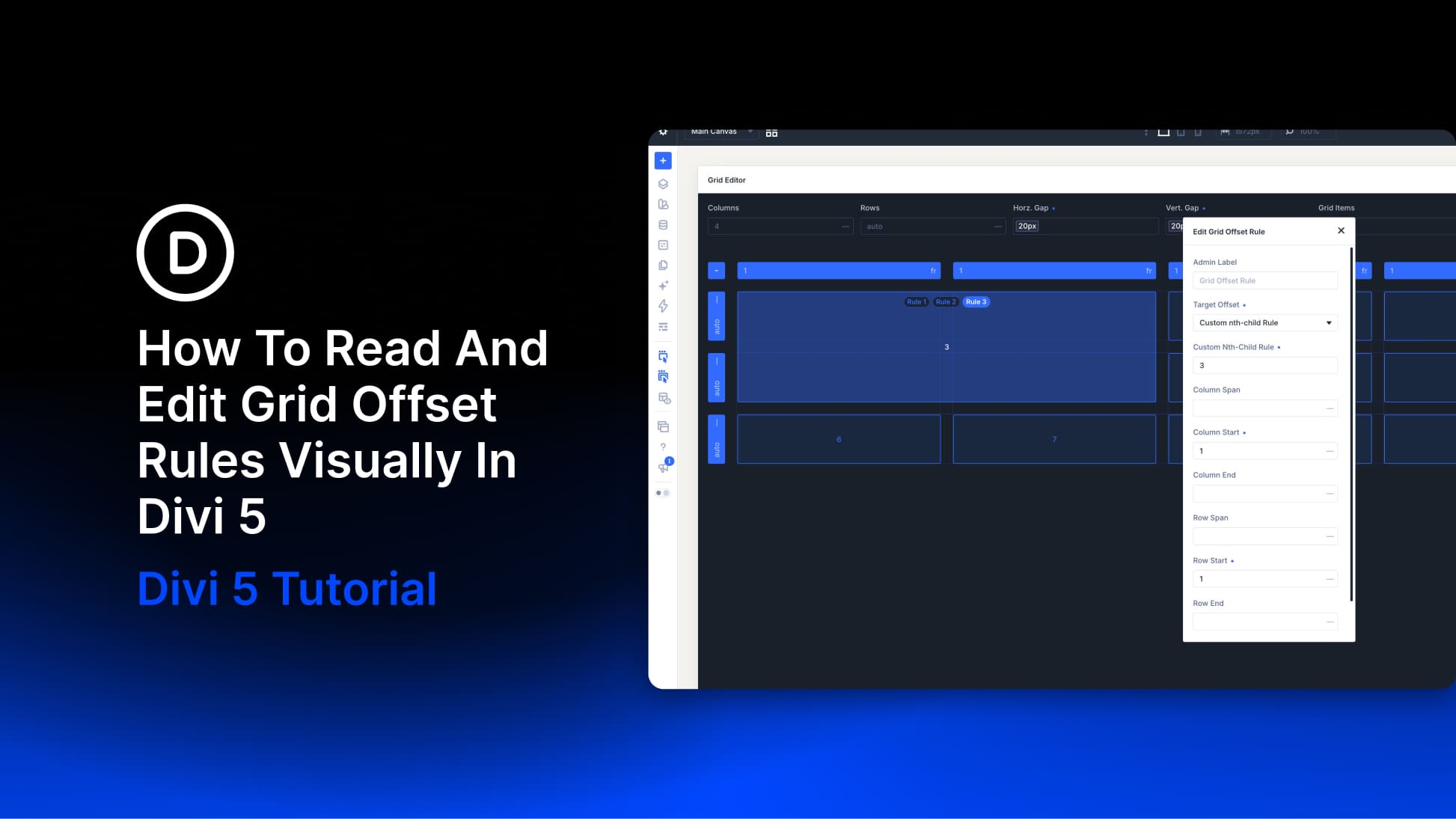
When a designer applies a Grid Offset Rule, they are effectively overriding this default behavior. These rules allow for the creation of featured cards that span multiple columns, promotional banners that stretch across rows, or complex, repeating patterns that persist even as dynamic content (such as a Loop) populates the grid.
The Architecture of a Rule
A rule is defined by two primary components: the Target and the Placement Values.
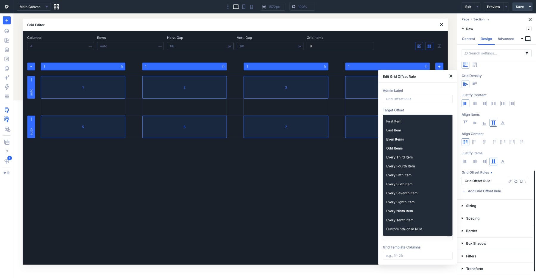
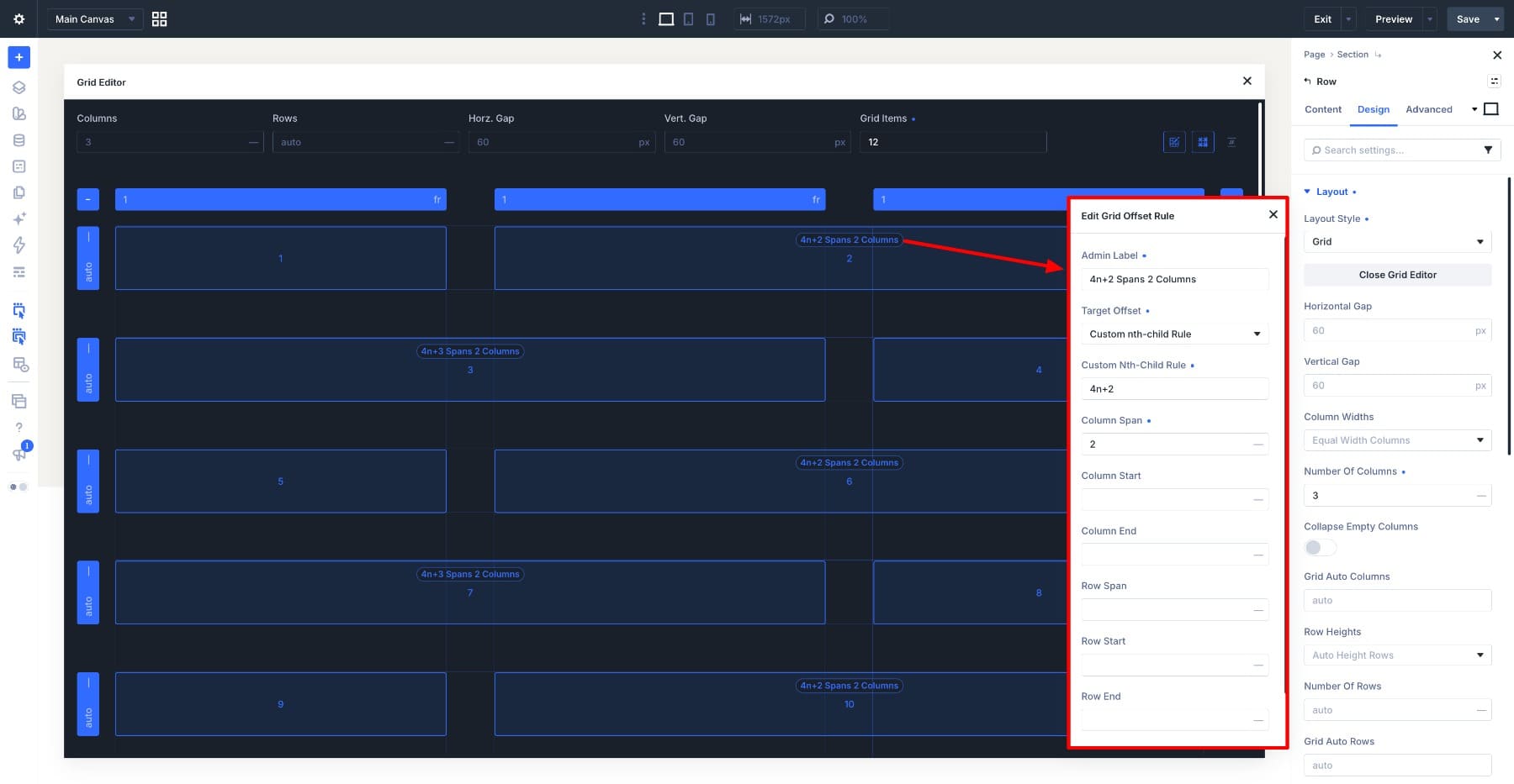
- The Target Offset: This dropdown menu defines which items the rule governs. Beyond standard options like "First Item" or "Last Item," users can select specific patterns such as "Even Items," "Odd Items," or repeating intervals like "Every Third Item." For highly granular control, the "Custom nth-child Rule" allows for advanced CSS-style targeting.
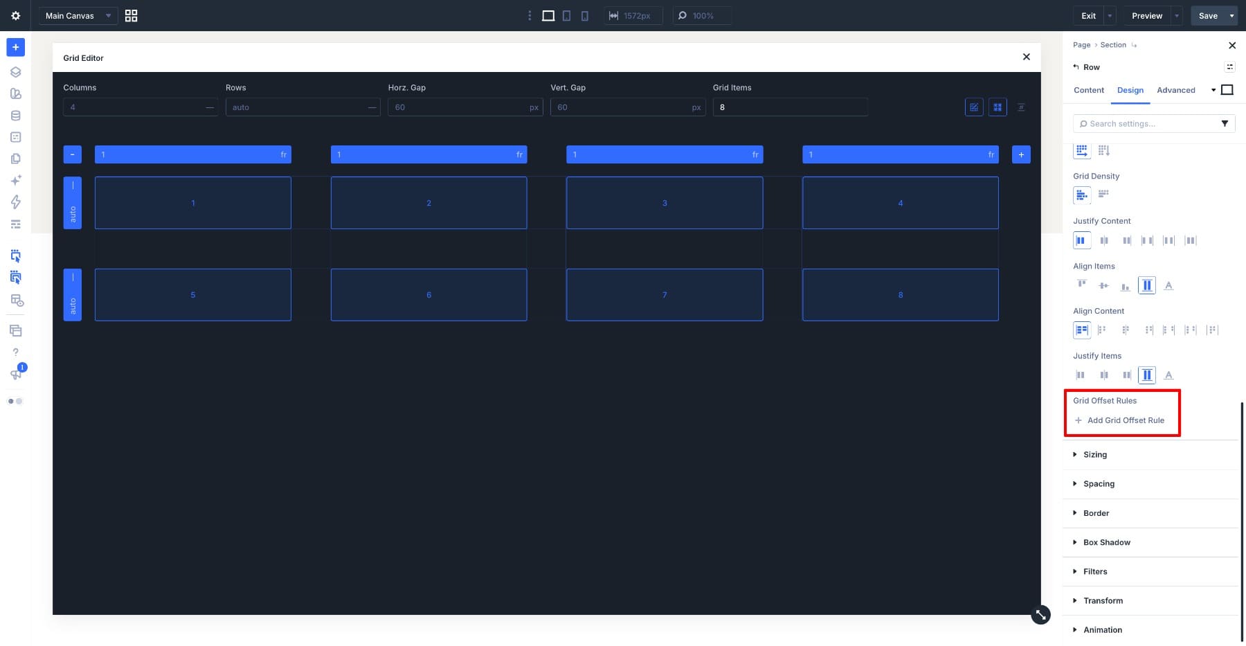
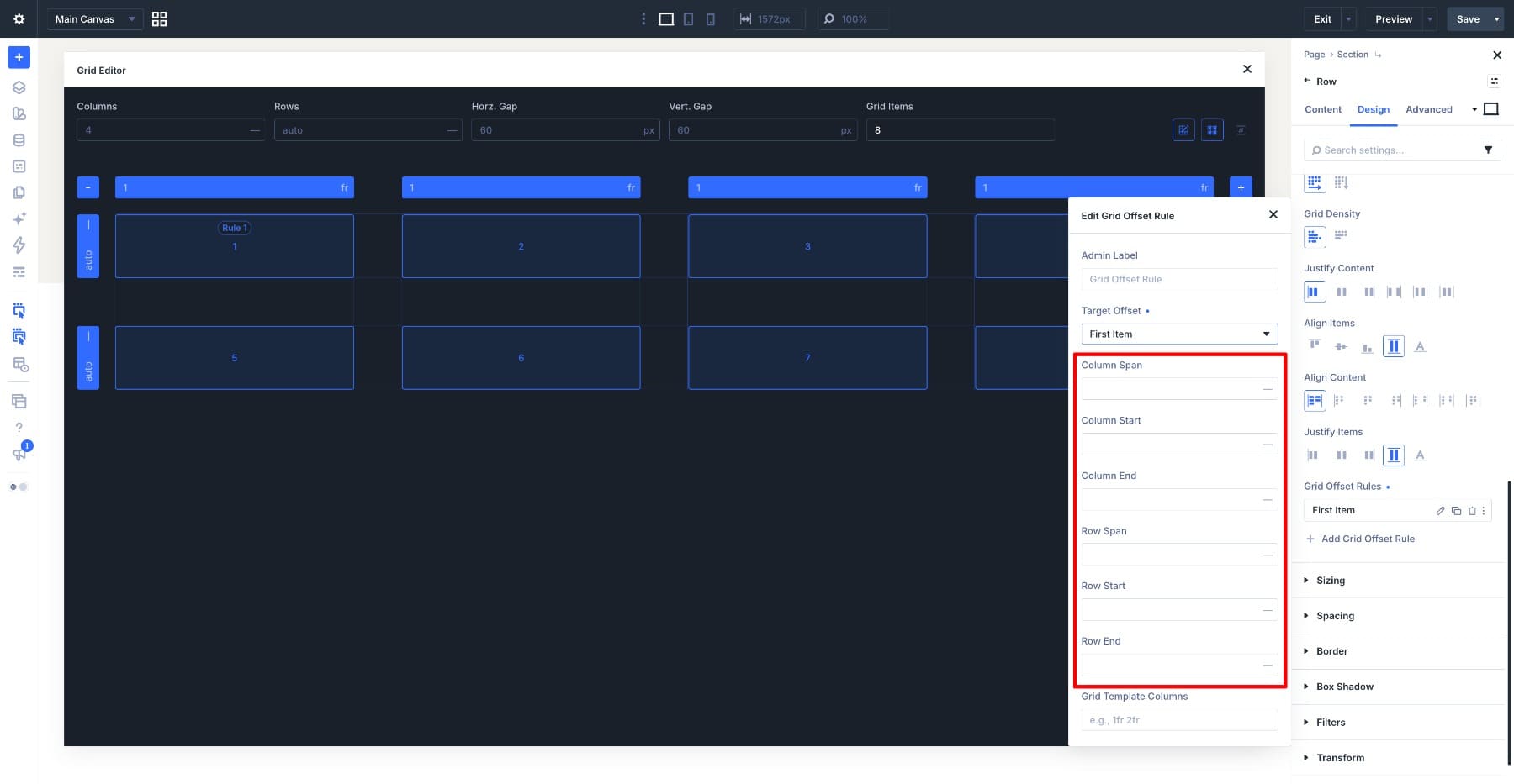
- Placement Values: Once a target is identified, the user dictates its physical presence. This involves setting the start/end lines for rows and columns and defining the span (the number of grid tracks an item occupies).
A Chronological Approach to Grid Configuration
To successfully implement these tools, developers should follow a systematic workflow that moves from structural planning to visual refinement.
Phase 1: Establishing the Foundation
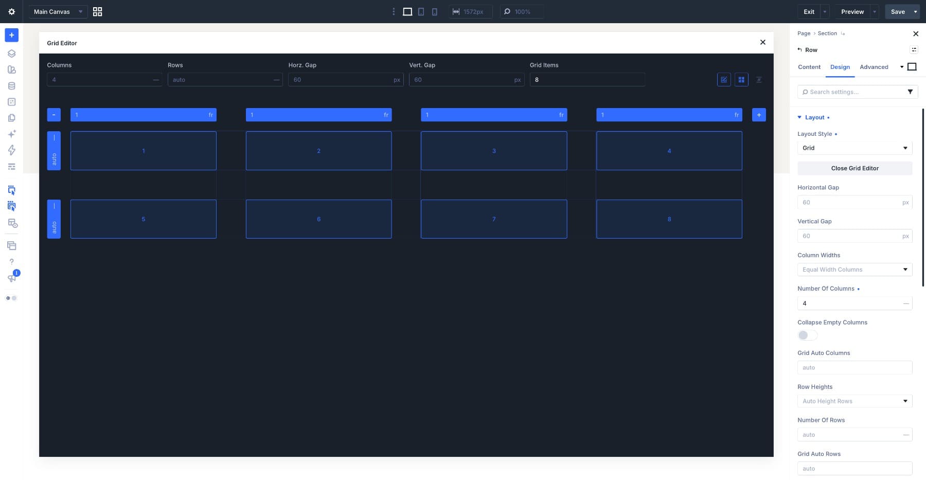
Before applying offset rules, the container must be set to "Grid" in the Layout settings. During this phase, it is best practice to utilize placeholder items. By increasing the "Grid Items" count in the settings panel, designers can visualize how a pattern will behave as more content is added, ensuring that the rules are scalable and robust.
Phase 2: Visual Editing with the Grid Editor
Once the container is established, the "Open Grid Editor" button acts as the primary workspace. The editor renders a real-time representation of the grid, including numbered items that correspond to their position in the source code. By dragging corner anchors on individual items, designers can visually define spans; the editor automatically translates these actions into the corresponding Grid Offset Rules, effectively "writing" the CSS for the user.
Phase 3: Iteration and Refinement
After the initial layout is set, the third phase involves testing the responsiveness of the rules. Using the breakpoint toggles (Desktop, Tablet, Phone), designers must ensure that spans that look elegant on a wide screen do not collapse or overlap on mobile devices. If a column span of two is appropriate for desktop, it may need to be adjusted to a single-cell span on mobile to prevent layout fragmentation.
Supporting Data and Responsive Logic
The efficacy of Divi 5’s Grid Editor lies in its ability to handle "source order" logic. A critical, often overlooked aspect of grid design is that rules count items based on their position in the source code, not their visual location.
For example, if an item in the second row is moved to the first row via a span, it remains the "nth" item in the source. Understanding this is vital for managing "Custom nth-child Rules." When content is dynamic—such as a blog post feed generated by a Loop—the rules apply to the position rather than the specific content. If you designate the 5th item to be a "Featured" wide card, that slot will always display a wide card, regardless of which post occupies that index in the loop.
The Role of Responsive Breakpoints
Data gathered from standard responsive testing confirms that grid disruption is most common when fixed column spans are inherited across breakpoints. Divi 5 mitigates this by allowing users to clear or override values at specific breakpoints.
- Desktop: High-density, multi-column layouts often require complex span rules.
- Tablet: Mid-range screens usually benefit from simplified spans to accommodate the reduced number of available grid tracks.
- Phone: In a single-column layout, nearly all span-based offset rules should be reset to a value of 1 to ensure content remains vertically stacked and readable.
Implications for Design and Development
The introduction of the Grid Offset Editor has significant implications for both professional web agencies and DIY site builders.
Enhanced Workflow Efficiency
Previously, achieving asymmetric grids required significant custom CSS, often involving media queries that were difficult to manage as site content grew. The visual editor reduces the "cognitive load" of grid management, allowing designers to see the relationship between their configuration and the finished page in real-time. This reduces the iteration cycle, allowing for faster prototyping and fewer "mystery bugs" related to CSS specificity or incorrect grid line math.
Design Versatility
By enabling repeating targets, the tool empowers users to create complex, magazine-style layouts—such as "Every 5th card spans two rows"—that were once the domain of highly custom, hand-coded themes. This flexibility allows for a more engaging user experience where content hierarchy is visually prioritized through varying card sizes and placements.
Maintaining Structural Integrity
One of the most important implications is the preservation of semantic structure. Because the Grid Editor handles the layout layer separately from the content layer, designers can reorganize the visual appearance of a page without altering the underlying document flow. This is essential for SEO and accessibility, as the logical source order remains intact for screen readers, even if the visual layout is non-linear.
Future-Proofing with Divi 5
As web standards continue to evolve, the integration of CSS Grid technology into visual page builders is no longer a luxury but a requirement. Elegant Themes’ approach with Divi 5 suggests a future where the gap between static design and dynamic, data-driven grids is bridged entirely through intuitive interfaces.
For developers looking to master this, the advice is simple: Start with the container. Treat the Grid Editor not just as a styling tool, but as a structural management system. By mastering the relationship between source order, target offsets, and responsive overrides, users can create websites that are not only visually striking but also performant and maintainable.
Whether building a portfolio, a news archive, or an e-commerce catalog, the Grid Offset Editor provides the necessary precision to ensure that every element sits exactly where it should, regardless of the screen size or the amount of content provided. This is the new standard for modern WordPress development: powerful, visual, and highly responsive.