







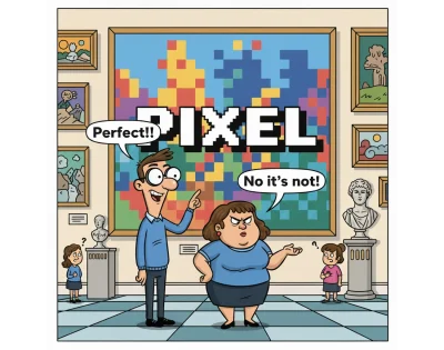
In the high-velocity technological landscape of 2026, the digital world has evolved into a hyper-fluid, multi-device ecosystem. We operate within sophisticated AI-enhanced workflows and leverage standards that were once considered science fiction. Yet, despite these leaps, a persistent, archaic ghost haunts the design-to-development pipeline: the concept of “Pixel Perfect” design.
As Amit Sheen argues in a recent industry critique, this legacy term—born from the static constraints of 20th-century print media—is no longer merely outdated; it is fundamentally counterproductive. In an era of foldable screens, spatial computing, and dynamic, responsive interfaces, the quest for a static, pixel-for-pixel match between a mockup and a browser is a structural failure that creates technical debt and stifles innovation. It is time to retire the term and redefine excellence through the lens of “design intent.”
A Brief History of a Rigid Mindset
To understand the tenacity of the “Pixel Perfect” myth, we must look to the late 1980s and 90s. During the infancy of desktop publishing, designers were trained on the physical realities of the printing press. In print, perfection is absolute: once ink hits paper, the layout is fixed in physical space.
When those designers migrated to the early web, they brought the “printed page” mentality with them. The goal was to force the browser to behave like a magazine. Developers of the era became masters of the “spacer GIF”—transparent 1×1 pixel images used to push elements into precise, rigid positions—and relied heavily on deeply nested HTML tables to maintain a static, 800×600 resolution layout.
This era established the dangerous precedent that a website was a finished, frozen artifact. While the medium has shifted from static monitors to responsive, adaptive surfaces, the vocabulary of the industry has remained trapped in this print-centric past.
The Chronology of Disruption
The resistance to this rigid mindset began almost as soon as it was established. The timeline of this shift highlights a growing divide between traditional print-based design and the realities of modern web standards:

- 2000: The Dao of Web Design: John Allsopp published his seminal work, arguing that forcing print constraints onto the web was a ritualistic error. He championed the medium’s inherent fluidity.
- 2010: The Responsive Turning Point: The mainstream adoption of Responsive Web Design (RWD) fundamentally invalidated the idea of a “standard screen size.” This signaled the death knell for static layouts, yet the “Pixel Perfect” label persisted in agency and corporate vernacular.
- 2010–2020: The Era of Documentation: Agencies continued to release “Pixel Perfect” guides and handbooks, attempting to reconcile static design tools with the increasingly dynamic nature of CSS.
- 2026: The Post-Static Reality: With the advent of spatial computing, wearable displays, and AI-generated adaptive components, the “pixel” has lost its status as the fundamental unit of truth.
Why “Pixel Perfect” Fails the Modern Product
Clinging to pixel-level precision is not just a semantic disagreement; it carries significant functional costs.
It Is Fundamentally Vague
When a stakeholder demands “pixel-perfect” execution, they are rarely issuing a technical directive. They are expressing a feeling—a desire for polish. However, because the term is so all-encompassing (covering typography, spacing, color, and interaction), it lacks specificity. It masks a lack of clear requirements and forces developers to guess the designer’s intent rather than follow a set of established logic.
The Multi-Surface Reality
We no longer build for a single device. A website might be viewed on a massive ultrawide monitor, a foldable smartphone that shifts aspect ratios in real-time, or a spatial interface projected into a physical room. A design that is “perfect” on a desktop is, by definition, broken on a watch or a TV. Striving for a fixed, static perfection is a mathematical impossibility in a world where the canvas is constantly in flux.

The Dynamic Nature of Content
Static mockups usually feature curated, idealized content. In the real world, data is unpredictable. A button that looks “perfect” in English may overflow or break its container when localized into German, or when populated by a long-form user-generated string. If a design is built to be pixel-perfect, it is inherently fragile; it lacks the resilience to handle the reality of live, internationalized, dynamic data.
Supporting Data: The Cost of “Magic Numbers”
When developers attempt to force a responsive system to adhere to the rigid constraints of a static mockup, they inevitably turn to “magic numbers.” These are arbitrary values—such as margin-top: 13px or left: -2px—hardcoded into CSS to fix a visual discrepancy on a specific screen size.
This practice is the primary driver of technical debt. It creates a brittle codebase where changing one component causes cascading failures across the entire system. Instead of leveraging the browser’s native layout engine—which is designed to handle fluid content—developers are forced to override it, making the codebase difficult to refactor, automate, or maintain.

Research into modern component-based architecture suggests that teams focusing on intent-based styling (using relative units like rem and clamp()) report significantly lower maintenance costs and higher accessibility scores than those chasing visual pixel-matches.
The Path Forward: Designing for Intent
If we abandon “Pixel Perfect,” what replaces it? The answer is a shift toward design intent.
From Pages to Systems
We no longer build pages; we build design systems. A design system is a collection of reusable components with defined constraints and behaviors. When a designer defines a component, they are not specifying a fixed coordinate; they are defining how that element should behave in any context.

The “Recipe” Approach
Designers should move away from providing static, fixed-width mockups. Instead, they should provide “the recipe.” This means defining:
- Constraints: What should stretch, and what should stay fixed?
- Fluidity: How does the component behave when the container shrinks or expands?
- Localization: How does the design hold up when content length varies?
Design Tokens
Design tokens serve as the bridge between design and code. By agreeing on shared tokens (e.g., --spacing-large instead of 32px), teams sync the logic of the design rather than the specific pixel values. This ensures that even if the underlying value is updated for a specific theme or device, the relationship between elements remains consistent.
Implications: A Call for Better Language
The shift toward intent-driven design is, at its core, a shift in communication. By replacing the binary, pass-fail mentality of “pixel perfection” with a descriptive vocabulary, teams can foster a more collaborative environment.

Mature engineering and design teams have already begun adopting new terminology:
- “Fluid alignment” instead of “fixed positioning.”
- “Intrinsic responsiveness” instead of “breakpoint matching.”
- “Visual integrity” instead of “pixel-perfect.”
Language creates reality. When we stop using the word “perfection” as a demand, it becomes a collaborative achievement.
Conclusion: Embracing the Chaos
The web was never meant to be a static gallery of frozen pixels. It was born to be a messy, fluid, and unpredictable medium. In 2026, we have the tools to build interfaces that think, adapt, and breathe. We have AI that generates layouts in seconds and spatial computing that ignores the concept of a screen entirely.

In this world, excellence is not about matching a static image. It is the promise that no matter who is looking, or what device they are using, the soul and logic of the design remain intact. It is time to bury the “Pixel Perfect” concept alongside the spacer GIFs of the 90s. Let us stop counting pixels and start building with intent. The future of the web depends on our ability to embrace the chaos rather than attempt to restrain it.