









For nearly two decades, the term "Responsive Web Design" (RWD) has served as the bedrock of our digital architecture. Yet, as we mark the 15th anniversary of Ethan Marcotte’s seminal 2010 article—the manifesto that birthed the fluid grid and media query era—a realization is taking hold among industry experts: we are no longer just "making things responsive." We are moving toward a new, more sophisticated paradigm.
Tomasz Jakut and other leading voices in web development suggest that we are currently undergoing a quiet revolution. While RWD felt like the "end of history" for design, the introduction of modern CSS layout engines has rendered our traditional reliance on rigid, breakpoint-heavy design obsolete. We are witnessing the shift from "Responsive" to "Intrinsic."
The Chronology: From Tables to Algorithms
To understand where we are, we must look at how we arrived here. The history of web layout can be distilled into three distinct eras:
- The Table Era (Pre-2010): The "Wild West" of web design. Developers relied on nested HTML tables to force content into position, a technique that was notoriously brittle and inaccessible.
- The RWD Era (2010–2015): Triggered by the rise of mobile devices, Marcotte’s RWD provided the first systematic approach to layouts. By using percentages for fluid grids and media queries to swap layouts, we finally gained control over the "multi-device" challenge.
- The Intrinsic Web Design (IWD) Era (2015–Present): With the introduction of Flexbox and CSS Grid, developers were finally granted tools that could "lay out" elements rather than merely floating them. This era, championed by experts like Jen Simmons, marks a shift where the browser—not the developer’s manual calculation—takes the lead.
The Shift to Intrinsic Web Design (IWD)
In 2019, at the An Event Apart conference, Jen Simmons introduced the term "Intrinsic Web Design." The term is derived from the definition of intrinsic: belonging to the essential nature of a thing. IWD isn’t a new set of hacks; it is a philosophy that embraces the native capabilities of the browser.
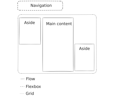
While RWD was largely about reacting to viewport sizes, IWD is about allowing elements to dictate their own dimensions based on their content. It combines the two-dimensional control of old-school tables with the flexible wrapping capabilities of modern CSS. By leveraging Flexbox and CSS Grid, we can create layouts that are inherently adaptive without needing a dozen custom media queries.

Supporting Data: Why Micromanagement Fails
The industry is moving toward a consensus: the browser is a more capable designer than any human developer. As Andy Bell famously stated, we should strive to be the "browser’s mentor, not its micromanager."
The data supports this. When developers attempt to force pixel-perfect layouts across every possible viewport, they create fragile code. A modern website is viewed on everything from an 8K desktop monitor to a smart-fridge screen. There are thousands of variables—battery levels, connection speeds, assistive technology settings, and OS-level font scaling—that a developer cannot predict.
By using native CSS layout systems, we offload the heavy lifting to the browser’s engine, which has been optimized for decades. The evidence shows that websites built using intrinsic, algorithm-based layouts are not only easier to maintain but are significantly more resilient to unexpected user environments.
Declarative Design: A New Methodology
The most significant implication of this evolution is the shift from imperative to declarative design. In an imperative workflow, the developer tells the browser how to render a layout (e.g., "If width is 800px, set margin to 20px"). In a declarative workflow, the developer defines what the layout should be (e.g., "This container should hold three columns, each at least 200px wide, and wrap if there is not enough room").
This shift mirrors the broader movement in technology toward declarative systems. Just as modern AI prompts focus on desired outcomes rather than technical process, our CSS should focus on constraints.
Key Pillars of the Declarative Approach:
- Semantic HTML: The foundation of every accessible, resilient page.
- Fluid Typography: Using the
clamp()function, we can set font sizes that scale smoothly between a minimum and maximum range, ensuring legibility on any screen. - Logical Properties: Moving away from "physical" CSS (left/right) toward logical CSS (start/end) allows layouts to automatically adapt to different writing modes and internationalization requirements.
- Progressive Enhancement: Accepting that some browsers will not support the latest features and ensuring the site remains functional regardless.
Implications for the Future: The Mental Shift
The most difficult hurdle in this transition is not technical; it is psychological. Many developers are still tethered to the "1rem = 16px" myth. In reality, rem units are relative to the user’s browser settings. When a user changes their base font size, they are expressing a specific need—often for accessibility or comfort.
By abandoning the pixel-based mindset and embracing a ratio-based one, developers can build interfaces that respect user agency. If a user increases their default font size to 64px, a site built on ratios will scale its entire layout proportionally. If it is built on fixed pixels or rigid breakpoints, it will break.
The Role of the Browser as a Partner
We must stop viewing the browser as a source of "bugs" and start viewing it as a sophisticated translator. When we provide the browser with clear, semantic instructions, it acts as a bridge between our design intent and the user’s reality.
This is the ultimate goal of "Taking RWD to the Extreme." It isn’t about making the code more complex; it’s about making it simpler. It is about trusting the standards. By using modern layout systems, we empower the browser to handle the edge cases we could never anticipate.
Conclusion: Designing for the User, Not the Device
Responsive Web Design isn’t dead, but it has evolved into something far more powerful. We are no longer designing for a list of devices; we are designing for the web.

As we move forward, the most successful developers will be those who relinquish the urge to control every pixel. By leaning into the inherent nature of the web, we create digital experiences that are more accessible, inclusive, and future-proof. The future of design lies in the space between our constraints and the browser’s intelligence. By fostering this dialogue, we don’t just build websites; we build environments that serve the user exactly as they need to be served.
In 2025, the best way to be a great web designer is to let the browser do what it was built to do. It is time to move beyond the breakpoint and embrace the intrinsic nature of the medium.