








The evolution of web design is marked by a constant pursuit of balance: the need for stylistic consistency versus the demand for individual content variety. With the release of Divi 5, Elegant Themes has introduced a transformative feature known as "Components," designed to redefine how designers manage recurring elements across complex websites. By allowing users to create a single, master design source that feeds multiple instances, Components enable a level of granular control previously unattainable in visual page building.
This article explores the technical framework, workflow implementation, and long-term implications of using Divi 5 Components, demonstrating how they streamline the creation of service cards, portfolios, and modular content systems.
The Core Concept: What Are Divi 5 Components?
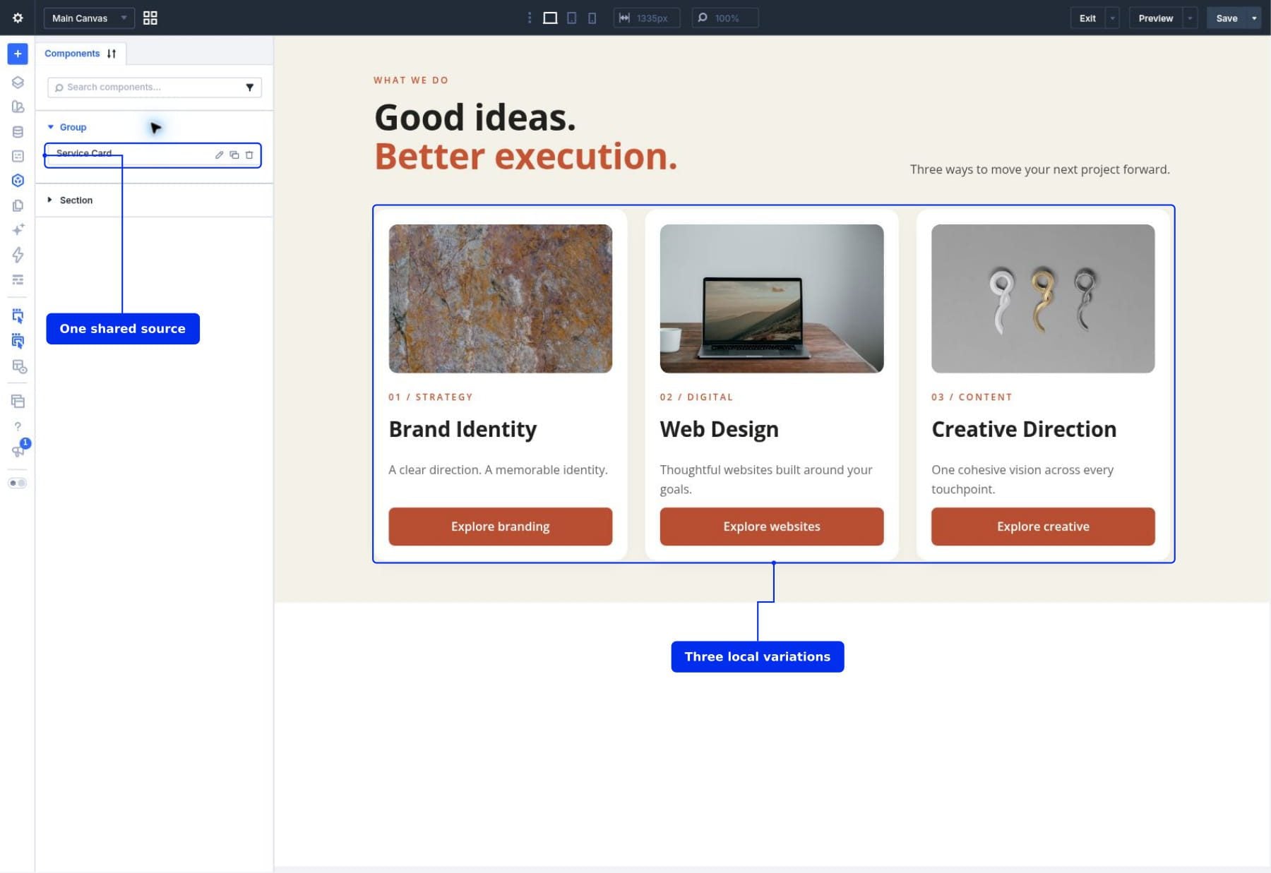
At its most fundamental level, a Component is a reusable design asset stored within the Divi Library. Unlike traditional global modules, which synchronize every single setting across every instance, Components offer a more sophisticated "source-and-instance" architecture.
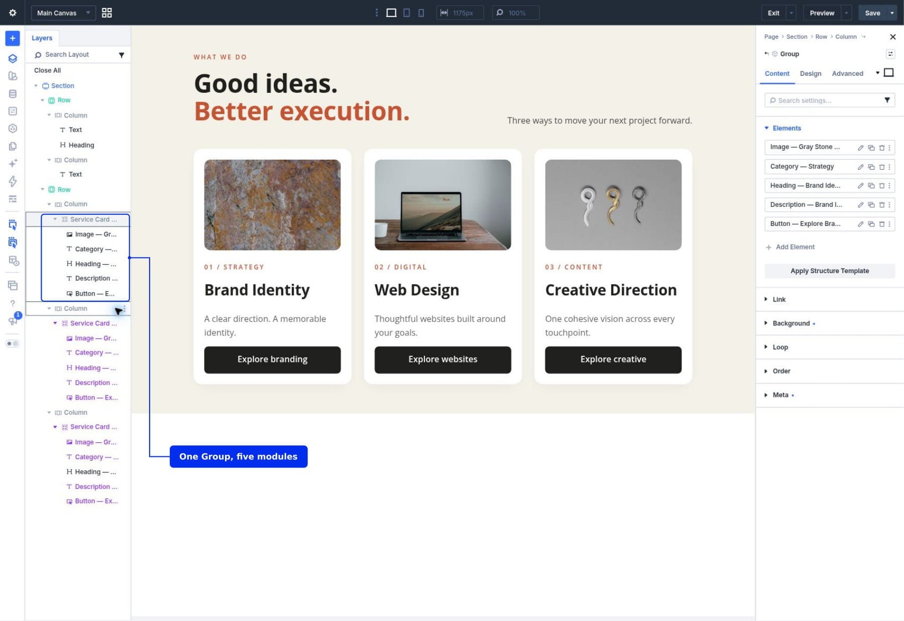
When you define an element—such as a service card—as a Component, you establish a primary source. Any subsequent uses of this element on your website are referred to as "instances." The genius of this system lies in the ability to designate specific fields as "locally editable." This means you can keep the structural DNA of a card (its padding, border radius, typography, and button color) locked to the source, while simultaneously allowing each individual instance to display its own unique photograph, heading, description, and link destination.
The Evolution of Global Elements
Divi has long championed the "Global Module" as a way to maintain consistency. However, global modules were often too rigid; changing the text on one global module would change it on every other instance. Components solve this by allowing developers to expose specific fields. If you are building a team page or a product showcase, you no longer need to create a new design for every single entry. You build one, define which parts change, and let the synchronization engine handle the rest.
Chronology of a Component Workflow
To fully grasp the power of this system, it is helpful to look at the chronological process of building a functional set of service cards.
1. Preparation and Source Creation
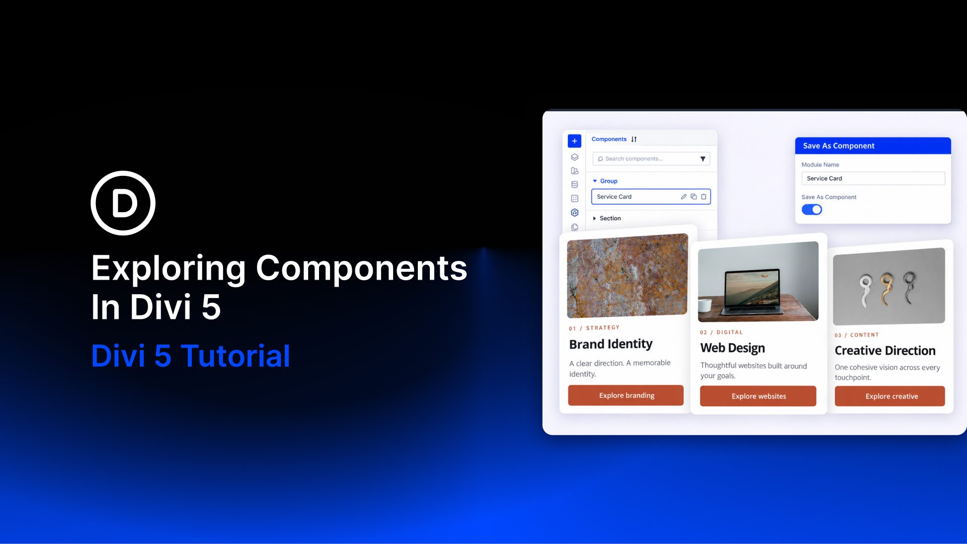
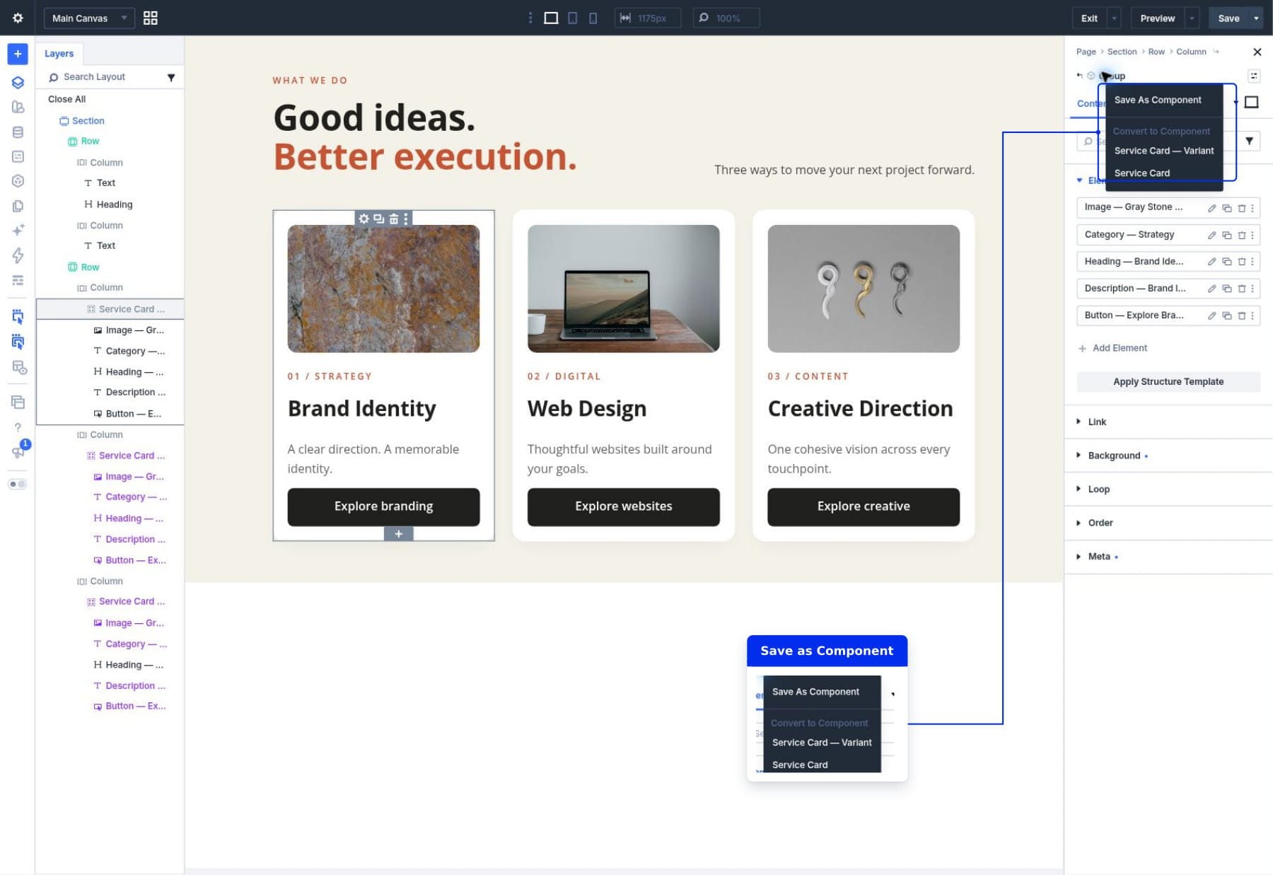
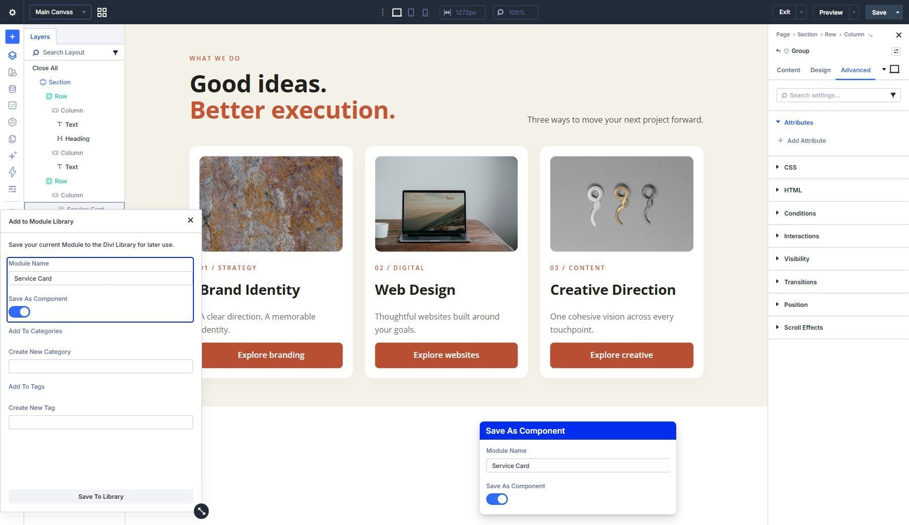
The workflow begins by constructing a "source" card. In a typical scenario, this is a Group module containing an Image, category text, a main Heading, a description, and a Call-to-Action button. Once the design is perfected, you select the Group and choose "Save As Component." This action effectively moves the design into the Divi Library, establishing it as the authoritative template.
2. Defining Local Editing Fields
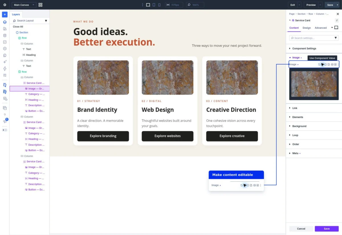
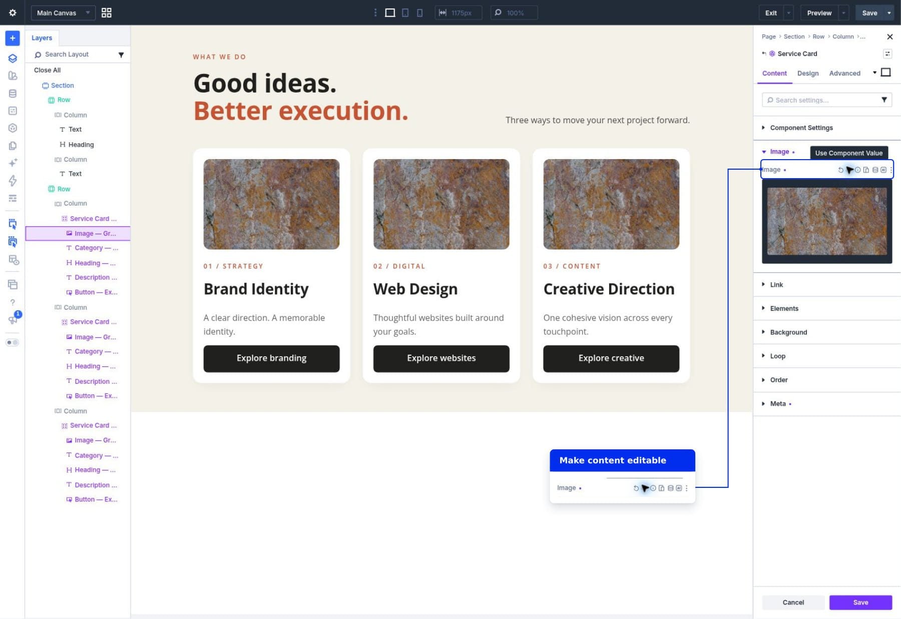
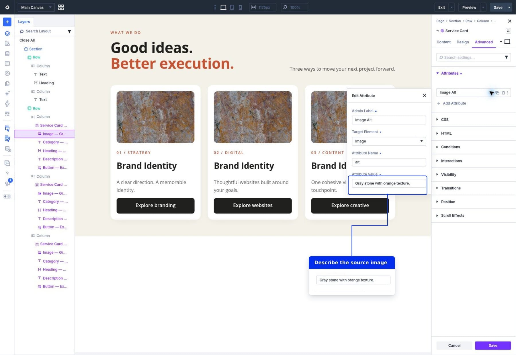
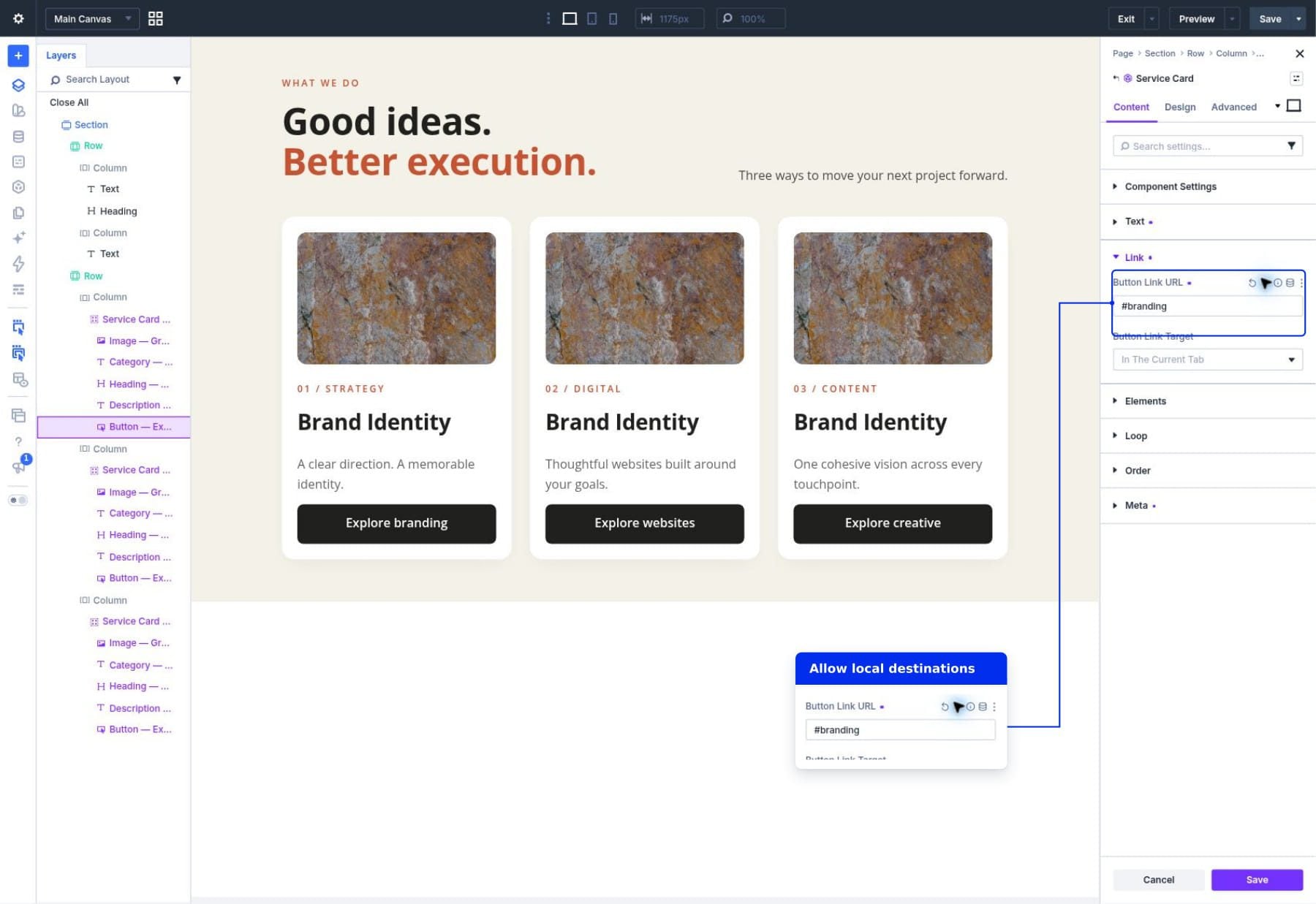
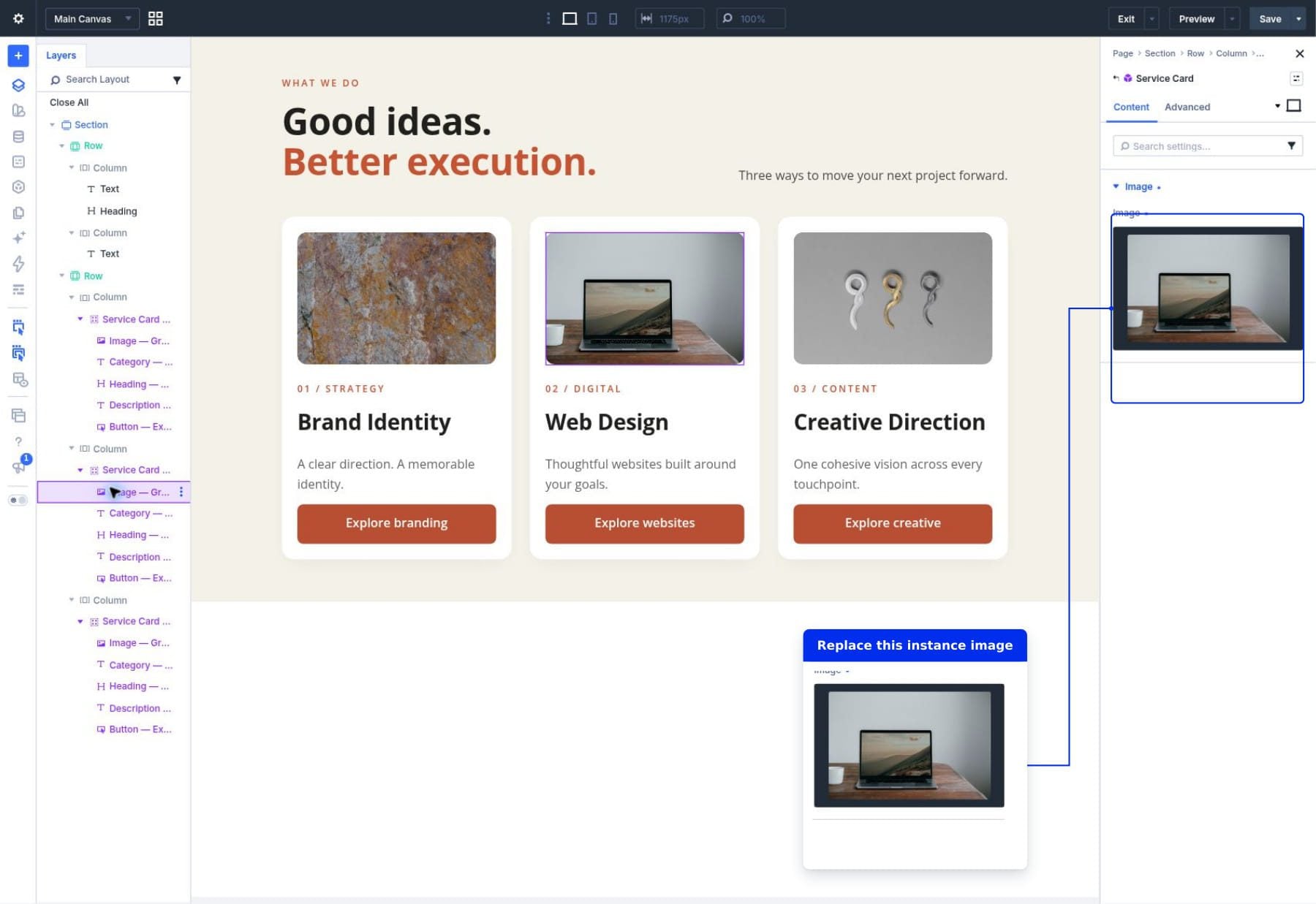
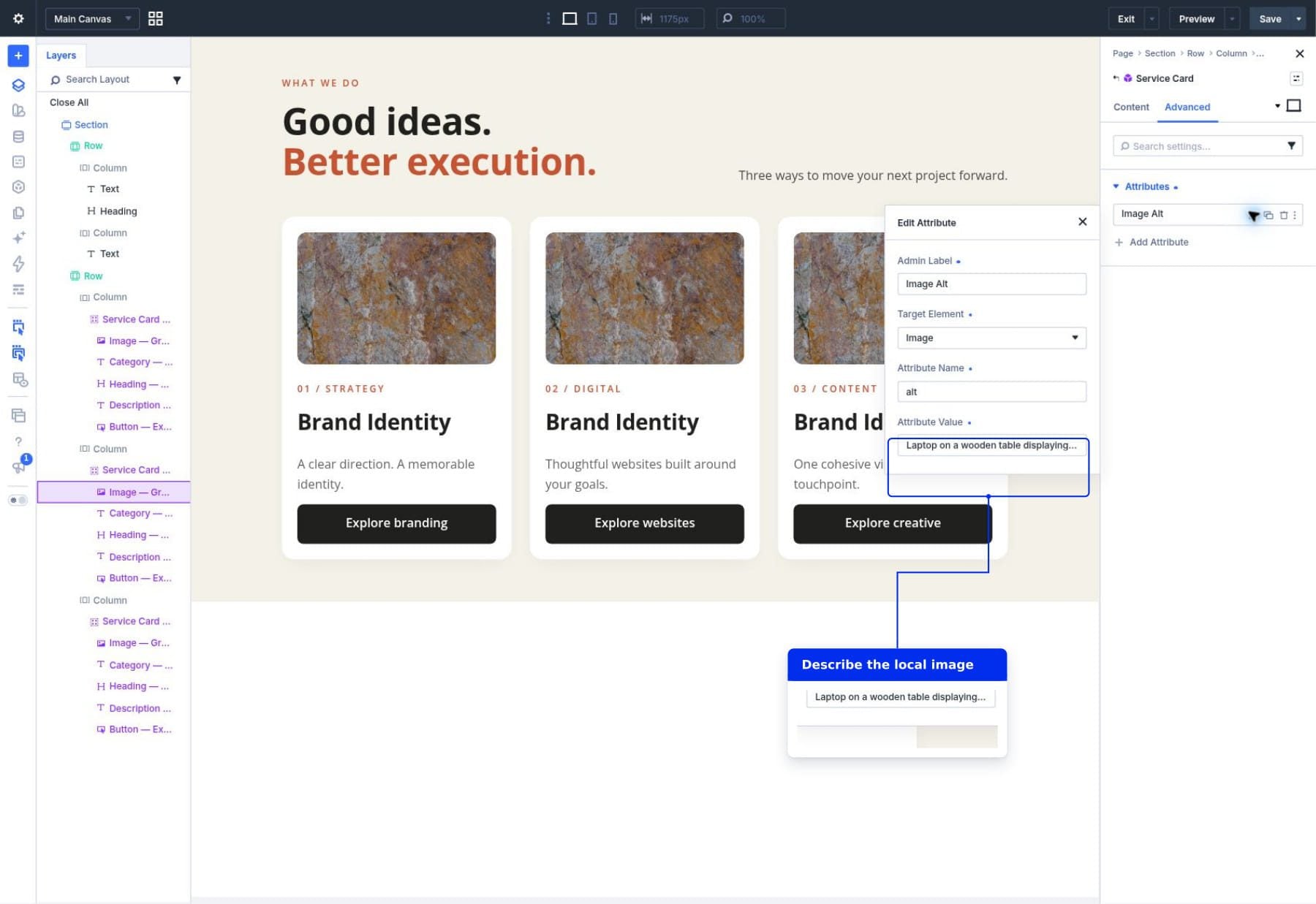
Once the source is saved, the designer must determine which elements should be flexible. By opening the "Edit Component" view, you can access the synchronization controls for each field. For instance, the button’s background color and typography remain locked to the source to ensure brand consistency. However, the "Button Text" and "Button Link URL" fields are toggled to "editable," allowing each service card to point to its respective landing page.
3. Deployment and Instance Customization
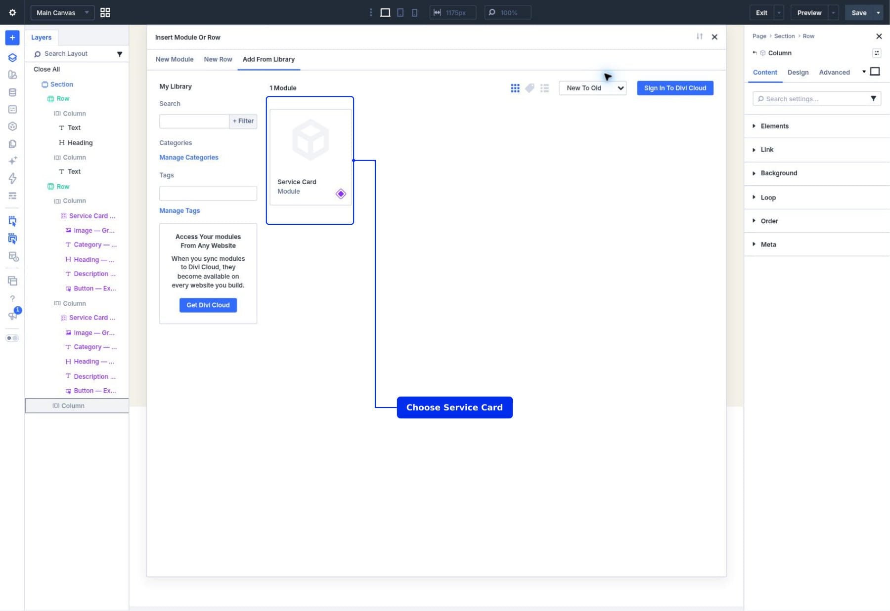
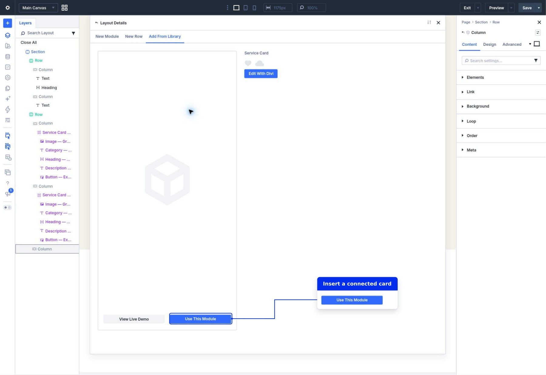
With the source established, you can now insert instances into your page. Whether you are using a new section or replacing existing cards, the insertion process pulls from the Library. Once inserted, the instance inherits all the source’s styling. When you click on an instance to change the text or image, the interface intuitively prompts you to enter local values. These values override the source defaults for that specific card, yet the card remains "connected" to the source.
Supporting Data and Technical Nuance
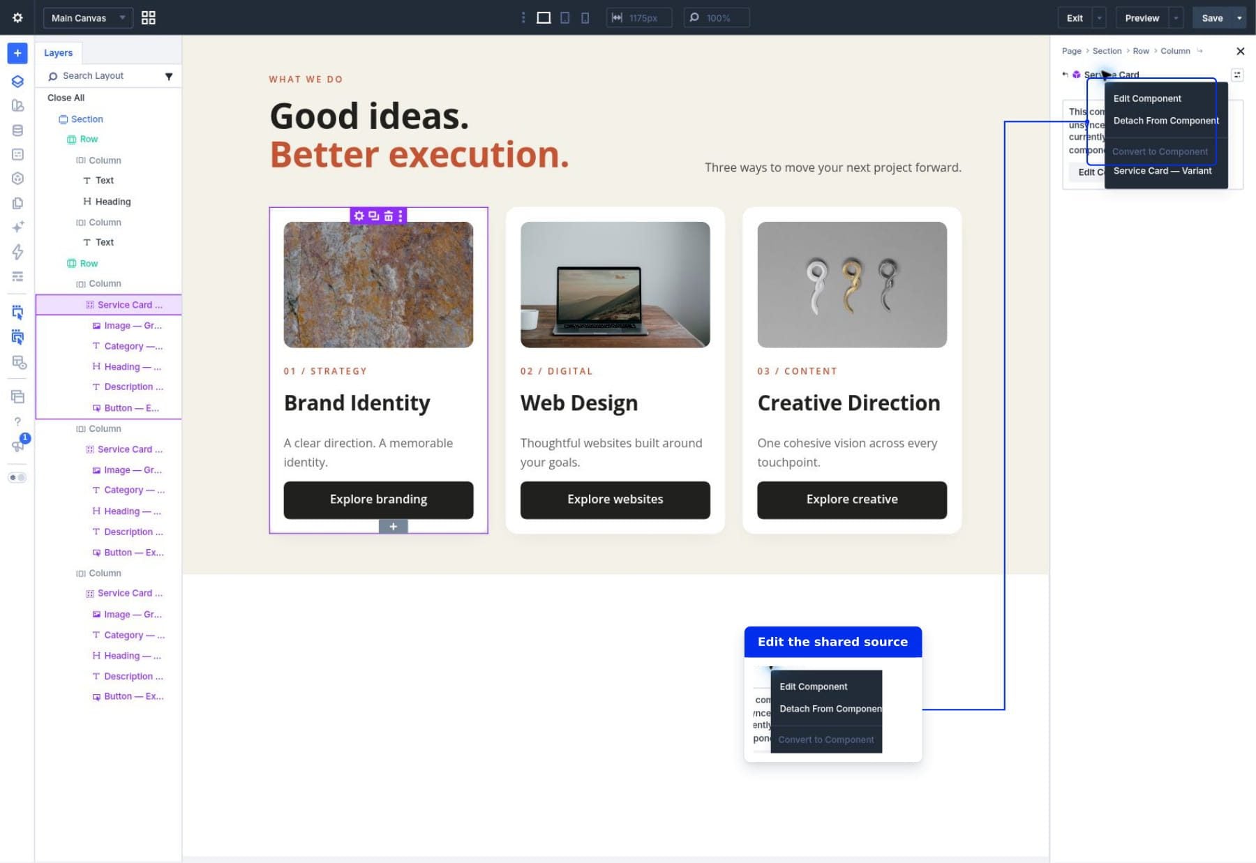
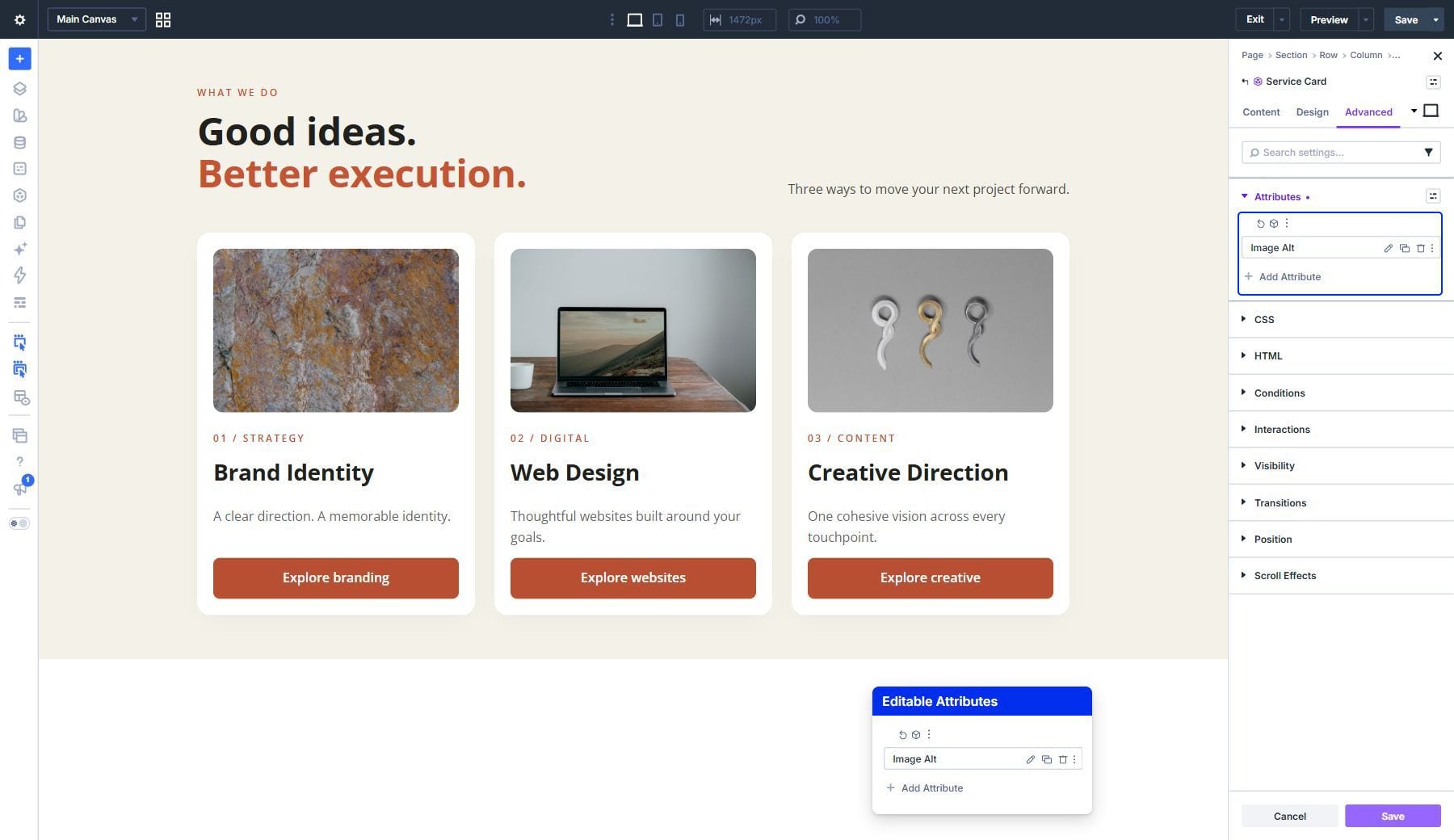
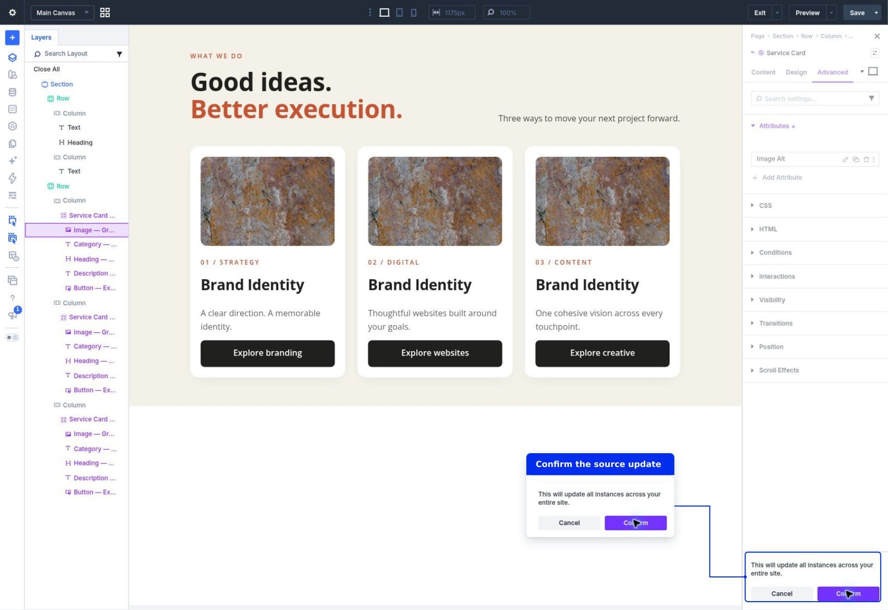
The power of Components is best illustrated through the management of shared settings versus local overrides. When you change a piece of content on an instance, that specific field is "overridden." However, if you were to decide that the font size of all headings across all cards was too small, you would return to the "Edit Component" source view.
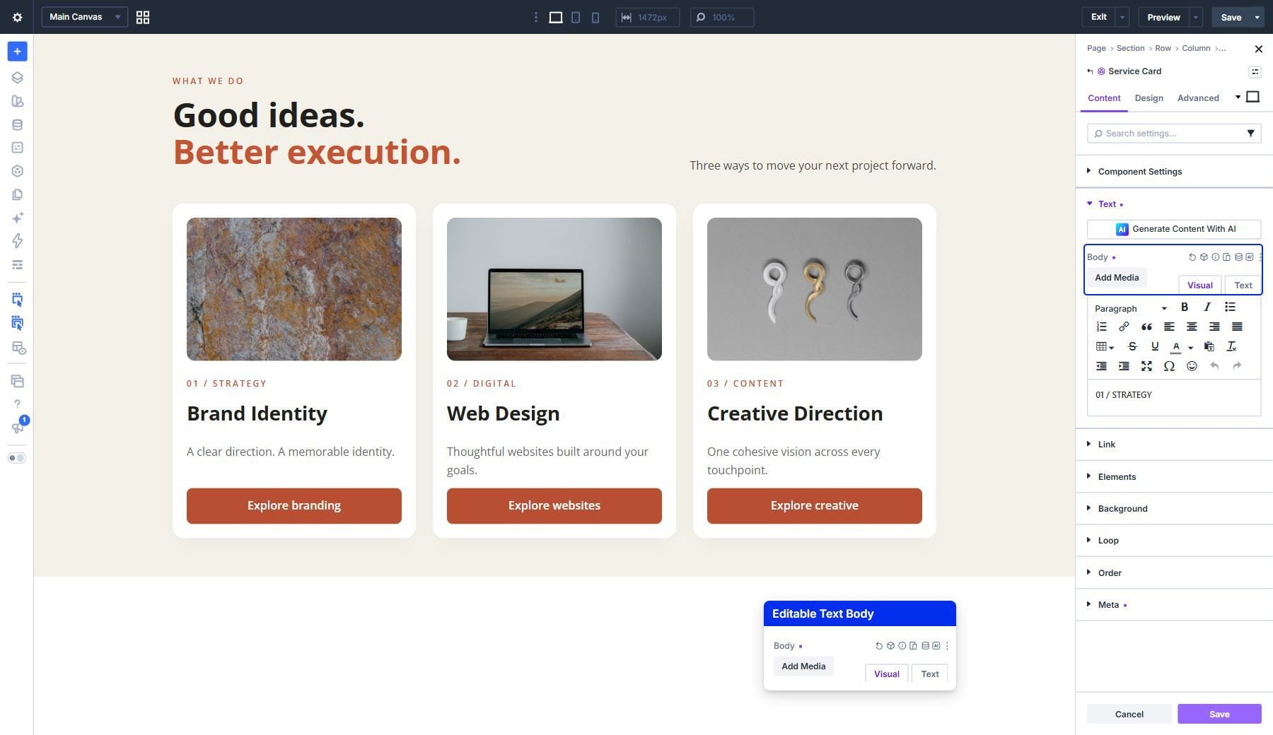
By updating the font size in the source, the change propagates to every instance across the site. Because the local headings (e.g., "Web Design," "Creative Direction") were flagged as editable, they retain their specific text, but adopt the new typography defined by the source. This is the primary efficiency gain: you are managing the design of an entire system from a single control point.
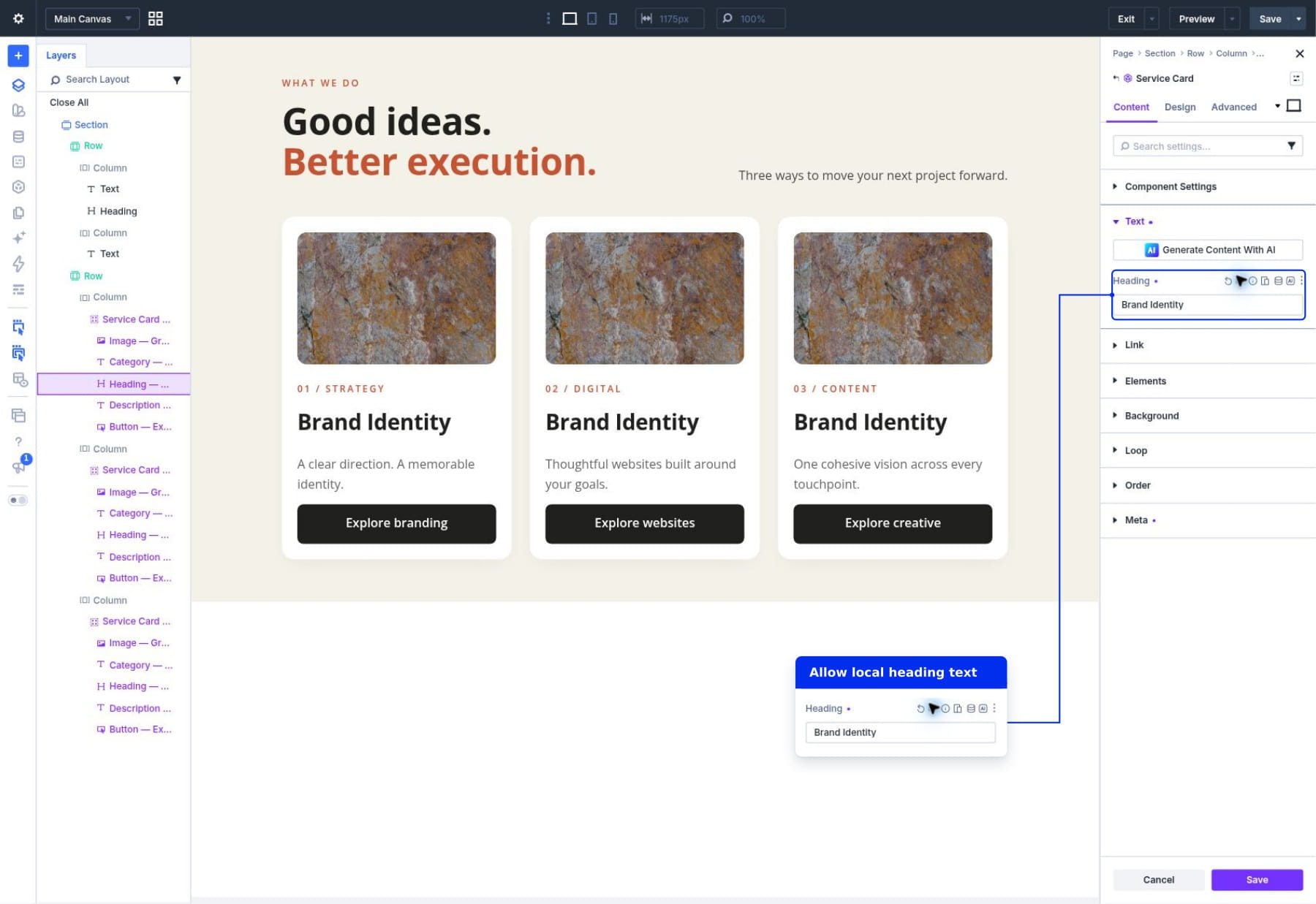
The Role of Presets and Variables
Components do not operate in a vacuum. They integrate seamlessly with Divi’s existing system of Presets and Design Variables. For example, a button within a Component can be assigned a "Primary Button" preset. If you update the global preset for all primary buttons on your site, the Component will automatically reflect those changes. This creates a "stacked" design system where the Component controls the layout, the Presets control the styling, and the Variables ensure theme-wide color and spacing consistency.
Official Responses and Strategic Implications
The introduction of Components reflects a broader shift in the web design industry toward "Design Systems" rather than "Page-by-Page" construction. According to the technical documentation from Elegant Themes, this feature is intended to reduce technical debt. By centralizing the management of recurring elements, designers avoid the common pitfall of "drift"—where the design of a button or a card on one page slowly deviates from the rest of the site due to manual updates.
Implications for Workflow Efficiency
- Maintenance Speed: Updates that once took hours across hundreds of pages can now be achieved in seconds by updating a single source.
- Consistency: Large teams can ensure that branding remains intact, as junior designers can be limited to editing only the content fields, preventing them from accidentally breaking the structural layout.
- Scalability: As a website grows from ten pages to hundreds, the administrative burden does not increase linearly. The Component system handles the complexity, allowing the design to remain modular.
Best Practices for a Seamless Workflow
To maximize the potential of Components, consider the following strategic tips:
- Name Your Sources Clearly: As your library grows, vague names like "Service Card 1" will become a liability. Use descriptive naming conventions like "Card_Service_Dark" or "Feature_Block_Hero."
- Use Layers for Precision: The Layer panel is your best friend when managing nested Components. It allows you to distinguish between the parent Group and the individual child modules, making it easier to select the correct element for "Edit Component" mode.
- Test Responsiveness at the Source: Never assume that a layout that looks good on desktop will translate perfectly to mobile. Always adjust the padding, margins, and font sizes within the source Component view while using the mobile preview toggles.
- The Power of Resetting: If you ever find that a local override has made a card look inconsistent, you can simply reset the field to the source default. This is a one-click operation that restores the inheritance and aligns the card back with your master design.
Conclusion: The Future of Modular Design
The implementation of Components in Divi 5 represents a maturation of the visual builder landscape. It acknowledges that modern web design is less about drawing shapes on a canvas and more about building scalable, maintainable systems.
By separating the "what" (the content) from the "how" (the design), Divi 5 empowers creators to focus on the high-level strategy of their websites. Whether you are a solo freelancer managing a single client or an agency architecting massive digital ecosystems, the Component workflow provides the tools necessary to stay agile.
As we look toward the future of web development, the ability to build with this level of modularity will become the standard. By adopting these practices today, you are not just building pages; you are building an infrastructure that can evolve alongside your business or your clients’ needs. The era of manual, repetitive updates is coming to an end, replaced by a more intelligent, connected, and efficient way of working.
To get started, we recommend taking a static element from one of your existing sites, saving it as a Component, and experimenting with the "Edit Component" mode. You will quickly find that once you experience the power of centralized design management, there is no going back to the old way of building.