






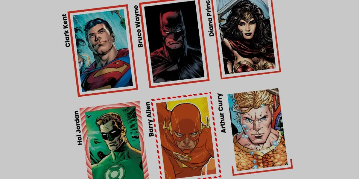
In the rapidly evolving landscape of frontend web development, user interface (UI) design often balances the fine line between aesthetic innovation and performance optimization. While developers have long relied on standard solid, dashed, or dotted outlines to frame content, modern CSS specifications offer powerful mechanisms to shatter these rigid design paradigms. Among the most versatile yet underutilized tools in a developer’s arsenal is the border-image property.
Though not a newly introduced feature in the Cascading Style Sheets specification, border-image has recently experienced a renaissance. Front-end engineers and designers are discovering that this property—traditionally viewed as static and rigid—can be supercharged using modern CSS layout and animation techniques. By combining border-image with @property definitions, custom variables, and gradient functions, developers can create fluid, interactive, and eye-catching border animations that behave as though a digital pen is drawing them in real time.
This technical deep dive explores the mechanics of animating CSS border images, examines the inherent limitations of the technology, explores creative workarounds, and demonstrates how to implement both linear and conic gradient border animations to elevate modern web design.
Main Facts: The Anatomy of border-image and CSS Houdini
At its core, the CSS border-image property allows developers to replace standard element borders with custom imagery, patterns, or complex gradients. Instead of being restricted to flat, monotonous lines, a web element can be framed by multi-colored gradients, textured artwork, or dynamic geometric patterns.
However, utilizing border-image comes with a notable caveat that often deters developers: border images do not naturally curve to conform to rounded border shapes (such as those created with border-radius). This poses a significant limitation for complex, flowing animations that travel seamlessly around an element’s perimeter. Despite this restriction, developers frequently choose border-image over alternative techniques—such as complex CSS masking solutions pioneered by experts like Temani Afif—due to its sheer efficiency.
Key advantages of leveraging border-image include:
- Automated Scaling: The design is automatically replicated and distributed across all four borders without requiring complex manual positioning.
- Slice Control: Using the
border-image-sliceproperty, developers can dictate how segments of the underlying image or gradient are parsed and stretched, functioning similarly tobackground-sizeandbackground-position. - Hardware-Accelerated Animation Potential: When paired with custom CSS properties defined via the CSS Houdini
@propertyAPI, static border images transform into dynamic, interactive UI components capable of smooth interpolation.
Chronology: From Static Borders to Programmable UI Animations
To understand how modern CSS border animations function, it is helpful to trace the technical progression of how browsers handle gradients and property transitions.
1. The Era of Static Border Images
Historically, if a developer wanted to apply a gradient to a border, they were forced to use complex nested HTML elements, pseudo-elements (::before and ::after), or intricate SVG workarounds. When border-image was first standardized, it solved part of this problem by allowing images to be mapped directly to an element’s border box. However, these borders remained completely static. Gradients applied to them could not be smoothly animated because browsers traditionally lacked the mathematical capability to interpolate (transition) between gradient stop percentages.
2. The Breakthrough of CSS Houdini (@property)
The landscape shifted dramatically with the widespread adoption of the CSS Properties and Values API (part of CSS Houdini). This specification allowed developers to explicitly register custom CSS variables, defining their syntax, initial values, and inheritance rules. By registering a custom property as a <percentage>, <angle>, or <number>, the browser suddenly understood how to interpolate intermediate values during a state change, such as a :hover event.
3. Modern Dynamic Implementation
Today, developers can combine registered custom properties with border-image-source, border-image-slice, and border-image-width. This breakthrough allows the browser to dynamically recalculate gradient stops and slice thresholds on the fly, unlocking complex visual effects like expanding color wheels, self-drawing borders, and pulsating neon frames without heavy JavaScript overhead.
Supporting Data: Implementation and Code Architecture
To see how these concepts translate into production-ready code, let us examine the step-by-step implementation of a self-drawing linear gradient border, followed by an advanced conic gradient variation.
The Foundation: HTML and Base Styles
We begin with a simple HTML structure containing a designated card element:
<div class="card">
  <strong>Bruce Wayne</strong>
</div>
Next, we establish the base CSS styles, setting explicit dimensions and dropping in a background image:
.card
  width: 150px;
  aspect-ratio: 0.69;
  position: relative;
  background: center/90% no-repeat;
  background-image: url("batman.jpg");
  padding: 1rem;
Implementing the Linear Gradient Border
To prepare for animation, we break down the border-image property into its individual longhand properties. This approach ensures maximum clarity regarding how each property affects the rendered output:
.card
  /* ... base styles ... */

  /* Creates a linear color gradient */
  border-image-source: linear-gradient(-45deg, red 0%, transparent 0%);

  /* Controls how the gradient is carved */
  border-image-slice: 1;

  /* Sets the physical thickness of the border */
  border-image-width: 5px;

  /* Pushes the border outward away from the element content */
  border-image-outset: 5px;
In this configuration, both the red and transparent color stops are set to initiate at 0%. Because transparent is declared second, it occupies the starting position and fills the remainder of the gradient, resulting in a fully transparent initial state.
Registering Custom Properties for Animation
Because standard CSS cannot natively interpolate changes within a gradient string, we must register a custom property to manage the animation percentage (--p):
@property --p
  syntax: "<percentage>";
  initial-value: 0%;
  inherits: false;
We then integrate this custom property into our .card selector and establish the hover interaction:
.card
  border-image-source: linear-gradient(-45deg, red var(--p), transparent 0%);
  border-image-slice: 1;
  border-image-width: 5px;
  border-image-outset: 5px;
  transition: --p 0.4s ease-in-out;

  &:hover
    --p: 100%;
When a user hovers over the card, the browser smoothly transitions --p from 0% to 100%. This causes the red portion of the gradient to expand across the entire perimeter, creating the striking illusion of a border drawing itself around the element.
Advanced Variations: Conic Gradients and Tiling
Linear gradients represent only the baseline of what is possible. By utilizing conic-gradient, adjusting slice values, and incorporating repeating patterns, developers can craft vastly more intricate animations.
Consider the following advanced configuration utilizing a conic gradient, dynamic angles, and sliced repetition:
/* Register custom properties for slice depth and rotation angle */
@property --n
  syntax: "<number>";
  initial-value: 1;
  inherits: false;


@property --a
  syntax: "<angle>";
  initial-value: 0deg;
  inherits: false;


.card
  width: 150px;
  aspect-ratio: 0.69;
  position: relative;
  background: center/90% no-repeat;
  background-image: url("batman.jpg");

  /* Advanced conic gradient border setup */
  border-image-source: conic-gradient(from var(--a), red var(--a), transparent 0%);
  border-image-width: 5px;
  border-image-slice: var(--n);
  border-image-repeat: round;

  transition-property: --n, --a;
  transition-duration: 0.6s;
  transition-timing-function: ease;

  &:hover
    --n: 20;
    --a: 360deg;
Understanding the Mechanics of Advanced Variations
border-image-repeat: round;: This property instructs the browser to tile the sliced border image regions seamlessly without clipping. If the exact dimensions do not align perfectly, the browser subtly stretches or squeezes the tiles until a whole number fits cleanly around the border.- Dynamic Slicing (
--n): By transitioning the slice value from1to20on hover, the border thickness and internal pattern scaling shift dynamically, creating segmented, geometric breaks that add texture and depth to the UI element. - Rotational Animation (
--a): Animating the conic gradient angle through a full360degrotation while simultaneously modifying the slice variable generates a swirling, highly engaging visual spectacle.
Official Responses and Industry Perspectives
Frontend architects and specification editors have increasingly emphasized the importance of CSS Houdini and paint worklets for modern web performance. According to discussions within the W3C CSS Working Group and developer communities on platforms like CSS-Tricks, native property registration has effectively bridged the gap between static stylesheets and programmatic animation.
Industry experts note that while JavaScript-driven canvas animations or heavy SVG SMIL animations were once required to achieve fluid border effects, the modern CSS approach offers distinct advantages:
- Main-Thread Offloading: Native CSS transitions are optimized by browser rendering engines, frequently running on the compositor thread rather than bogging down the main JavaScript execution thread.
- Maintainability: Declarative CSS syntax reduces the cognitive load required to manage DOM elements, making stylesheets easier to audit, refactor, and scale across large enterprise applications.
Implications for Future Web Design
The mastery of properties like border-image combined with CSS Houdini variables signals a broader shift in how digital experiences are constructed. As browsers continue to optimize rendering pipelines for CSS custom property transitions, the boundary between static styling and dynamic motion design blurs further.
Key Takeaways for Developers:
- Performance First: Prioritize CSS-based custom property transitions over JavaScript requestAnimationFrame loops whenever possible for UI state changes.
- Embrace Constraints: Understand the geometric limitations of
border-image(such as the lack of native border-radius conformity) and design creative workarounds—such as outset spacing or alternative masking strategies—where necessary. - Experimentation is Key: By dissecting linear gradients, conic color wheels, and repeating slice patterns, developers can unlock a virtually limitless array of custom visual accents that elevate standard web applications into immersive, polished digital products.
As you explore these techniques in your own projects, experiment with overlapping color stops, varying animation durations, and unique gradient combinations. The future of interactive web design is limited only by the creativity written into the stylesheet.